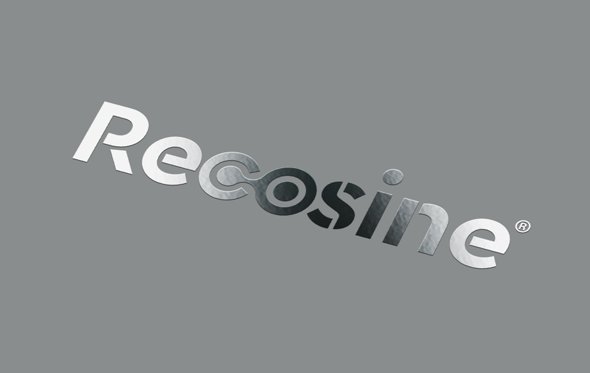
Vianex / Recosine Logo
The Recosine logo redesign aimed to establish a fresh, dynamic, and clear representation of the product's features.
The design concept revolves around the product's beneficial effects on joint health and functionality.
The letters "C" and "O" are interconnected, visually symbolising the connection of a joint, which subtly alludes to the healing properties that Recosine offers. A clean, modern typeface was chosen to convey a sense of complete recovery, underscored by the trusted quality of VIANEX.
Client: Vianex
Industry: Pharmaceutical
Service: Brand Definition, Brand Development, Packaging Design, Creative design, Typography, Logo Design, Visual Identity, Image Language, Illustration Language


