Frezyderm / Feminine Line
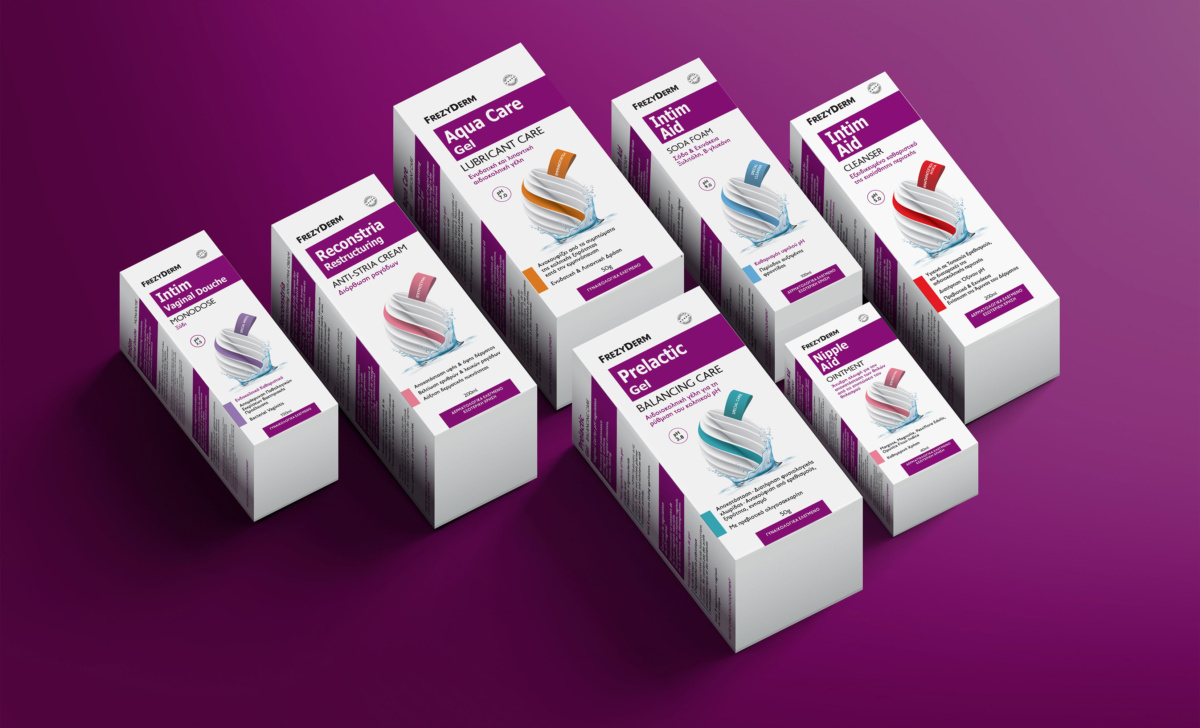
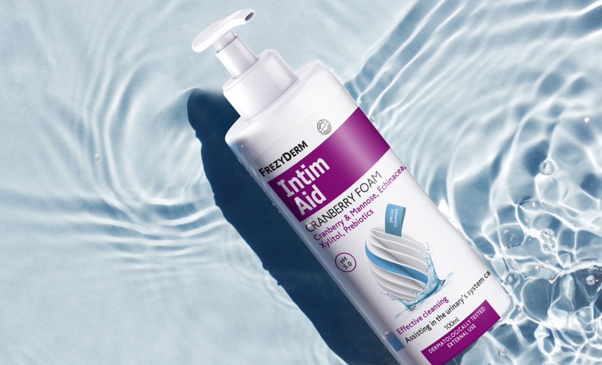
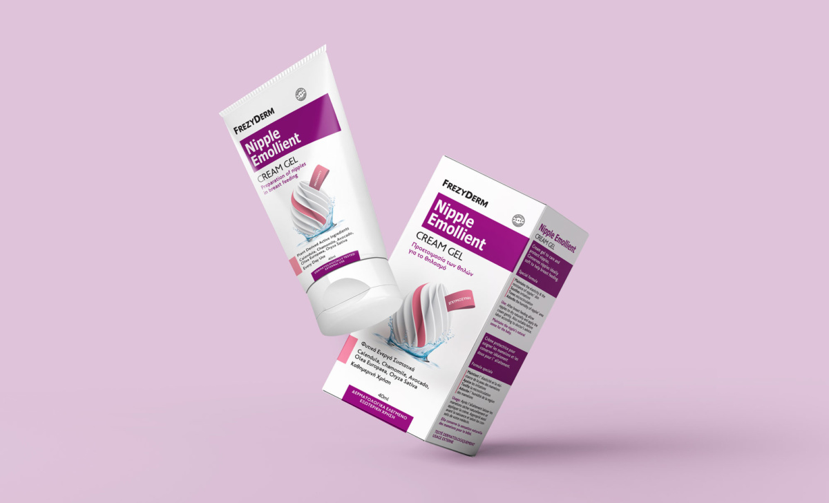
Frezyderm entrusted AbcDesign with the redesign of its Feminine product line packaging. Designed to offer women the highest level of safety and care while preserving the natural integrity of the ingredients, the packaging needed to embody these fundamental values.
We elevated the original design by introducing a modern, minimalist depiction of an egg symbol, surrounded by water. This represents the protection, hydration, care, and softness this product range delivers. Distinct colour codes for each product enhance recognition, while contemporary typography helps consumers easily identify and choose the right product.
The new Feminine line packaging has seamlessly integrated into women's daily routines.
Client: Frezyderm
Industry: Pharmaceutical
Service: Brand Definition, Brand Development, Consumer Branding & Packaging, Packaging Design, Creative design, Typography, Logo Design, Visual Identity, Image Language, Production

