Frezyderm / Atoprel
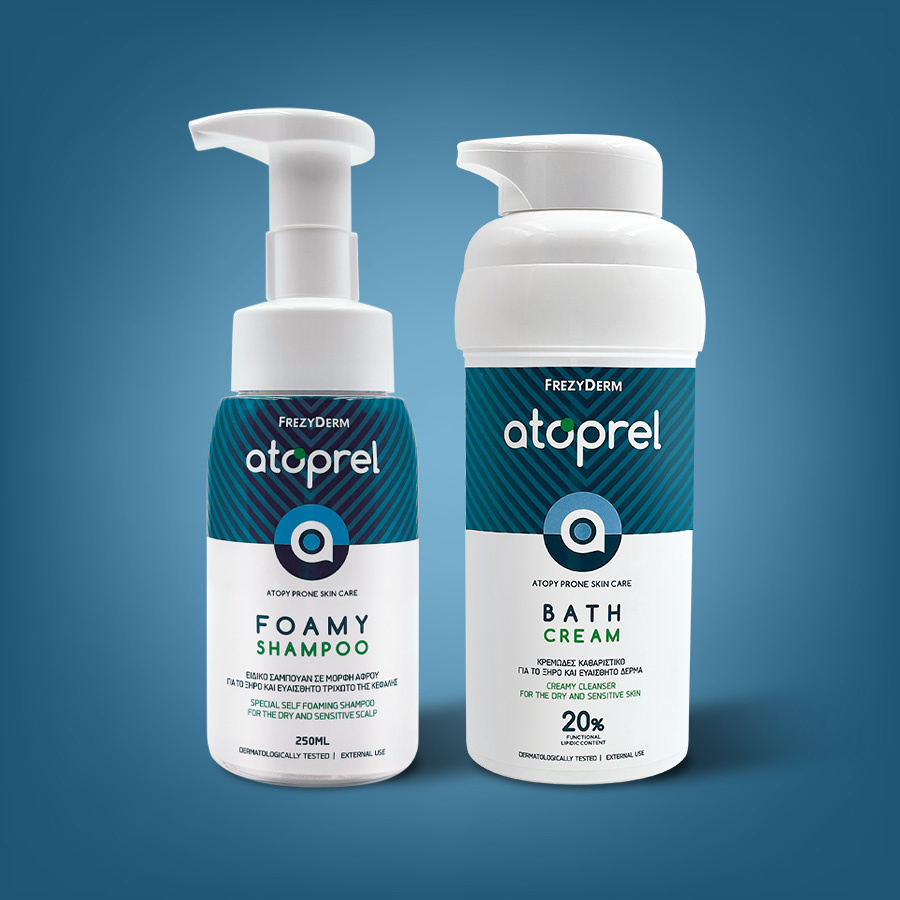
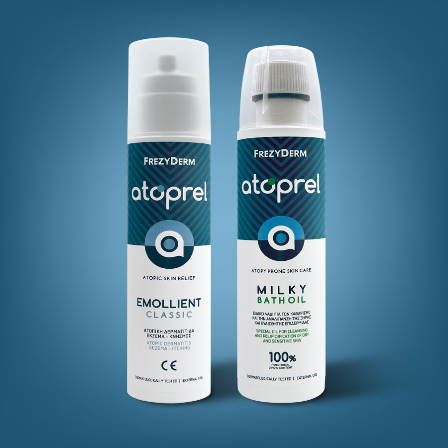
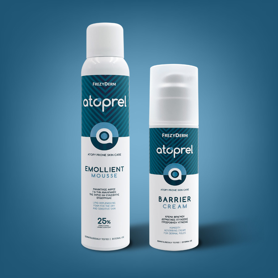
In the fight against atopic dermatitis and the challenges of dry, sensitive skin, Frezyderm introduced the revolutionary Atoprel skincare range. This series emerged from the company’s commitment to extensive laboratory research and its intention to expand its range of products for sensitive skin.
We were tasked with giving form and colour to the product packaging capturing the revolutionary spirit of the approach in the design. Our mission was to convey a sense of care and protection, subtly reflecting the promise of relief and healing that the range offers.
By designing the logo and carefully selecting calming, uplifting colours, we effectively conveyed a message of safety and trust. With this concept, the Atoprel range is not just another offering in the dermatological care sector. It’s a promise of softness, protection, and healing for stressed skin, making a real difference in pharmacies and in the hearts of those who trust Frezyderm deeply.
Client: Frezyderm
Industry: Pharmaceutical
Service: Brand Definition, Brand Development, Consumer Branding & Packaging, Packaging Design, Creative design, Typography, Logo Design, Visual Identity
Image Language, Illustration Language, Production