Frezyderm / Atoprel Logo
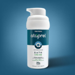
In the search for a logo for FREZYDERM’s ATOPREL range, a complete skincare line for dry, sensitive, fragile, and atopic skin, the creation emerged from the company's extensive scientific research.
We designed a symbol based on the letter 'a', representing skin regeneration.
Additionally, the circle in the Atoprel graphic signifies the healing process, reflecting the ongoing care provided by the products.
Client: Frezyderm
Industry: Food
Service: Brand Definition, Brand Development, Consumer Branding & Packaging, Packaging Design, Creative design