Frezyderm / Frezylac
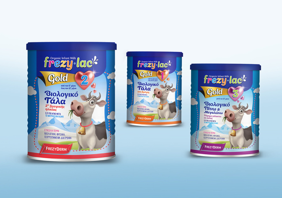
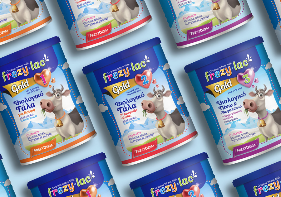
Frezyderm ushers in a new era of infant nutrition with the launch of Frezylac Gold; pure, organic milk designed to support the healthy development of newborns and children.
This pioneering initiative is beautifully complemented by the creativity of our team, with the packaging brought to life by the cheerful cow; a timeless symbol of warmth and safety. With its bright smile and friendly aura, the cow embodies the purity and quality of milk sourced directly from nature.
Every design element on the packaging has been meticulously crafted to emphasize the safety and care the product delivers. Notably, the heart icon on the right side of the label highlights the appropriate age group for consumption.
Frezylac Gold represents a holistic approach to premium infant nutrition. Its vibrant and approachable design ensures the product stands out on store shelves, offering a new and reassuring shopping experience for every parent.
Client: Frezyderm
Industry: Pharmaceutical
Service: Brand Definition, Brand Development, Consumer Branding & Packaging, Packaging Design, Creative design, Typography, Logo Design, Visual Identity, Image Language, Illustration Language, Production