Frezyderm / Immuno
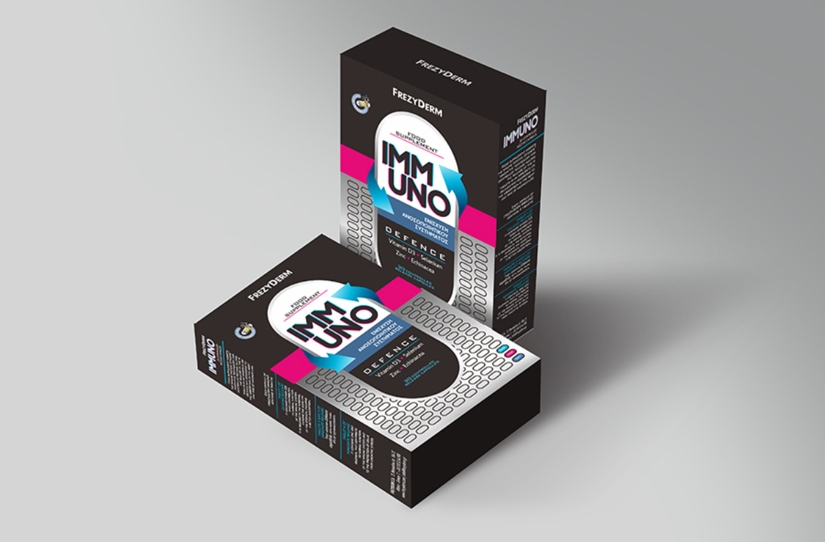
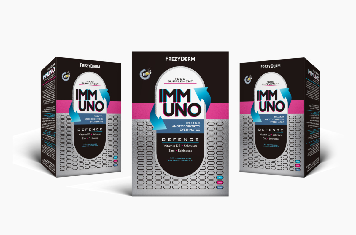
The first impression sets the stage for a product's success, which is why the packaging for Frezyderm's IMMUNO reflects a targeted visual representation of a dietary supplement that fortifies and works comprehensively to boost the immune system.
Our approach focused on highlighting the benefits of IMMUNO. The capsule, being the heart of the product, was chosen as the central element of the packaging to emphasise its concentrated and all-encompassing action. The graphic elements surrounding the capsule – circular, swirling arrows – draw attention to the core message: continuous and complete immune system support.
The use of metallic colour and embossed varnish in the pattern is deliberate. It symbolises innovation, giving the packaging a dimension that communicates the advanced nature of the product. The choice of fuchsia and sky blue, harmonised with black and silver, completes the message, creating packaging that stands out for its pioneering design and effective communication.
Client: Frezyderm
Industry: Pharmaceutical
Service: Brand Definition, Brand Development, Consumer Branding & Packaging, Packaging Design, Creative design, Typography, Logo Design, Visual Identity, Image Language, Illustration Language, Production

