Frezyderm / Nazal
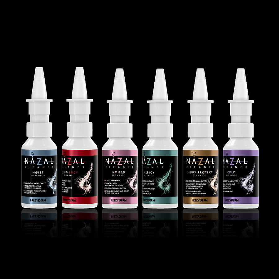
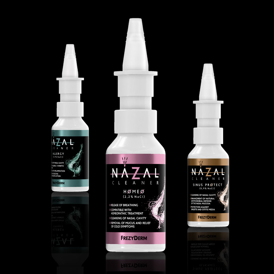
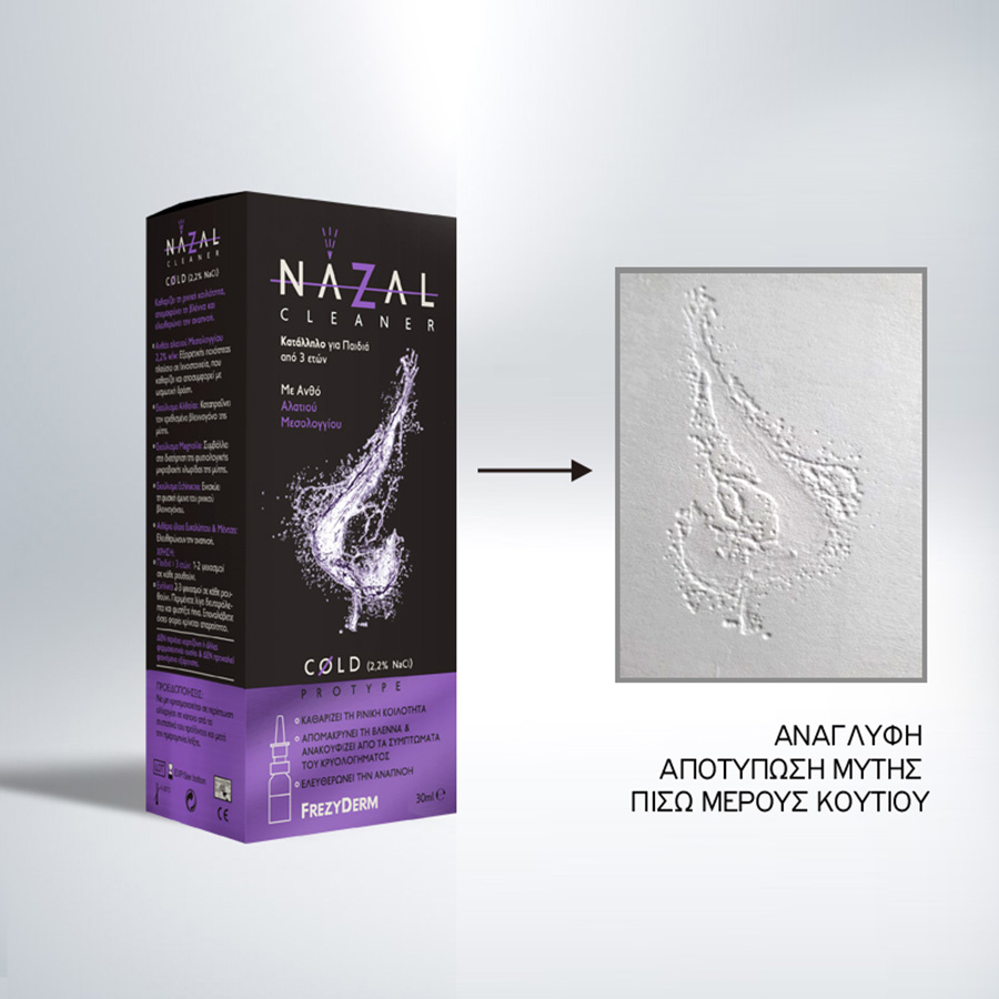
Frezyderm recognised the need for an effective solution to nasal congestion. As a result, they introduced an innovative nasal spray. The product's logo was designed to visually represent the spray’s function, adding a creative twist to the letter "A". The design emphasises the immediate relief the spray provides, with a dynamic horizontal line running through the logo to highlight its rapid action.
At the heart of the visual identity lies the letter "Z", reflecting Frezyderm’s unique approach to tackling nasal congestion. This clever design choice also ties the product to the Frezyderm brand, as the letter appears in the company’s name itself. By doing so, we aimed to showcase the brand's dedication to delivering solutions that merge functionality with aesthetics, resulting in a product that stands out both for its superior quality and its distinctive visual identity.
Client: Frezyderm
Industry: Pharmaceutical
Service: Brand Definition, Brand Development, Consumer Branding & Packaging, Packaging Design, Creative design, Typography, Logo Design, Visual Identity
Image Language, Illustration Language, Production