Frezyderm / The Snack
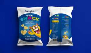
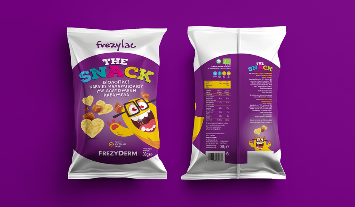
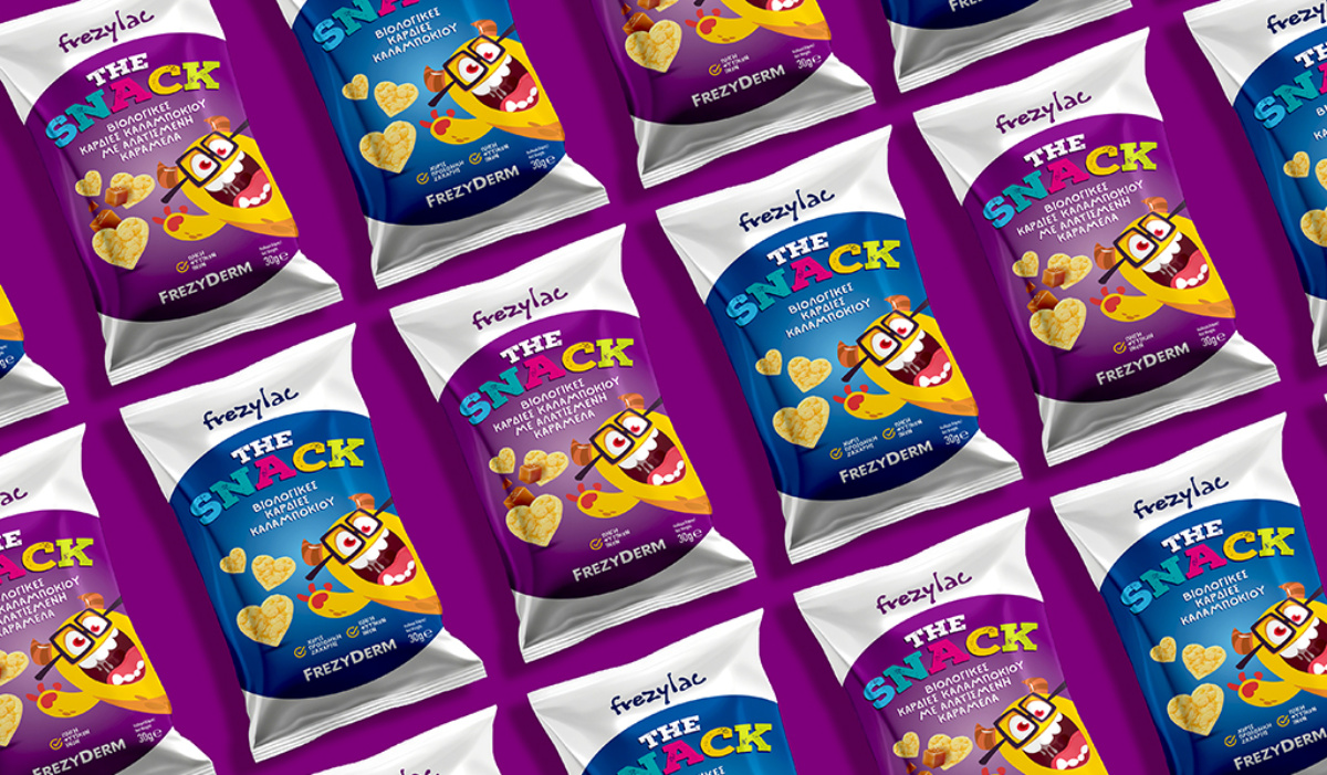
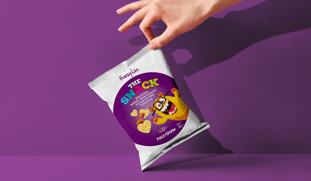
The packaging of Frezyderm’s “The Snack” is designed to appeal to young consumers, using vibrant colors, playful graphics, and a cheerful character that radiates energy and positivity. The happy character, with expressive eyes and an enthusiastic smile, quickly becomes lovable and builds a sense of familiarity and fun. The geek-chic elements (glasses, wide smile, lively expression) highlight intelligence and friendliness, associating the product with positive role models.
The modern, colorful title “THE SNACK” grabs attention instantly, while the heart-shaped snacks enhance the product’s friendly feel and emotional connection with both children and parents.
The overall aesthetic strikes a balance between fun and health-consciousness, making the packaging attractive, enjoyable, and effective.
Client: Frezyderm
Industry: Pharmaceutical
Service: Brand Definition, Brand Development, Consumer Branding & Packaging, Packaging Design, Creative design, Typography, Logo Design, Visual Identity, Image Language, Illustration Language, Production
