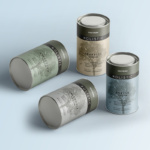
Frezyderm / Velvet Colors
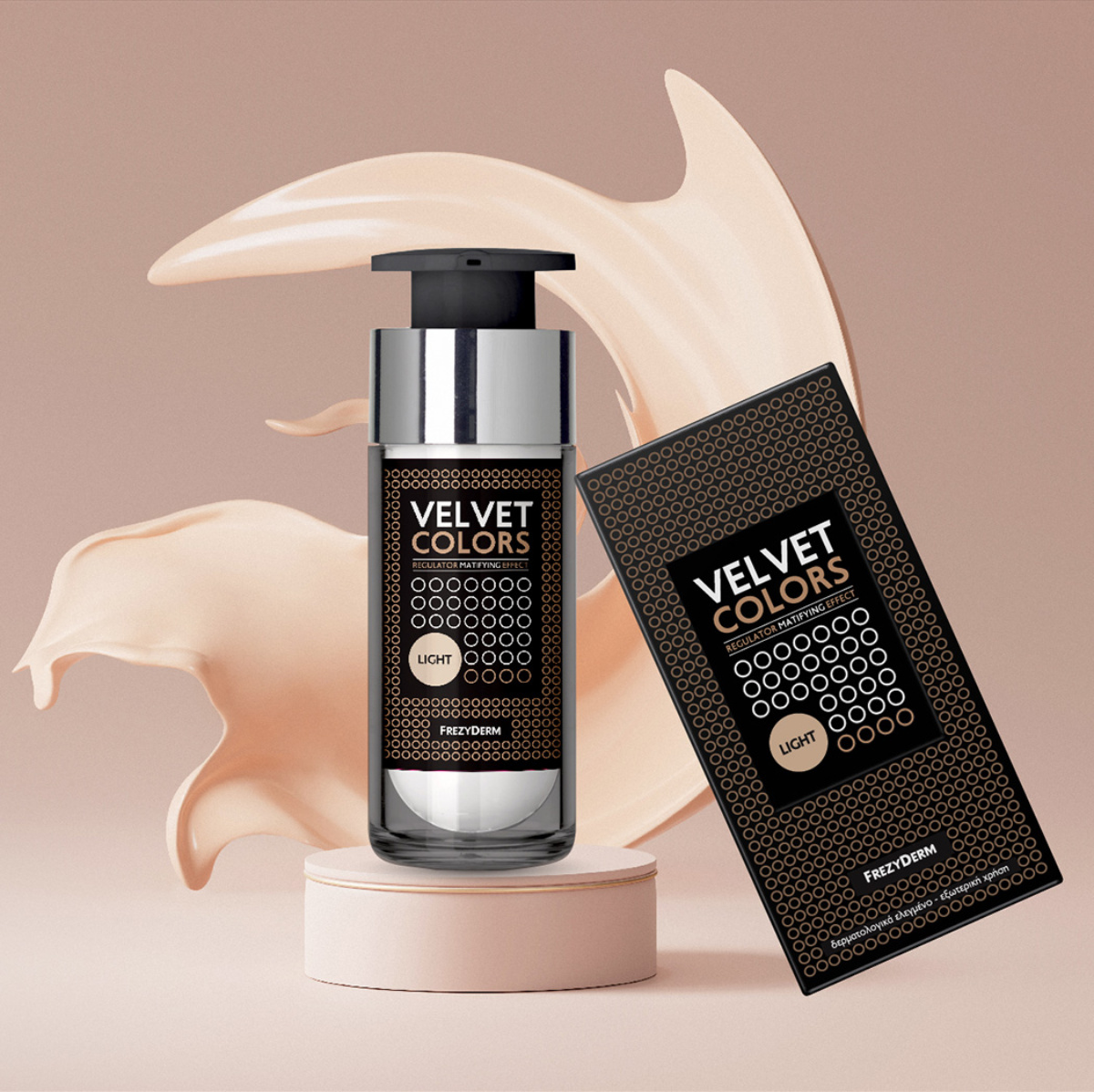
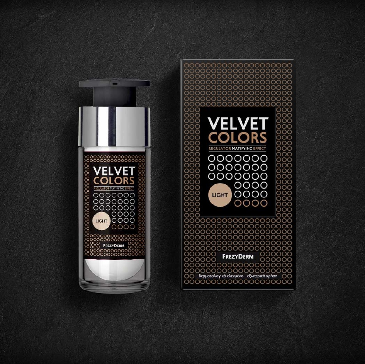
The Velvet Colors product collection by Frezyderm is crafted to give makeup a flawless finish. Emphasising the blend of coverage and skincare, Velvet Colors finds the perfect balance between beauty and skin health.
In a world where inspiration meets innovation, the packaging design had to echo this philosophy, unveiling the stunning intricacies of the skin itself. Inspired by the skin's cellular structure, we crafted a striking label and packaging that effectively communicates the idea of superior skin coverage while prioritizing skin health. This vision called for a minimalist approach – seeking simplicity within complexity. Much like artists stripping away excess to reveal the real concept of their art, we embraced the idea of clean, open circles as a breath of life and natural skin vitality.
The skin should not only look but also feel beautiful. This principle is reflected in every aspect of Frezyderm Velvet Colors' visual identity.
Client: Frezyderm
Industry: Pharmaceutical
Service: Brand Definition, Brand Development, Consumer Branding & Packaging, Packaging Design, Creative design, Typography, Logo Design, Visual Identity, Image Language, Illustration Language, Production

