Mercola / Detergents
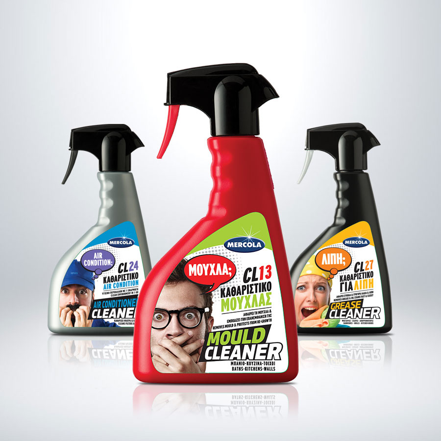
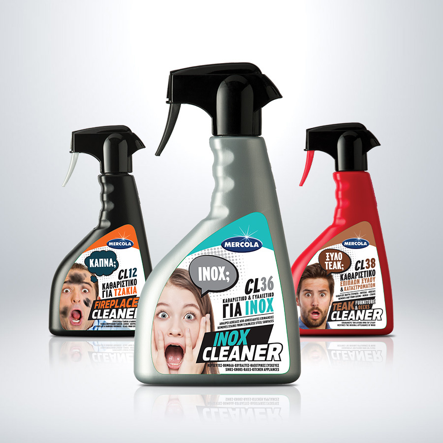
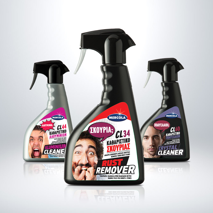
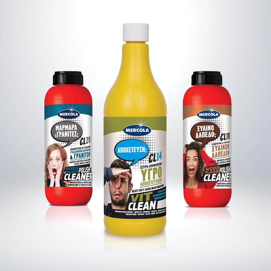
The placement of MERCOLA products in paint stores and hardware shops required a bold creative touch to make them stand out. In our effort to differentiate the MERCOLA liquid cleaners from the competition, we embraced the concept of a "mirror," where consumers essentially see themselves reflected in the product's label.
By incorporating humorous copy and images of people striking exaggerated facial expressions, we conveyed their curiosity and concern over stains.
The label design focused on bold colour codes and clear, distinctive elements for each product, ensuring immediate recognition and differentiation. The overall approach elevates the cleaning experience, adding a surprise and delight element. With their unique visual identity, MERCOLA products now capture the attention of consumers daily.
Client: Evochem
Industry: Technical Constructions
Service: Brand Definition, Brand Development, Consumer Branding & Packaging, Packaging Design, Creative design