Sottos Family / Espresso Coffee
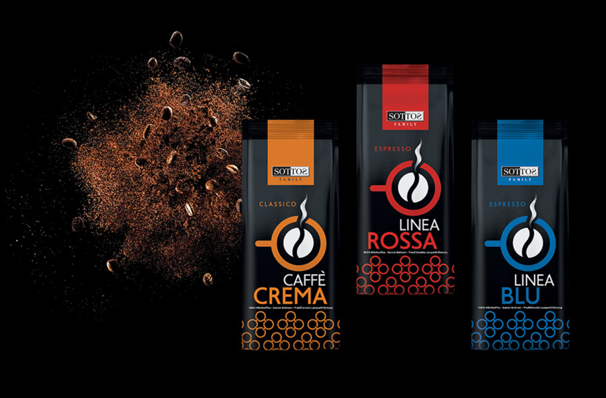
Based in Germany and with over fifty years of experience in coffee production and packaging, Sottos Family has decided to refresh its latest product line: Espresso Linea. This product series is specially designed for coffee professionals.
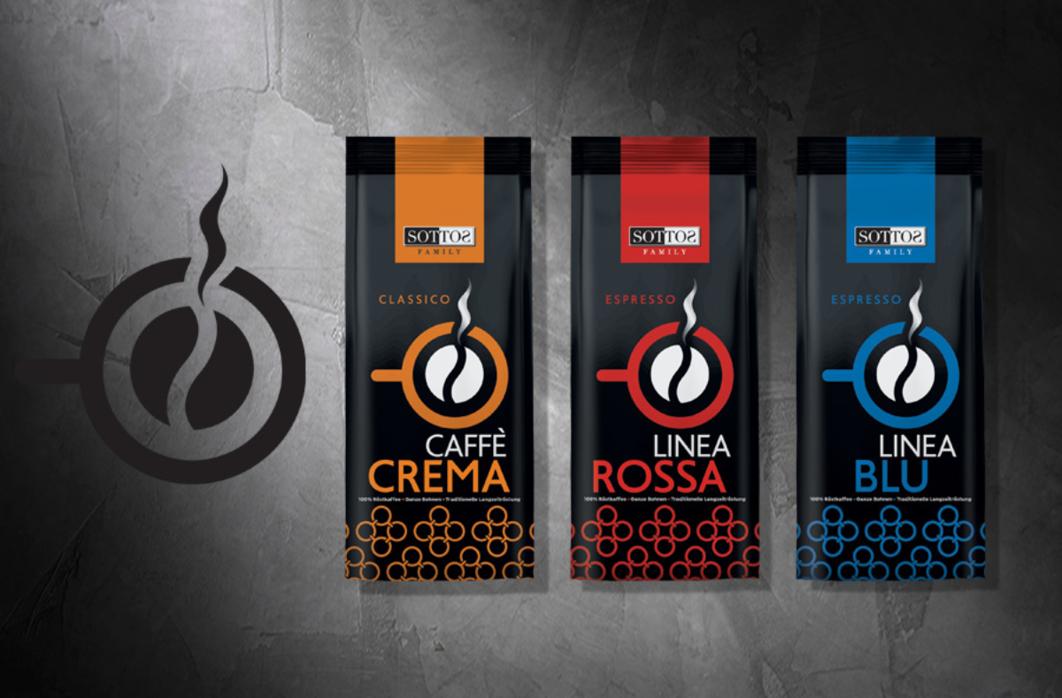
The logo is inspired by the exquisite taste and unique aroma of freshly ground coffee, with the coffee bean itself being surrounded by the outline of a warm cup.
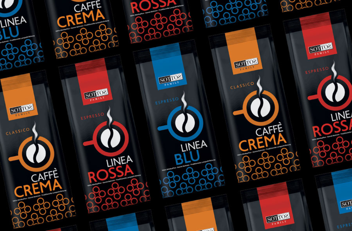
The vibrant packaging colours, from vivid red and deep blue to bright orange, reflect Sottos Family’s passion and dynamic, giving the products a commanding presence on coffee shop shelves. With this move, Sottos Family not only enhances its quality and aesthetic identity but also breaks the stereotype that wholesale products should remain in the background, paving the way for new possibilities in coffee retail.
Client: Sottos Family
Industry: Coffee & Beverages
Service: Brand Definition, Brand Development, Consumer Branding & Packaging, Packaging Design, Creative design, Typography, Logo Design, Visual Identity, Image Language, Illustration Language

