
24 Oct WBDS – Kondos/Figs


Explore how we developed the visual identity for "From Grandpa's Garden" snacks, successfully blending traditional heritage with an award-winning, modern aesthetic.
How is traditional heritage balanced with modern aesthetics?
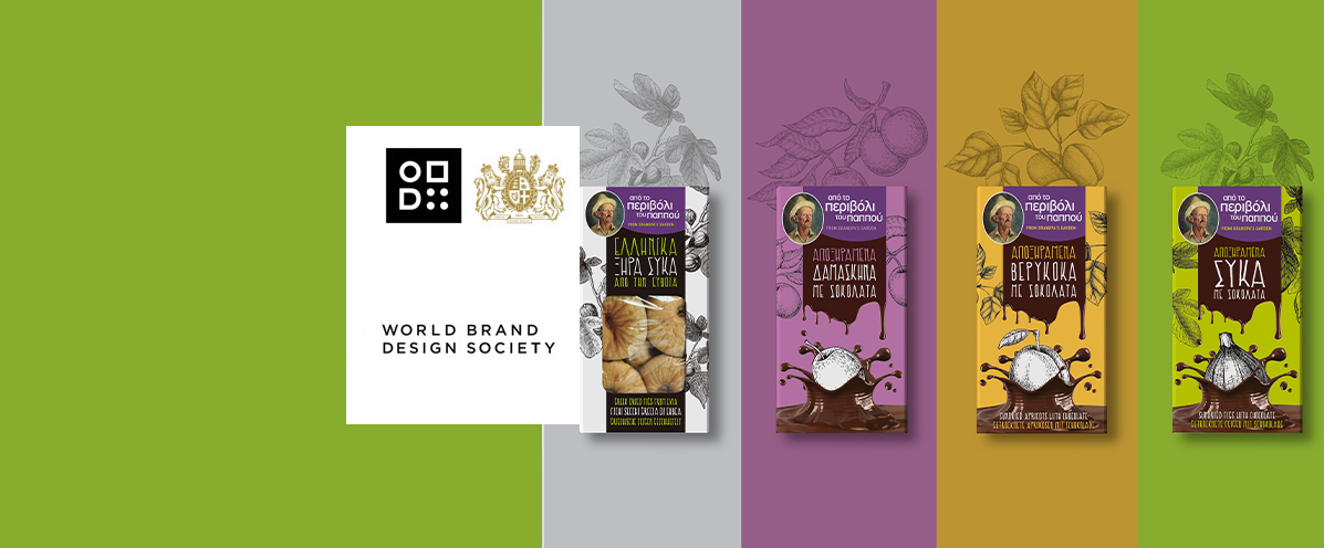
Our strategic approach for this dried fruit packaging design relied on creatively merging classic visual elements with a highly contemporary look. At the top of every package in the "From Grandpa's Garden" product line, we placed the brand's signature portrait of the grandfather, beautifully framed by detailed, vintage botanical illustrations of the respective fruits. This specific design choice instantly communicates authenticity, the Greek origin of the Evia figs, and the strong family heritage behind the local brand. In contrast, the lower section of the chocolate-coated product boxes features a dynamic, bold graphic depicting a splash of liquid chocolate embracing the fruit. This striking visual contrast gives the product an exceptionally modern, mouth-watering appeal that successfully attracts younger consumers while firmly retaining its traditional, agricultural core.
What is the strategic role of color coding?
Selecting a clear, bold color palette greatly facilitates the immediate and effortless recognition of each individual product variant by the shopper. Within this demanding dried fruit packaging design, we assigned a dominant background color for every single flavor profile: deep purple for the plums, warm mustard-yellow for the apricots, vibrant green for the chocolate-dipped figs, and crisp white for the classic dried figs. This intuitive color-coding system creates a powerful, uniform color-blocking effect when the items are displayed together on retail shelves. Consequently, customers can quickly navigate the product range and select their preferred treat, while the brand maintains absolute visual cohesion and reinforces the professional image of its entire snacking line.
How does the design enhance brand visibility?
Establishing a robust visual identity directly ensures immediate product differentiation in a highly competitive market landscape. This specific approach to dried fruit packaging design was honored with a feature by the internationally acclaimed World Brand Design Society, strongly validating the high quality of our visual communication strategy. The implementation of legible, handwritten typography reinforces the artisanal nature of the snacks, whereas the central transparent window on the classic fig packaging allows consumers to visually inspect the premium quality of the contents. The careful combination of all these distinct elements effectively builds consumer trust and transforms a traditional local delicacy into a globally competitive brand.
Browse our extended design portfolio to discover more strategic branding solutions developed for premium food and beverage brands.
Discover our award-winning dried fruit packaging design for "From Grandpa's Garden". A perfect balance of authentic tradition and modern shelf appeal.
Read the article