Award-Winning Herbal Tea Packaging – Frezyderm


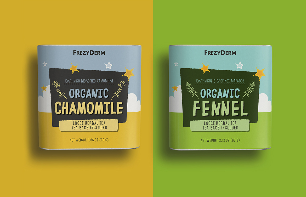
Frezyderm launched a premium collection of organic herbal teas made from Greek chamomile and fennel, a celebration of purity and wellness. The challenge was to design packaging that reflects tranquility, natural simplicity, and modern aesthetics, while conveying the brand’s commitment to quality.
We selected a rectangular metal tin, both durable and elegant, ensuring freshness and practicality. The visual identity combines soft gradients and minimalist illustrations, inspired by clouds and stars, symbolizing the natural calmness of herbal tea rituals. The typography conveys warmth, authenticity, and a sense of gentle sophistication, echoing Frezyderm’s clean design philosophy.
The packaging of Frezyderm Organic Herbal Teas was designed to become part of the wellness experience itself, serene, inviting, and emotionally resonant. Its color harmony and understated graphics create a sense of calm and purity, while positioning the product as both premium and naturally honest.
This award-winning design by ABC Design Communication celebrates nature as a timeless source of inspiration. A packaging concept that transforms simplicity into sophistication and nature into a visual language of well-being.