Frezyderm, a brand synonymous with dermatological science, introduced a new range rooted in the holistic power of nature. The challenge was to create packaging that would communicate this new, nature-driven philosophy without diluting the brand’s scientific credibility. We needed to design an identity that would stand out from the competition, capturing the essence of phytotherapy in a way that feels premium yet protective.
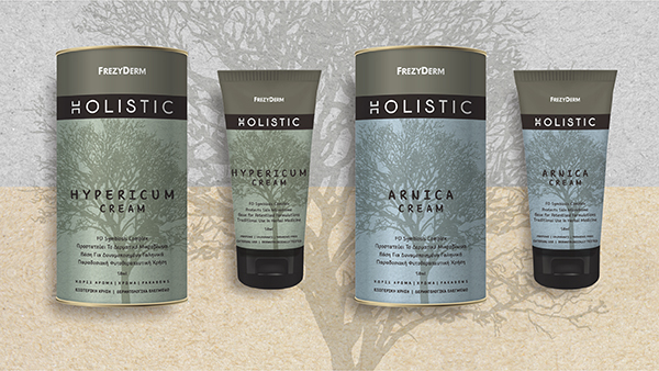
Our central idea was to translate the concepts of protection and purity from the formula into the form. Instead of a conventional box, we chose a paper cylinder as the defining structural element of the identity. The cylinder acts symbolically as a “cradle” — a protective shell that embraces the precious botanical ingredients, such as calendula and propolis. The tree, as the key visual, reinforces the holistic philosophy of the range, where nature is the root of wellbeing.
The result is a design language that embodies the balance between nature and scientific precision, creating a distinctive experience for the consumer.
The choice of a paper cylinder offers a superior tactile and visual experience. It gives the product presence and stature on the shelf, while simultaneously communicating values of sustainability and natural origin.
The detailed tree illustration on each pack serves as the visual manifesto of the range, symbolising life, growth and a deep connection to the earth.
Soft, earthy tones reference the world of botany and phytotherapy, creating a sense of calm and purity.
The clean, architectural typography of the word “HOLISTIC” preserves Frezyderm’s scientific heritage, reassuring the consumer of the product’s efficacy and safety.
Through this design, ABC Design Communication captures the harmony between nature and science, transforming skincare into an experience of serenity and trust.