

The soft drink market is full of ordinary designs. We wanted to create something completely new. We created a concept for a beverage with popping bubbles. The product had to stand out immediately on the shelf. We needed an image that was fresh, youthful, and full of energy. The competition demands bold moves. The goal was truly premium packaging.
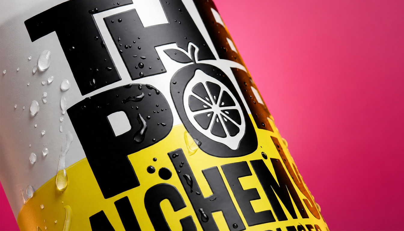
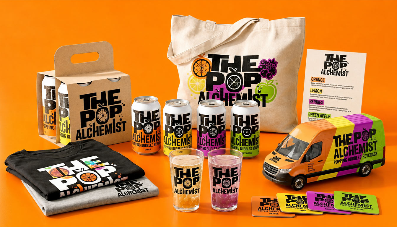
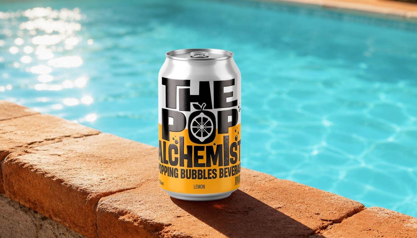
At ABC Design, we were inspired by pop culture and street aesthetics. We played with bold, bulky typography. The logo was designed to be huge and imposing. We chose the strong contrast of black with bright, neon colors. Each flavor has its own distinct shade. We paid attention to every millimeter of the container, from the base to the metal cap. We wanted the design to scream summer.
Introducing “The Pop Alchemist”. A complete beverage packaging concept. The two-tone color scheme creates a tremendous visual impact. The large typography harmoniously embraces the cylindrical shape. We applied matte textures that elevate the tactile experience. It is an authentic premium packaging proposal. But we didn't stop at just the can. We extended the concept to apparel, glassware, and vehicles, creating a powerful, experiential brand.


