Rice Biscuit Packaging Design – Violanta


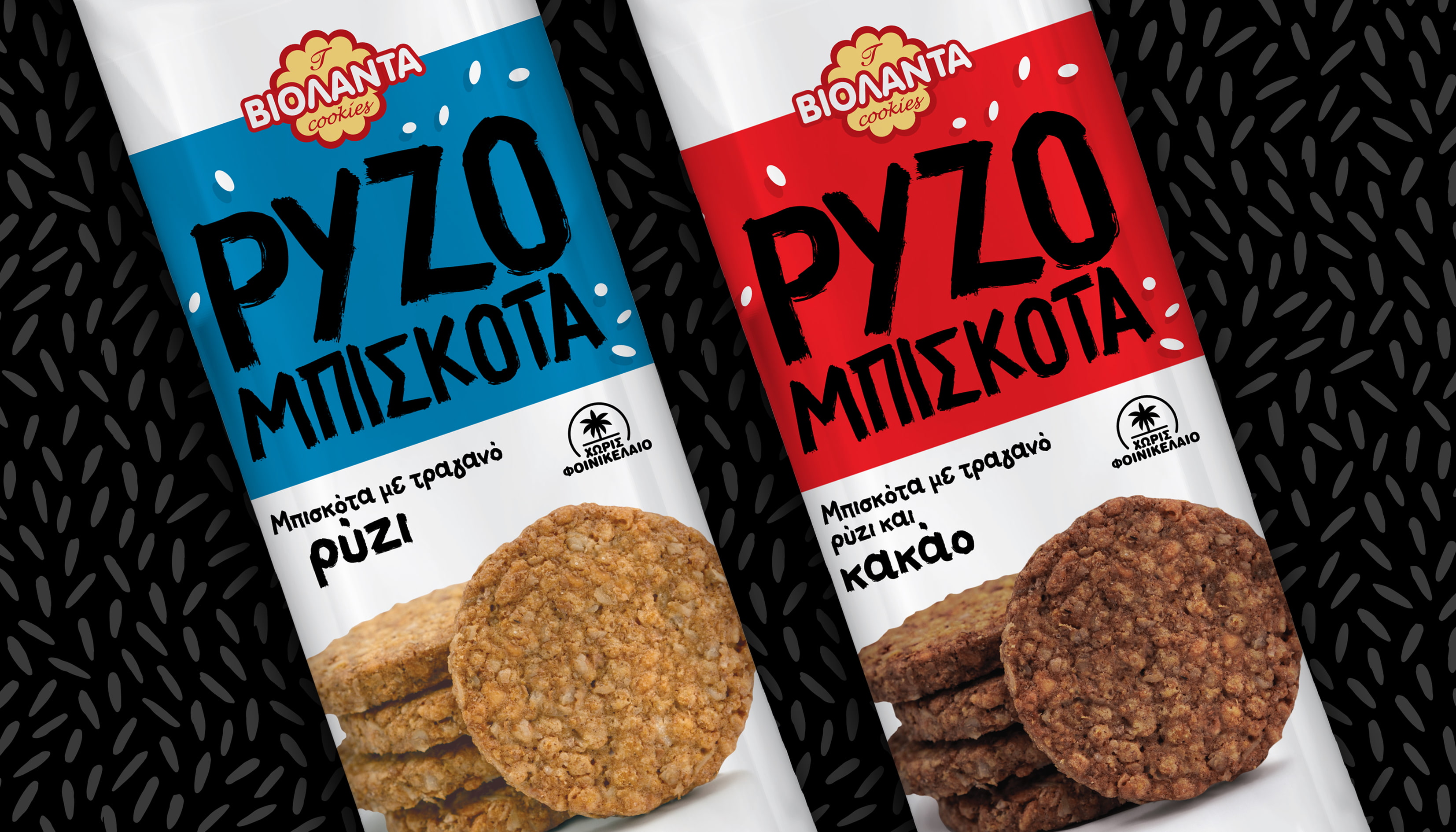
Violanta, a well-established brand in the biscuit category, introduced its new rice biscuits in three flavors – classic, cocoa, and cinnamon – aiming to express a lighter, purer snacking experience. The challenge for ABC Design Communication was to translate the simplicity and crisp texture of rice into packaging that stands out in an already crowded shelf.
Our strategy was built on a clear design idea: the rice grain becomes the hero. Through a minimalist visual approach, we used clean forms, bold uppercase typography, and scattered rice-grain illustrations around the logo, allowing the packaging to communicate texture and lightness without unnecessary visual noise.
The bright white background conveys purity, while the colorful stripes (turquoise, red, orange) distinguish the three flavors and make the range instantly recognizable. The result is a clean-cut packaging design that gives Violanta’s rice biscuits a modern, honest identity, turning crispy enjoyment into a moment of minimalist design.
Brand Strategy | Visual Identity | FMCG Packaging Design | Typography | Retail & POS Design | Logo Design | Art Direction