Agency Rebranding & Visual Identity – ABC Design
As a creative agency shaping the identities of other brands, redefining our own was the greatest challenge.
The objective for ABC Design was to refresh its logo in a way that expresses a contemporary, dynamic and evolved identity.
We needed a visual language aligned with the present, reflecting our creativity, flexibility and strategic expertise in branding and packaging design, while preserving the brand’s recognition and heritage.
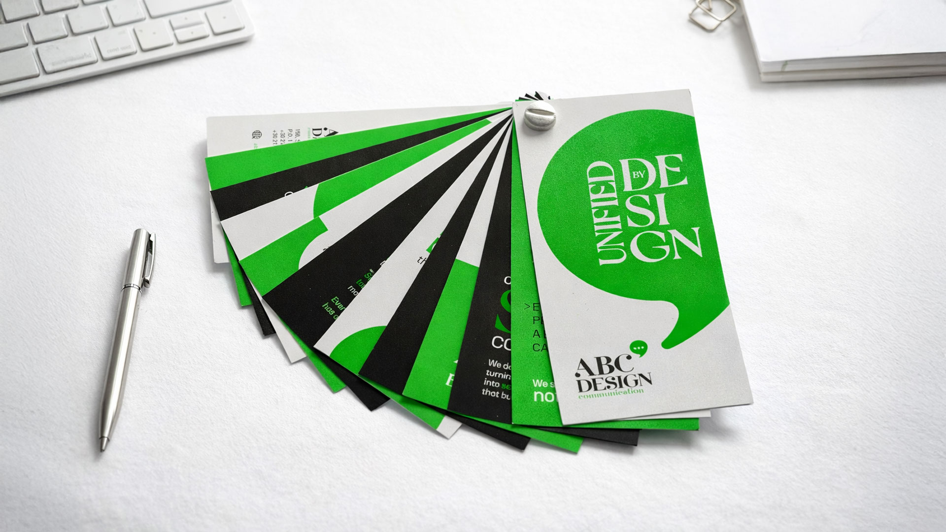
Our central concept was “Dialogue as Design.”.
The idea was to visually express the essence of our work: creating meaningful communication between a brand and its audience.
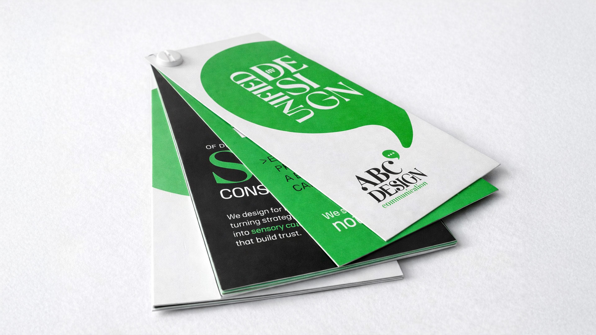
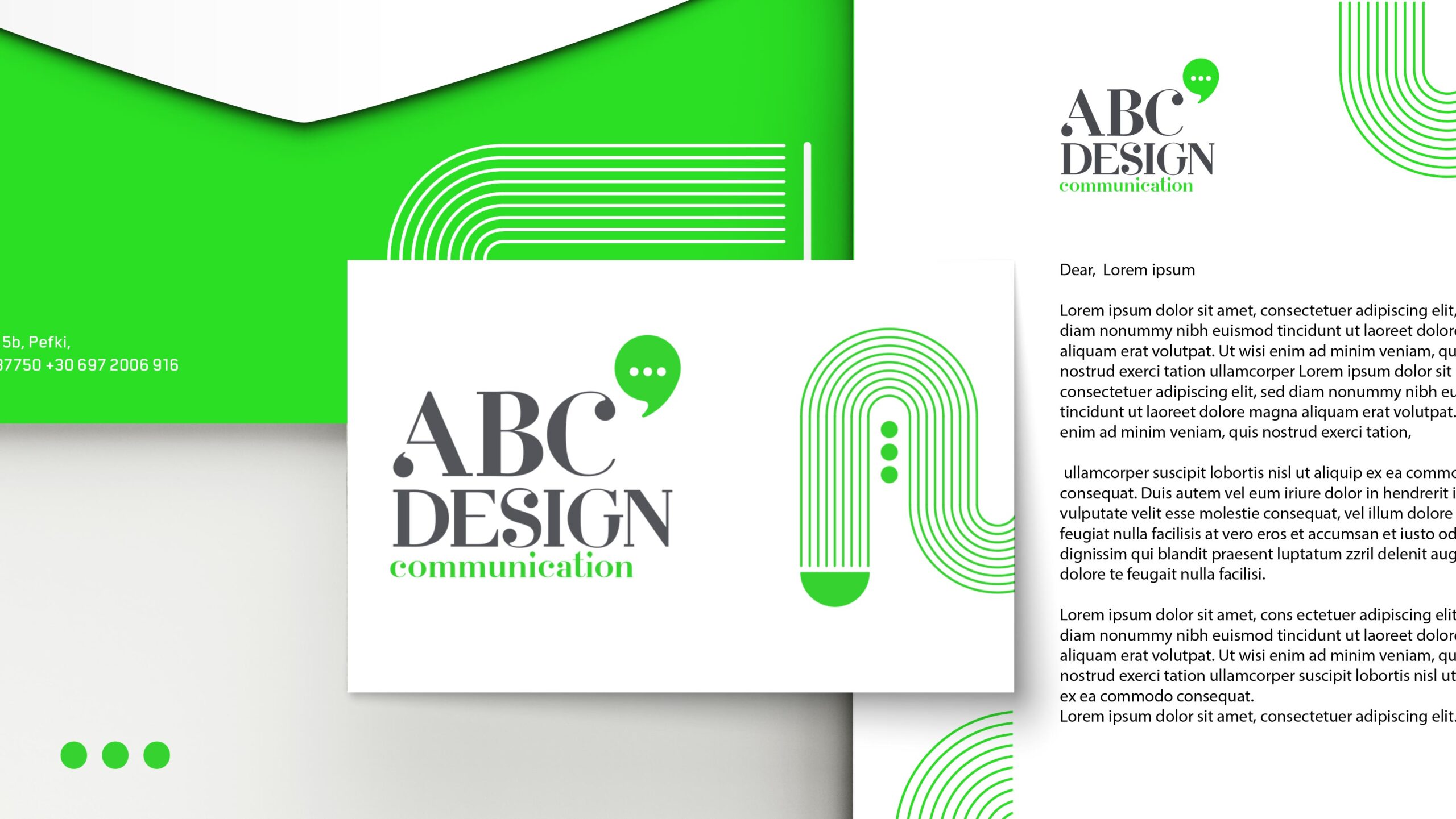
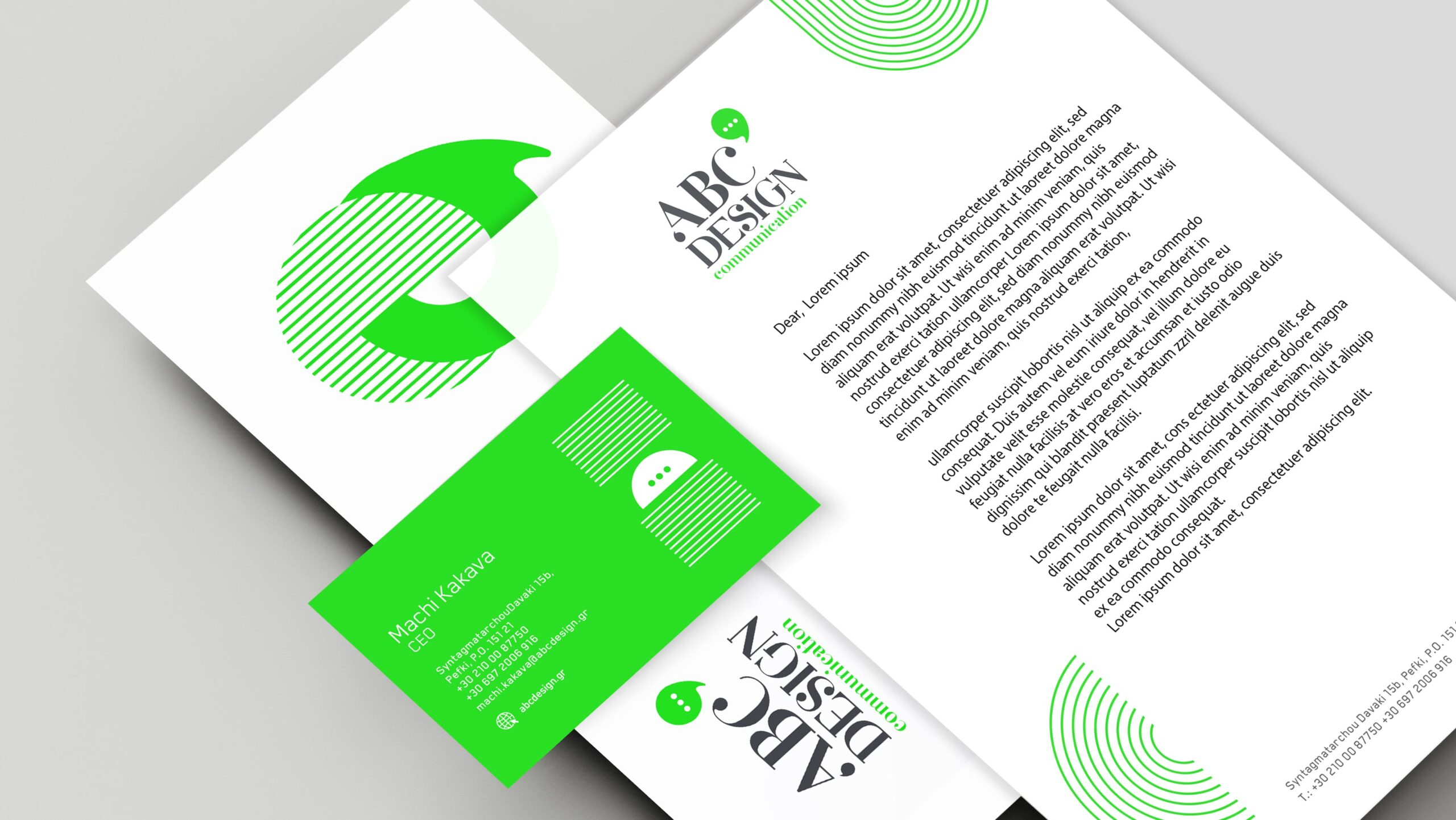
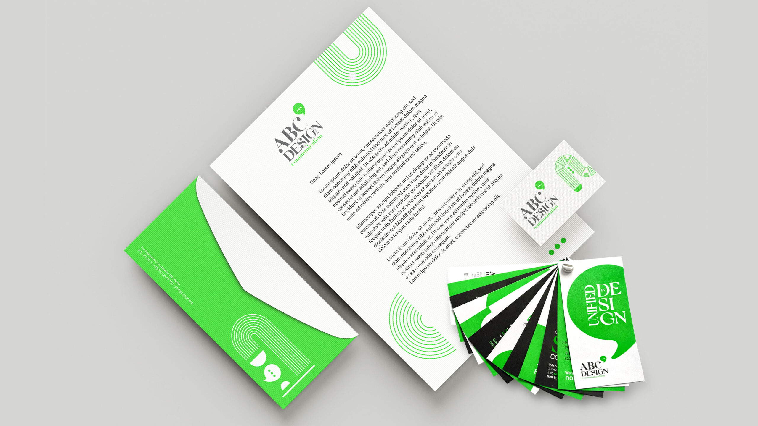
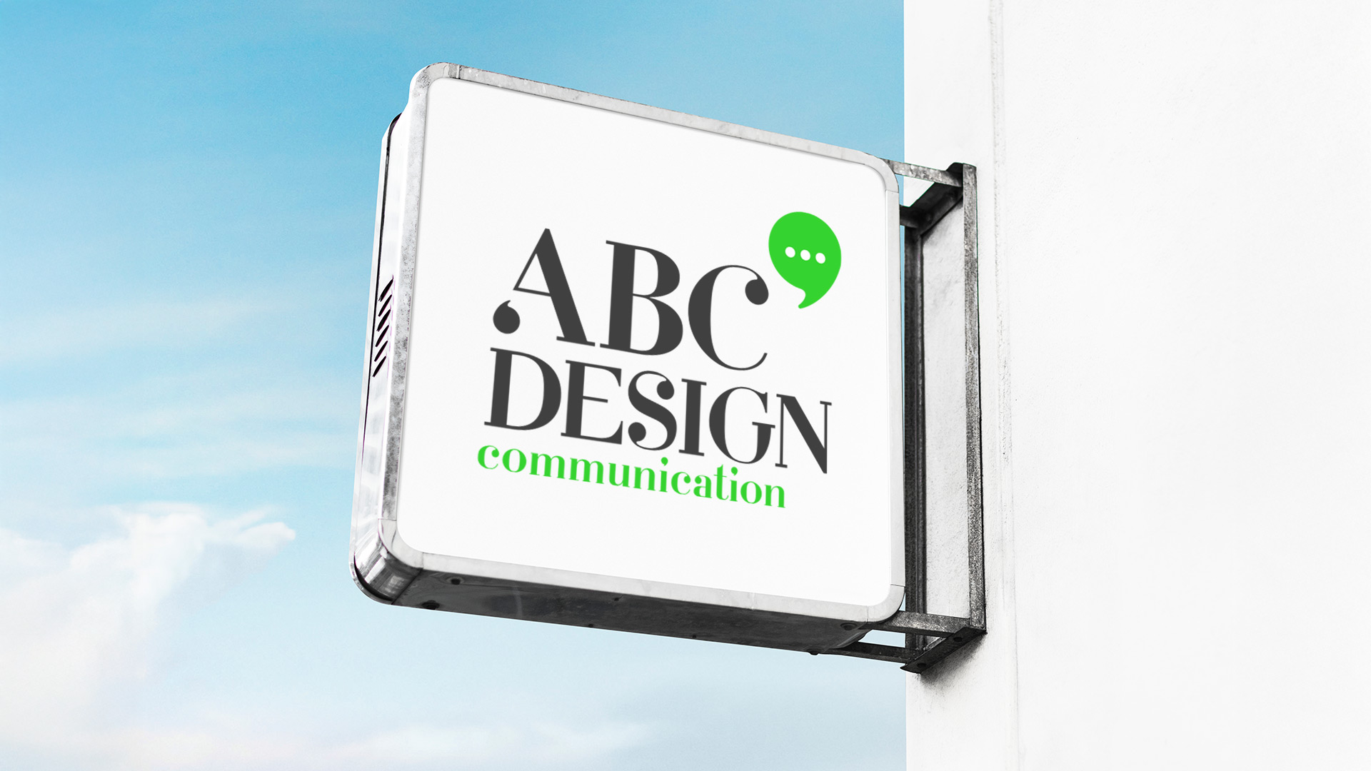
The renewed logo maintains its classic typographic elegance, symbolizing experience and design maturity, while introducing a new dynamic element, the speech bubble,a universal symbol of dialogue, strategy and communication.
The solution is a fresh yet timeless visual identity that balances classic and contemporary elements.
The serif typeface conveys authority and longevity, while the addition of the word communication in a modern green accent highlights our strategic focus.
The bold green speech bubble functions as a flexible and contemporary mark, instantly communicating our core values: strategic thinking, open communication and fresh ideas.
The combination of classic grey and black with vibrant digital green creates a palette that is both serious and dynamic.
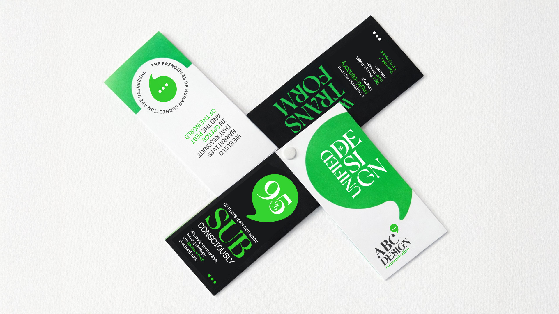
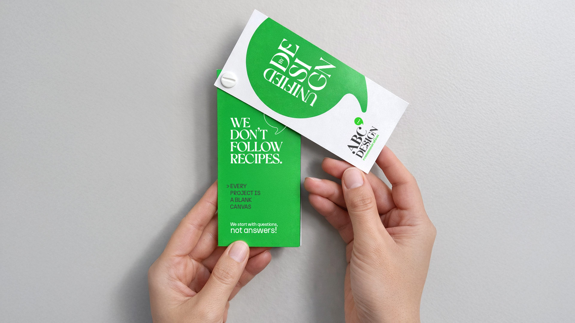
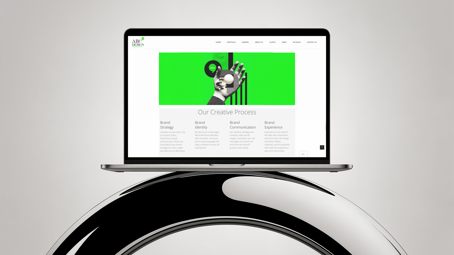
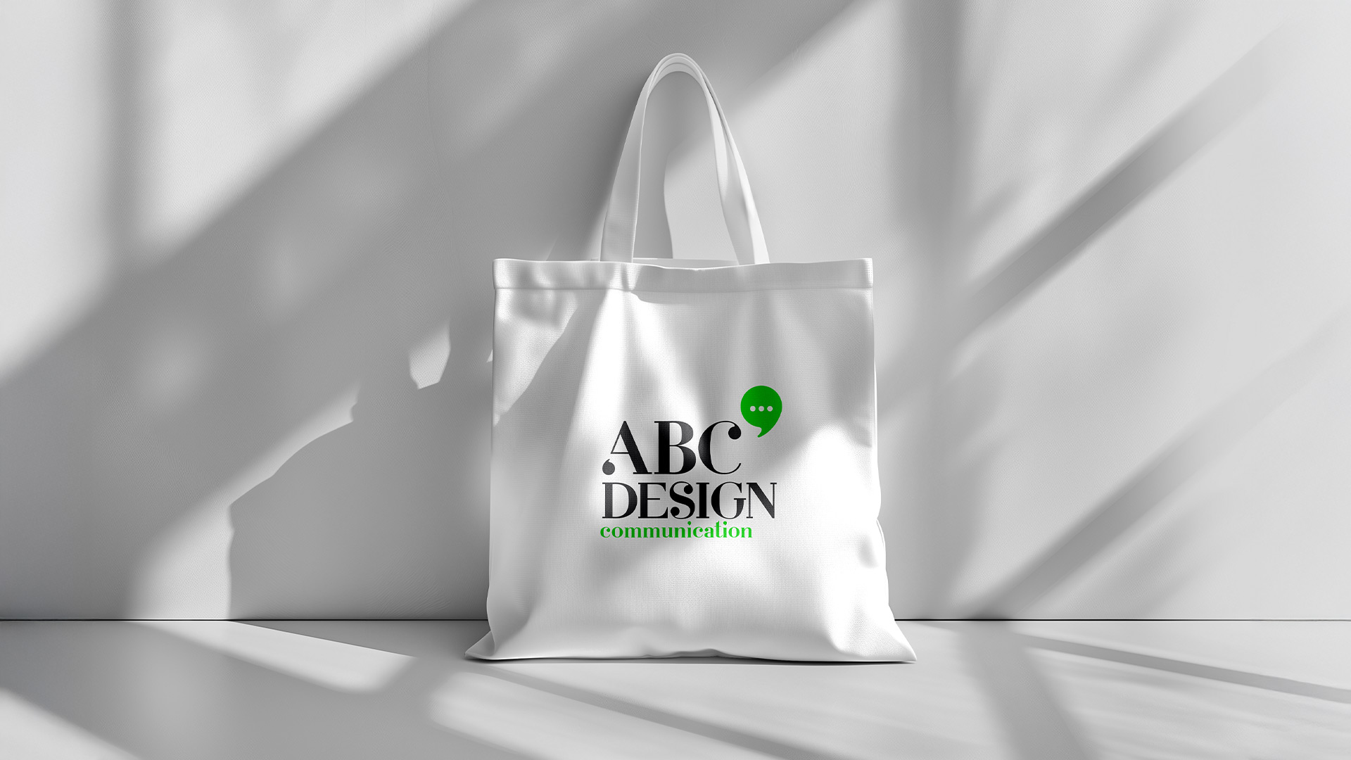
The new identity was designed as a complete brand system, adaptable across all applications, from print and business cards to tote bags and digital platforms.
A cohesive visual language that demonstrates the true power of well-structured strategic design.