
28 Feb Favourite Design – Designer of the Day


Why choose retro illustrations for e-liquids?
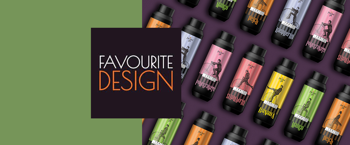
Selecting the right aesthetic is crucial for standing out in a heavily saturated market. In this specific project, the vintage packaging design utilizes classic Victorian-style illustrations to immediately grab consumer attention. By featuring period characters riding retro bicycles, the label acquires a unique, almost narrative and nostalgic character. This highly creative approach transforms a thoroughly modern product into a premium item, drastically enhancing its perceived value. Furthermore, the detailed black-and-white line art of the characters adds a timeless elegance that works perfectly with the overall contemporary layout.
How does color coding aid product recognition?
Navigating through multiple product options becomes effortless with the strategic use of vivid hues. Each distinct flavor such as bright yellow for banana, pink for strawberry, green for mango, and orange for peach is paired with a bold, solid background color. In a successful vintage packaging design, dynamic and clean color palettes balance the classic feel of the illustrations, creating a striking visual contrast. Consequently, the customer instantly spots their preferred flavor, while the visual uniformity and coherence of the entire product line are flawlessly maintained when displayed on the shelf.
What makes a design earn international acclaim?
True distinction occurs when artistic creativity meets absolute commercial functionality. This particular product line managed to stand out and earn the prestigious "Favourite Design" feature, confirming the success of our creative direction. A targeted vintage packaging design does not stop at a beautiful, artistic image; it must clearly communicate the brand's core message and appeal to the buyer. Meticulous attention to typographic detail, combined with the clear placement of essential product information, is the ultimate secret to helping a brand thrive in a competitive, global environment.
Explore how we apply similar bold creative strategies across different product categories in our extensive agency portfolio.
Discover how strategic vintage packaging design for e-liquids combines classic illustration and color coding, earning the Favourite Design global feature.
