
23 Oct Packaging of the World – Frezyderm/AC-Norm


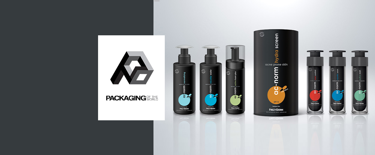
Explore how our dermocosmetics packaging design for the Frezyderm Ac-Norm line seamlessly combines scientific authority with modern aesthetics. An acclaimed visual approach that simplifies consumer choice through smart color coding.
How does color coding enhance the user experience?
The differentiation of specialized products within this dermocosmetics packaging design is achieved instantly through bold, colored circles set against a clean, dark background. Every product in the comprehensive Frezyderm Ac-Norm range, from the micellar water to the hydra screen sunscreen, is assigned its own unique, vibrant hue such as blue, green, orange, or red. This intuitive visual system allows consumers with acne-prone skin to immediately identify and select the appropriate steps for their daily skincare routine with absolute confidence.
Why did we choose dark, matte finishes for the design?
The black and dark grey matte finishes were strategically selected to convey a sense of premium care, boldly stepping away from conventional, clinical white standards. This innovative approach to dermocosmetics packaging design effectively highlights Frezyderm's top-tier scientific expertise while maintaining an exceptionally modern and striking presence on the retail shelf. The overall success and high aesthetic value of this balanced design are further validated by its prestigious feature on the global Packaging of the World platform.
Browse our extensive portfolio to discover more contemporary branding solutions tailored for specialized dermatological and healthcare products.
Discover our premium dermocosmetics packaging design for the Frezyderm Ac-Norm line. An innovative aesthetic featuring smart, intuitive color coding.
Read the article