
29 Jun Packaging of the World – Frezyderm/ Face Care


Discover how clean, scientific aesthetics in cosmetic packaging design build brand trust. Explore our internationally recognized visual approach for the premium Frezyderm skincare line.
How do you visually communicate scientific credibility?
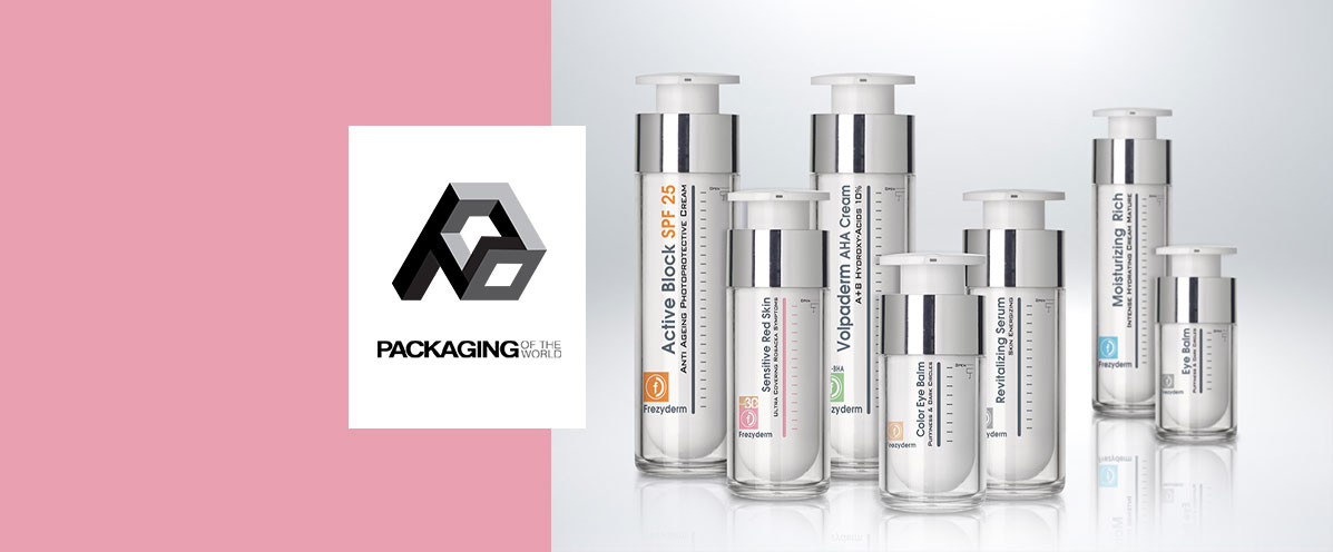
Building consumer trust begins the exact moment a product is viewed on the shelf, instantly conveying safety and efficacy. For the comprehensive Frezyderm dermocosmetics line (featuring specific items like Active Block SPF 25 and Volpaderm AHA Cream), we implemented a strictly minimalist design language that exudes medical purity. At ABC Design Communication, leveraging our operations across 19+ countries and 100+ international awards, we know successful cosmetic packaging design requires a precise balance between premium elegance and clinical authority. A clean, clinical white base intentionally dominates the visual space, allowing the functional characteristics of the formula to stand out clearly.
Why did we combine transparency with metallic elements?
The strategic selection of packaging materials immediately communicates high manufacturing quality, brand innovation, and overall product value. Utilizing advanced dual-wall containers a solid white inner vessel fully protected by a crystal-clear outer casing paired with sleek silver metallic details on the dispensers, gives the line an undeniable premium character. Furthermore, these modern airless pump systems effectively protect highly sensitive skincare formulas, such as the Revitalizing Serum, Eye Balm, and Sensitive Red Skin treatments. This practical approach demonstrates that effective cosmetic packaging design must decisively solve physical preservation challenges while effortlessly maintaining high-end aesthetic superiority.
How does minimalist typography aid consumer choice?
Clear, logically and hierarchically structured information decisively facilitates the consumer's final selection within the crowded, highly competitive pharmacy environment. We applied a highly sophisticated combination of vertical and horizontal typography across the entire product line. This text arrangement, paired with subtle color-coded indicators (such as the distinct orange marking for sun protection), allows for instant visual recognition of each item. The global recognition of this specific project, prominently featured on the respected Packaging of the World platform, validates our studio's methodology. Ultimately, strategic cosmetic packaging design transforms a brand's commercial presence while building lasting loyalty.
Browse through our selected portfolio to see how we translate complex brand values into compelling, award-winning visual identities worldwide. Discover how our cosmetic packaging design for Frezyderm seamlessly blends clinical credibility with premium aesthetics, earning global recognition.
Read the article