
21 Jun Packaging of the World – Minos Color Spray


Discover how strategic mascot usage and clear color coding transformed the Minos Color spray cans. Explore the secrets behind this globally recognized branding approach.
How does a technical product stand out on retail shelves?
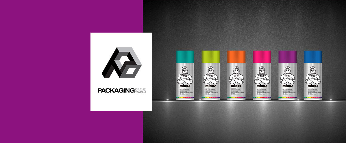
Establishing a strong visual identity is strictly crucial for industrial and DIY products on crowded shelves. For the strategic paint packaging design of the Minos line, we deliberately utilized the raw, unprinted metallic base of the spray can. This bold minimalist background strongly emphasizes the professional grade of the acrylic paint.
Why did we incorporate a central illustrated character?
A central character instantly adds approachability and builds immediate trust with the everyday professional consumer. We incorporated a distinct, black-and-white mascot figure with crossed arms that firmly anchors the entire paint packaging design. This creative visual choice, combined with highly visible color coding on the cap and bottom bar, makes the brand instantly recognizable.
What drives international design platform recognition?
Global recognition naturally arrives when functional usability perfectly meets high aesthetic industry standards. This specific product line successfully captured the attention of the highly prestigious Packaging of the World platform. Ultimately, meticulous paint packaging design proves that technical hardware products can be both visually striking and commercially successful.
Explore how we implement similar visual differentiation strategies for other technical and industrial brands by browsing our detailed portfolio. Discover how strategic paint packaging design elevated the Minos spray cans. Explore our internationally recognized project focusing on bold brand positioning.
Read the article