
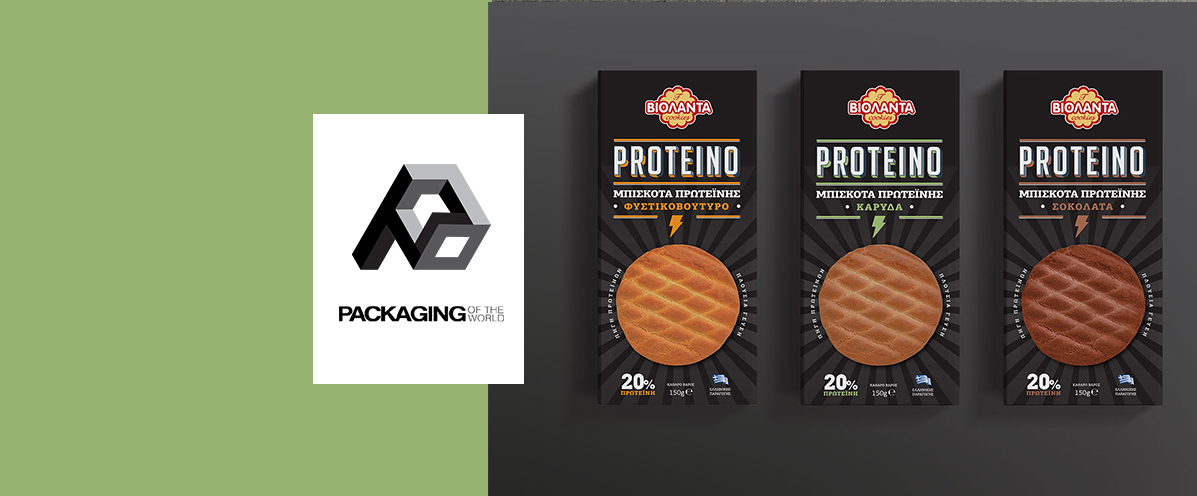


Discover how strategic design highlights energy and taste in sports snacks. A quick look into the internationally recognized Proteino project by Violanta.
We achieve this by utilizing dynamic visual elements and bold typography that radiate energy. In the Proteino protein cookie packaging by Violanta, the premium dark background clearly differentiates the product from traditional biscuits. This strategic visual approach actively attracts modern consumers looking for functional, healthy snacks.
Clear communication of flavors and ingredients builds immediate consumer trust at first glance. Each protein cookie packaging utilizes distinct color coding and a realistic, central product image to tempt the palate. Furthermore, the thunderbolt icon and the bold "20% Protein" claim instantly convey the core nutritional benefits.
Success comes from perfectly balancing local brand identity with global packaging design trends. Being featured on the prestigious Packaging of the World platform proves the effectiveness of this visual strategy. Ultimately, well-designed protein cookie packaging can confidently compete on any retail shelf worldwide.
Browse our extensive portfolio to see how we elevate the visual identity of other functional food brands internationally.
Learn how effective protein cookie packaging balances flavor appeal and energy cues. Read the internationally featured design case study for Violanta Proteino.
Read the article