Minos Foods / Sweet Brioche
In its effort to win over consumers with vegetarian dietary habits, Minos Foods has embraced an innovative approach to the packaging design of its new bakery products. Three distinct colours represent three unique flavours:
– Yellow for the raisin bread
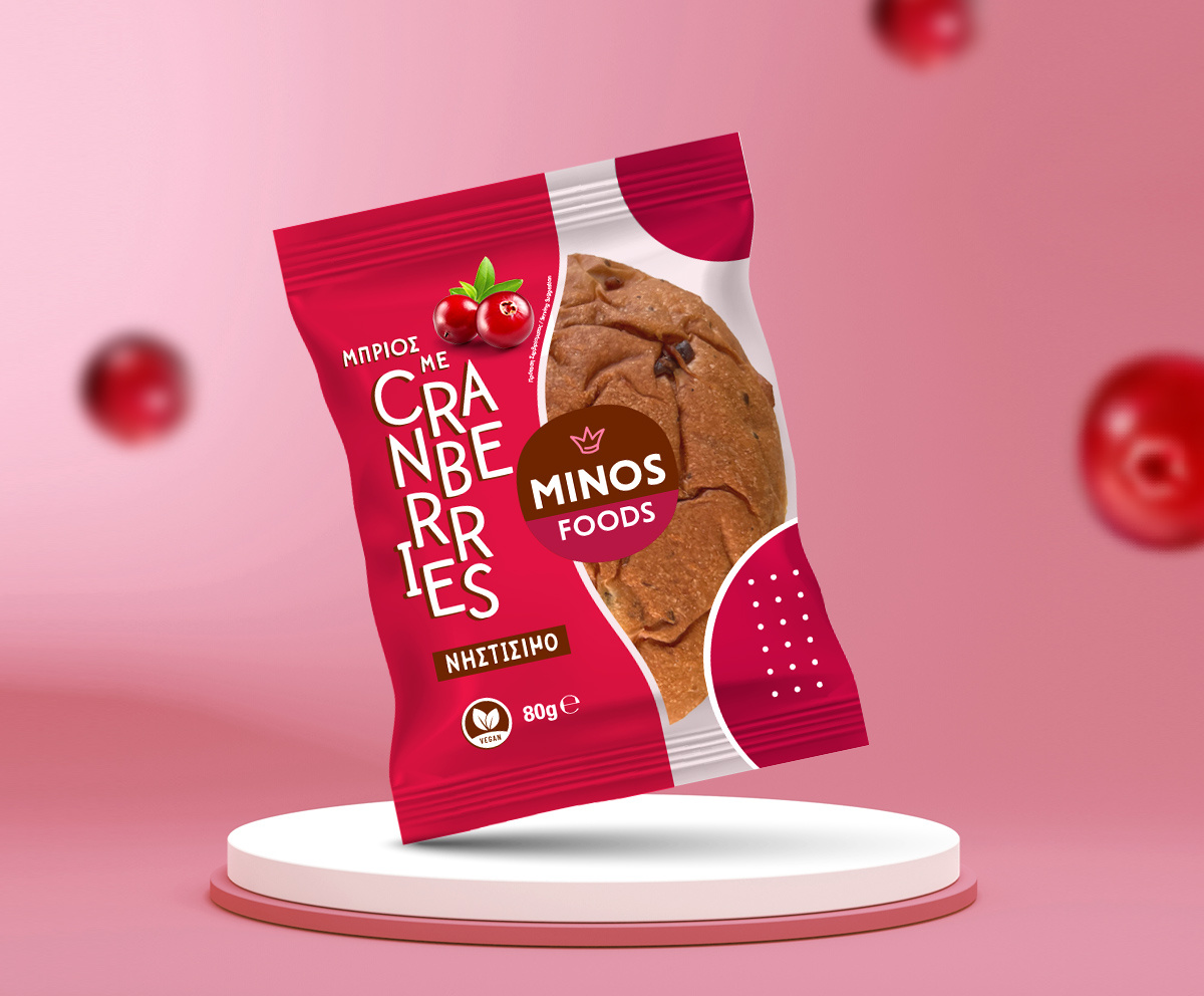
– Magenta for the cranberry brioche
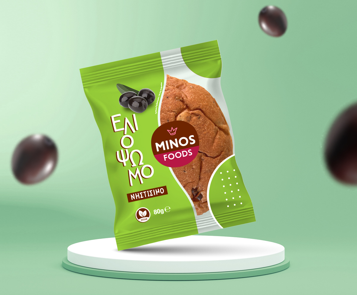
– Olive green for the olive bread
These colour choices reflect the flavour identity of each product, enhancing shelf recognition. Additionally, 50% of the packaging is transparent, allowing consumers a clear view of the contents, and establishing a deeper connection with the product.
The clear labelling of "vegan" and "fasting-friendly" further builds consumer trust and confidence. Minos Foods aims not only at vegan or fasting customers but also at anyone seeking healthy, high-quality options for their weekly meals.
The design direction we pursued reflects Minos’ commitment to innovation and transparency, key pillars in their strategy for growth and success in the modern market.
Client: Minos Foods
Industry: Food & Beverages
Service: Brand Definition, Brand Development, Consumer Branding & Packaging, Packaging Design, Creative design, Typography, Logo Design, Visual Identity, Image Language, Illustration Language, Production


