ABC Design Communication / New Logo

New Identity, Same Creative Power
For a creative agency that shapes other brands’ identities, the greatest challenge is often redefining its own. For ABC Design, the task was to refresh its logo in a way that expressed a more contemporary, dynamic and evolved identity. We needed a visual mark that felt aligned with today, reflecting our creativity, flexibility and strategic expertise in branding & packaging design, while preserving our recognisability and heritage.
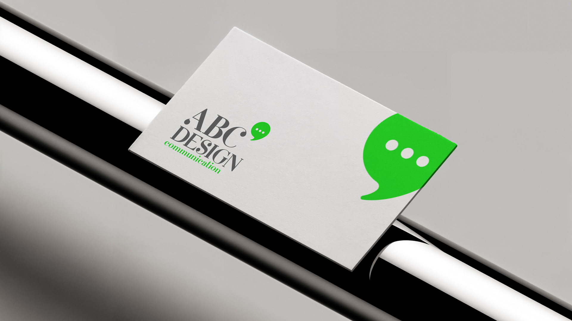
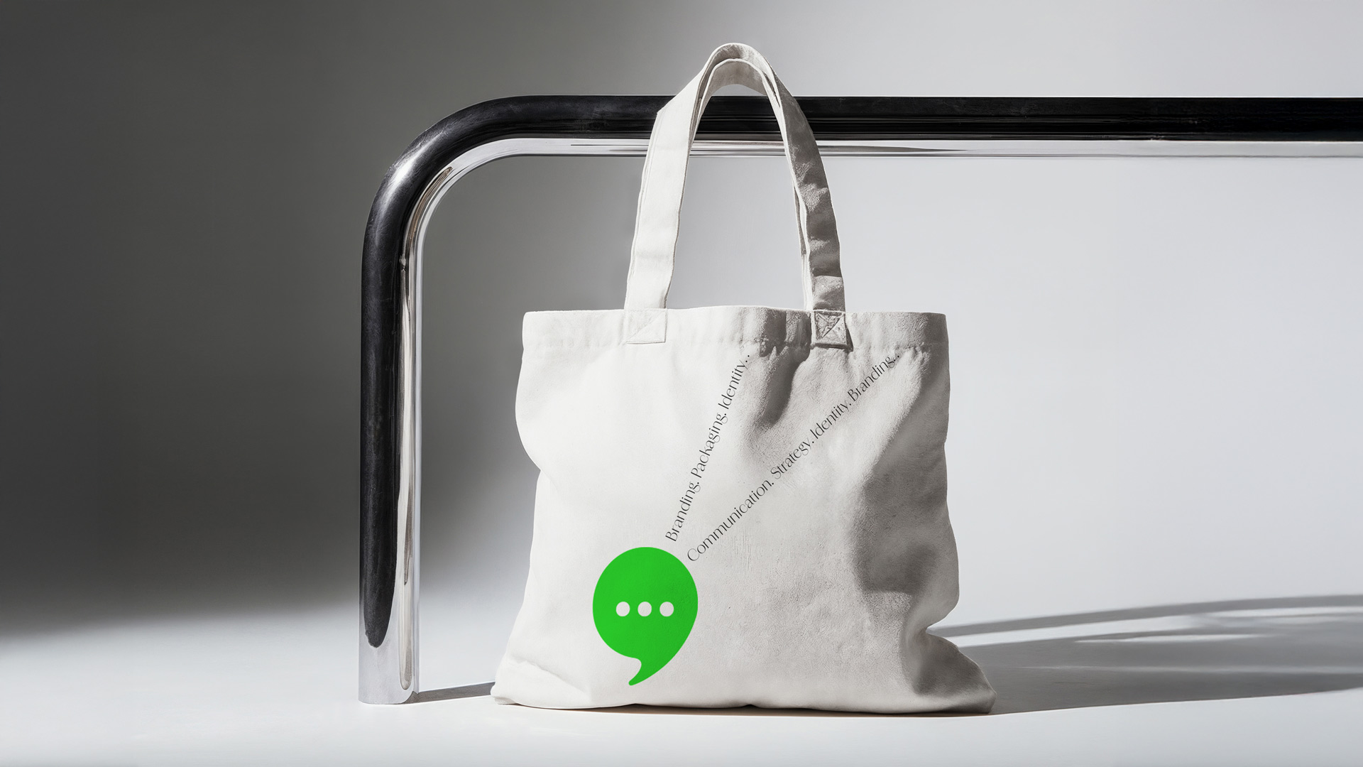
Our central concept was “Dialogue as Design.” The strategic insight was to visualise the essence of what we do: creating meaningful communication between a brand and its audience. The refreshed logo retains its classic typographic elegance, symbolising experience and design craftsmanship. Alongside it, we introduced a new, dynamic symbol: a speech bubble — a universal icon of dialogue, strategy and communication.
The result is a fresh yet timeless aesthetic that balances the classic with the contemporary.
The ABC Design logotype has been updated using a refined serif typeface that conveys authority and longevity, while the addition of the word “communication” in a modern green accent emphasises our area of specialisation.
The bold green speech bubble functions as a flexible, modern signifier. It instantly communicates our core values: strategic thinking, open communication and fresh ideas.
The combination of classic grey/black with a vibrant, digital green creates a palette that is both serious and energetic, professional and creative.
The new identity has been designed to perform seamlessly across all applications — from business cards and printed collateral to fabric totes and digital platforms — demonstrating in practice the strength of a well-crafted brand system.