Award-Winning Greek Premium Olive Oil Packaging – Nikolos Olivixir


The branding and packaging design of Olivixir was developed by ABC Design Communication. Our main goal was to highlight the connection between design and well-being. Specifically, we showcased Greek olive oil as a product of high aesthetic and scientific value.
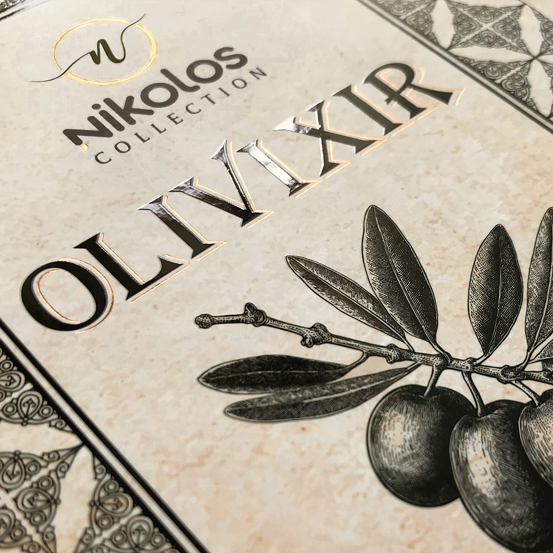
For this purpose, we chose a dark pharmaceutical-style bottle. This choice protects the sensitive polyphenols from light. Moreover, the label with its aged manuscript aesthetic tells the story of a rare elixir. At the same time, the calligraphic typography reinforces the sense of authenticity.
Furthermore, we developed two different versions to meet market needs. The initial version in a textured paper box emphasizes the purity of the product. In contrast, the collector's wooden case transforms Olivixir into a true work of art. Consequently, the product becomes an ideal gift and a symbol of prestige.
Finally, this project confirms the creative approach of ABC Design Communication in premium olive oil packaging. The result goes beyond simple packaging. In this way, we created an olive oil symbol that represents the epitome of natural luxury.