Designing a deodorant for children presents a unique challenge. The packaging must be appealing enough to encourage kids to begin a personal hygiene routine, while still earning the full trust of parents. It has to be playful without being childish — and, above all, it must communicate safety and gentle care.
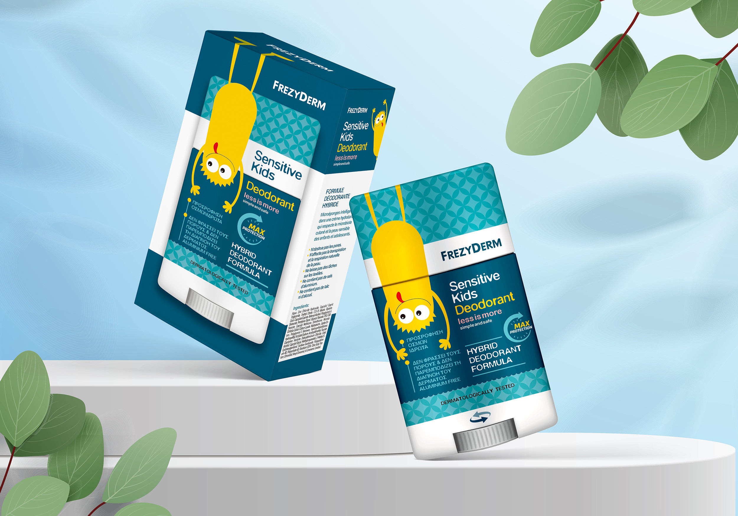
Our central idea was to create a “hygiene ally.” We set out to design a lovable character who transforms a daily routine into a fun, engaging habit. The friendly yellow monster isn’t just a graphic element; it’s a companion that makes the product familiar and approachable. The design needed to speak two languages at once: the language of fun for children, and the language of safety for parents.
Our solution bridges the gap between playfulness and care, offering a balanced and effective visual identity.
The charming yellow character becomes the face of the product, integrated playfully into the packaging — hanging from the top — turning the deodorant into a friendly object kids will want to reach for.
For children, the character and vibrant pattern create a sense of joy and excitement. For parents, the clean, clinical layout, the trustworthy blue-and-white palette, and clear safety assurances (“less is more,” “aluminium free”) reinforce the reliability of Frezyderm.
The design achieves its dual goal: it encourages children to adopt a new routine while reassuring parents of their choice, making daily care effective, gentle and genuinely enjoyable.