Cokooni / Zenor Skin Premium Cosmetics


The Art of the Premium Experience
The premium cosmetics market is exceptionally demanding. For Zenor Skin, the challenge was to create packaging that went beyond visual appeal, offering a multi-sensory experience that embodies the product’s promise of rejuvenation and skin care. The design needed to build trust, evoke emotion and differentiate the brand with true substance.
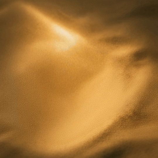
ABC Design Communication drew inspiration from the natural texture of human skin, transforming the packaging into a tactile encounter — a dialogue between the product and the body. Touch becomes the first point of connection with the brand, creating an immediate, almost subconscious sense of familiarity. Every detail is designed to provoke sensation, from the embossed surface that mimics skin to the subtle sheen created by local UV varnish.
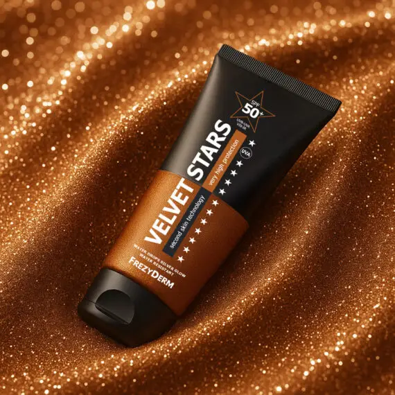
The butterfly logo — a symbol of transformation and inner beauty — is rendered in gold foil, adding elegance and prestige. The palette of deep purple and copper-orange conveys a balance between science and care, emphasising the product’s premium identity.
Zenor Skin is not just packaging; it is an experience that begins with touch, continues with sight and culminates in the promise of renewal. A branding project that turns luxury into sensation, and design into an act of care.