DMP Dental Industry / NEW Logo
The New Visual Code of DMP
DMP, a leading company in the production of dental materials, needed a redesign of its logo. The challenge was to create a new visual mark that would reflect its commitment to innovation, quality and expertise — enhancing its recognisability in today’s global market and reinforcing its reliability among dental professionals.
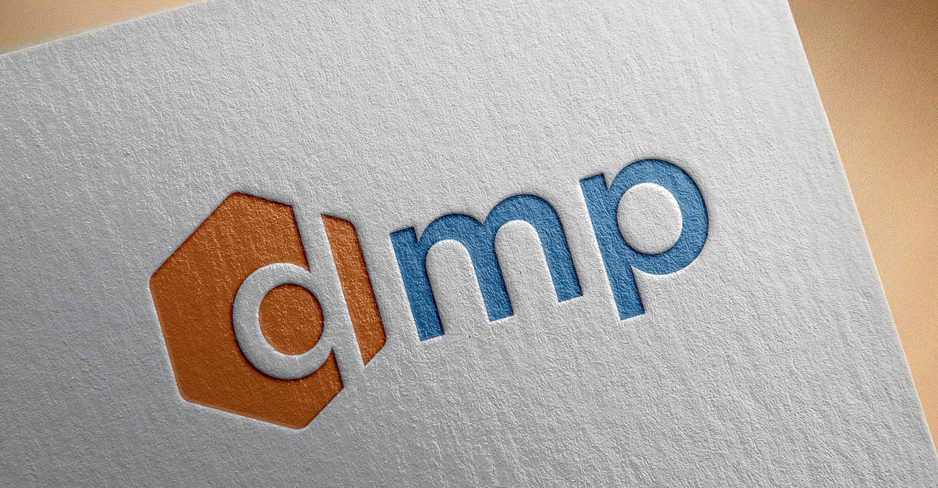
Our central concept was “The Geometry of Precision.” The strategic insight was to merge the company’s initial, “d”, with a universal symbol of scientific structure and strength: the hexagon. This union creates not just a letter, but a powerful emblem that visually communicates dental precision and technological innovation.
The result is a logo with clean lines and a modern aesthetic that conveys trustworthiness and dynamism.
The “d” is seamlessly integrated within the hexagon, forming a compact, balanced and instantly recognisable mark that symbolises precision and protection.
The combination of vibrant orange with professional blue creates a contemporary contrast: orange representing innovation, and blue representing reliability.
The new logo is designed to perform flawlessly across all applications — from digital presence and print to corporate signage — strengthening DMP’s image as a leader in the dental industry.
Through this redesign, ABC Design Communication demonstrated how strategic branding and contemporary visual design can renew the identity of an international industrial company while preserving its functionality and scientific accuracy.


