Frezyderm / Cough Syrup Kids

When a Cough Becomes a Friend
Frezyderm, a brand synonymous with scientific reliability, took its next step in children’s care with a cough syrup made from natural extracts. The challenge was to create a label that would balance two worlds: the safety and effectiveness parents expect from Frezyderm, and a friendly, approachable image that makes the treatment process less intimidating for children.
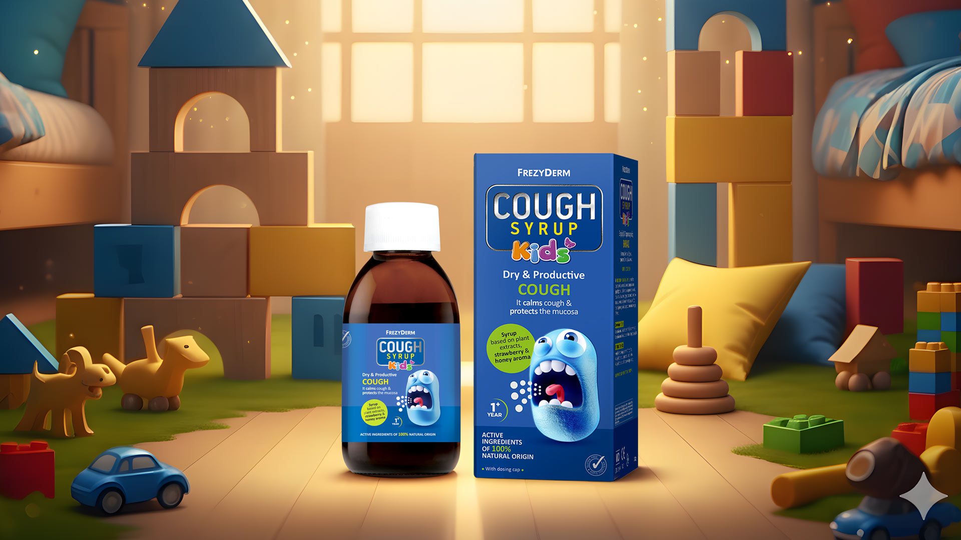
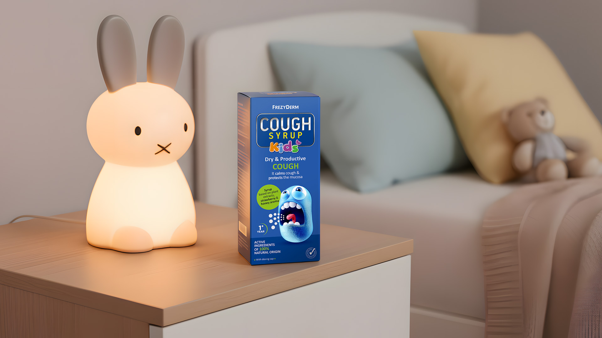
Our central idea was to de-dramatise the cough. Instead of a strictly clinical approach, we chose to give the cough a face — a cute, lovable one. Our strategy was to design a small blue cartoon hero who is coughing. This character isn’t the problem; he’s the little friend who needs help. By turning the symptom into a friendly figure, we make the product instantly understandable and far less threatening for the child.
Our solution combines playfulness with premium cues, creating packaging that appeals to both children and parents.
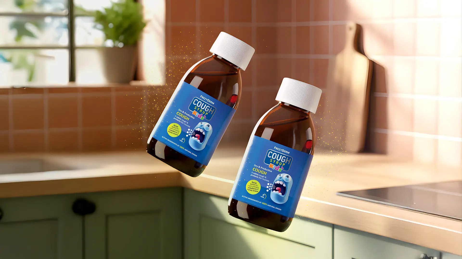
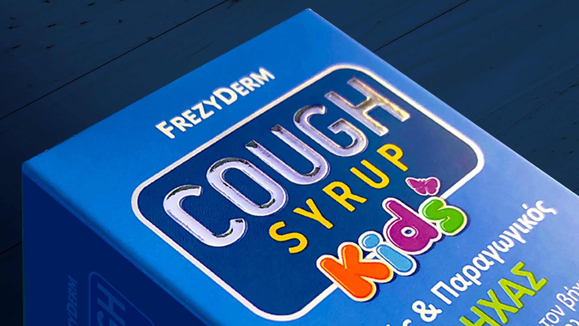
The little blue coughing character becomes the star of the label. His humorous expression adds lightness and makes the product approachable.
The “KIDS” logotype was designed with bold, cheerful colours, clearly signalling the audience the syrup is intended for.
The choice of a metallic label and the use of foil stamping on the logo give the packaging a subtle shine. This detail acts as a visual guarantee of the high quality and effectiveness associated with all Frezyderm products.