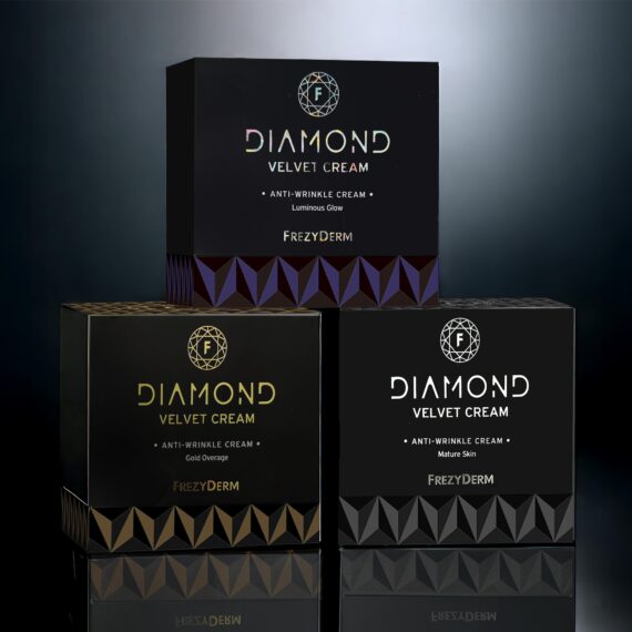
Frezyderm / Diamond Cosmetics Logo Design
The Luxury of Science, Captured in a Diamond
Frezyderm, renowned for its scientific precision and premium aesthetic, introduced the new Diamond Line, inspired by the brilliance and power of the diamond itself.
The challenge was to design a logo that expresses luxury, purity, and the perfect balance between science and beauty — a mark that would stand out on packaging while remaining strong enough to function independently as a brand symbol.
Our strategy focused on visualising the luminosity and geometric perfection that define a diamond. We sought a form that embodied structure, clarity and radiance — without unnecessary embellishment.
ABC Design Communication developed the idea of a logo-jewel: minimal, symmetrical and meticulously crafted, echoing the very qualities of the object that inspired it.
The logo was designed as a composite geometric form based on diamond-cut facets, rendered through clean, luminous lines. Its symmetry and sharp angles highlight strength and brilliance, while the simplicity of execution ensures timeless elegance.
The accompanying typography is minimal and refined, allowing the emblem to take centre stage as the signature of the Diamond Line.
The new Diamond Line logo expresses the essence of the product: purity, precision and the radiant beauty born from Frezyderm’s scientific expertise.
The design conveys trust and high value, while enhancing the brand’s overall visual cohesion — establishing the Diamond Line as a true reference point in the world of premium cosmetics.