The Velvet Colors make-up range by Frezyderm doesn’t just promise flawless coverage — it promises skin health. The challenge was to capture this dual promise in a single packaging concept. How do you visually communicate a product that provides perfect coverage while still allowing the skin to breathe? The design had to bridge the world of premium make-up with Frezyderm’s scientific credibility.
Our inspiration came from the micro-universe of the skin itself. Instead of focusing on coverage, we focused on health: on the image of the skin’s pores that allow it to breathe. Our central idea was to transform this natural “imperfection” into an abstract, minimalist motif. Clean circles became our symbol for skin that is healthy, happy and alive beneath the make-up. The design does not hide — it reveals the beauty of natural skin function.
The result is a scientific insight transformed into a statement of luxury and elegance.
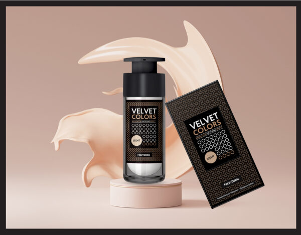
We created a dynamic, repeating circle pattern that wraps around the packaging. This motif is not merely decorative; it is a visual expression of the “second-skin” philosophy — coverage that breathes.
The combination of deep black with warm metallic gold-bronze adds richness and sophistication. The colour choice is intentional, echoing the tones of the product itself and creating a harmonious connection.
From the sturdy airless pump bottle to the premium carton, every detail is designed to deliver an elevated experience, reinforcing the idea that skin health and high aesthetics can coexist seamlessly.
With Velvet Colors, ABC Design Communication captures the union of science and beauty, creating a design that celebrates natural skin through innovation and thoughtful balance.