Sottos Family / Espresso Coffee


Breaking the Rules of B2B Branding
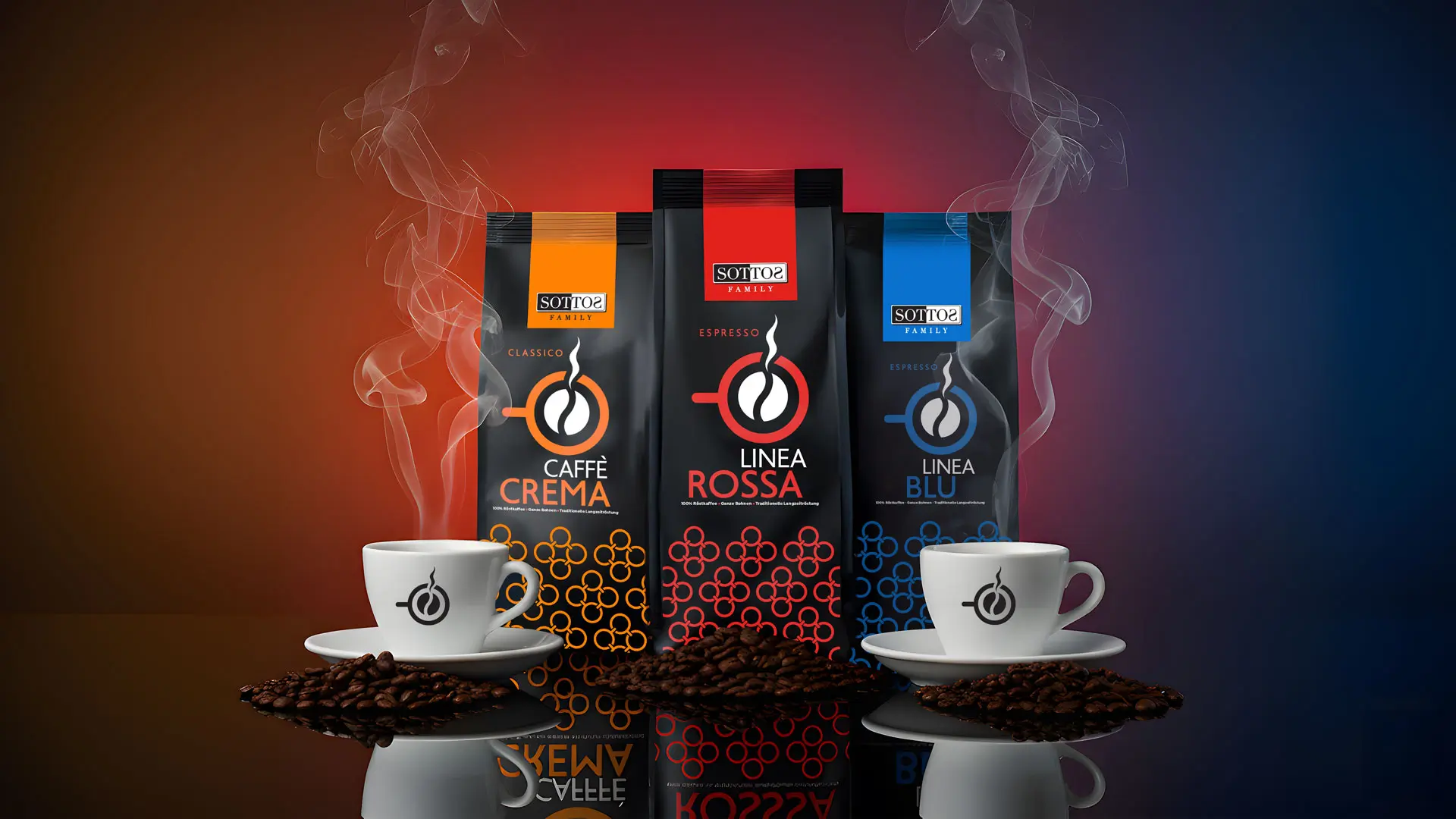
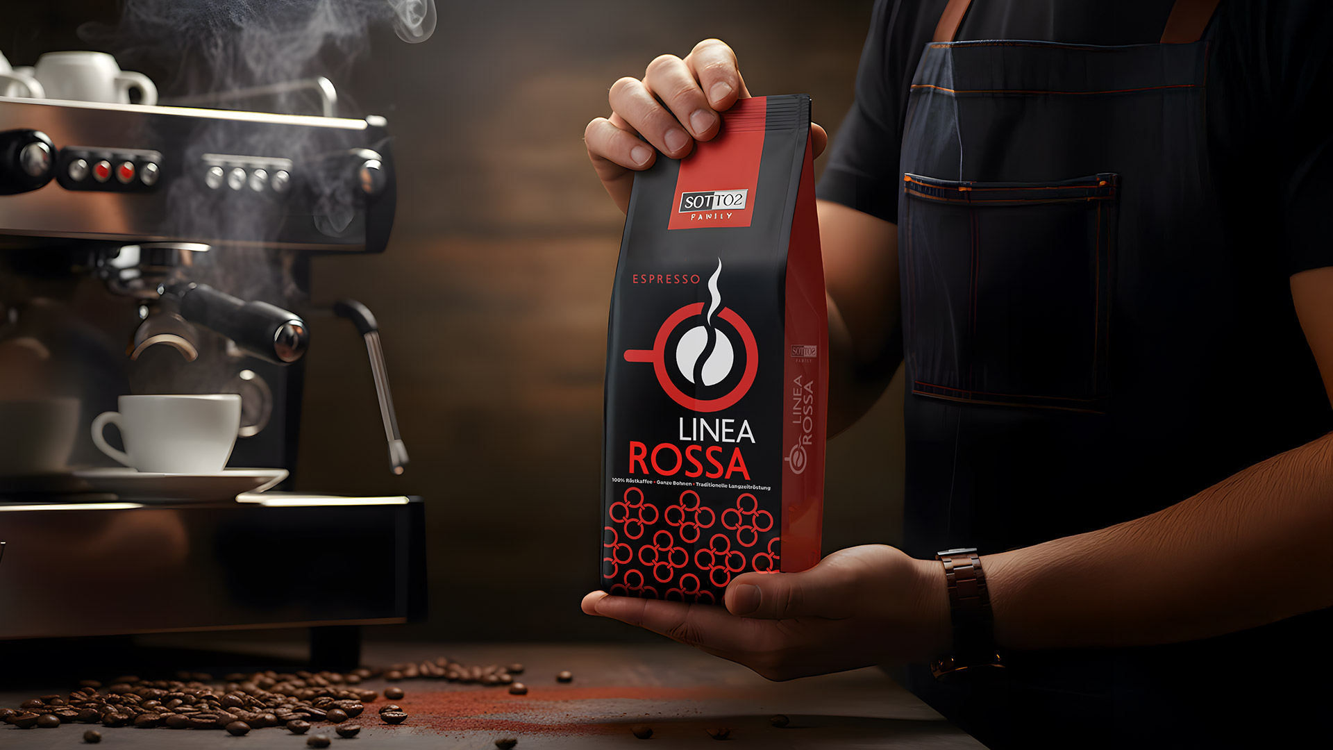
Sottos Family, a German company with 50 years of coffee heritage, needed to refresh its Espresso Linea range, aimed exclusively at professionals. The challenge was twofold: to create an identity that would inspire baristas, while breaking the stereotype that wholesale products must be visually uninteresting. The design had to be so strong that it could transform a B2B product into a brand consumers would actually want to buy for their homes.
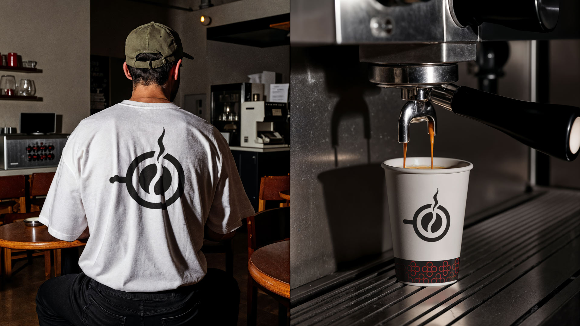
Our central idea was based on a simple truth: today’s coffee professionals are trendsetters. Their tools and ingredients are not hidden away in the back — they are part of the overall customer experience. The branding, therefore, had to be designed to be on display. Our strategy was to create an identity that acts as a badge of quality and pride for the barista, and at the same time as a magnet for the customer, turning the packaging from a mere commodity into a desirable consumer good.
The result is a complete branding ecosystem that radiates confidence and passion.
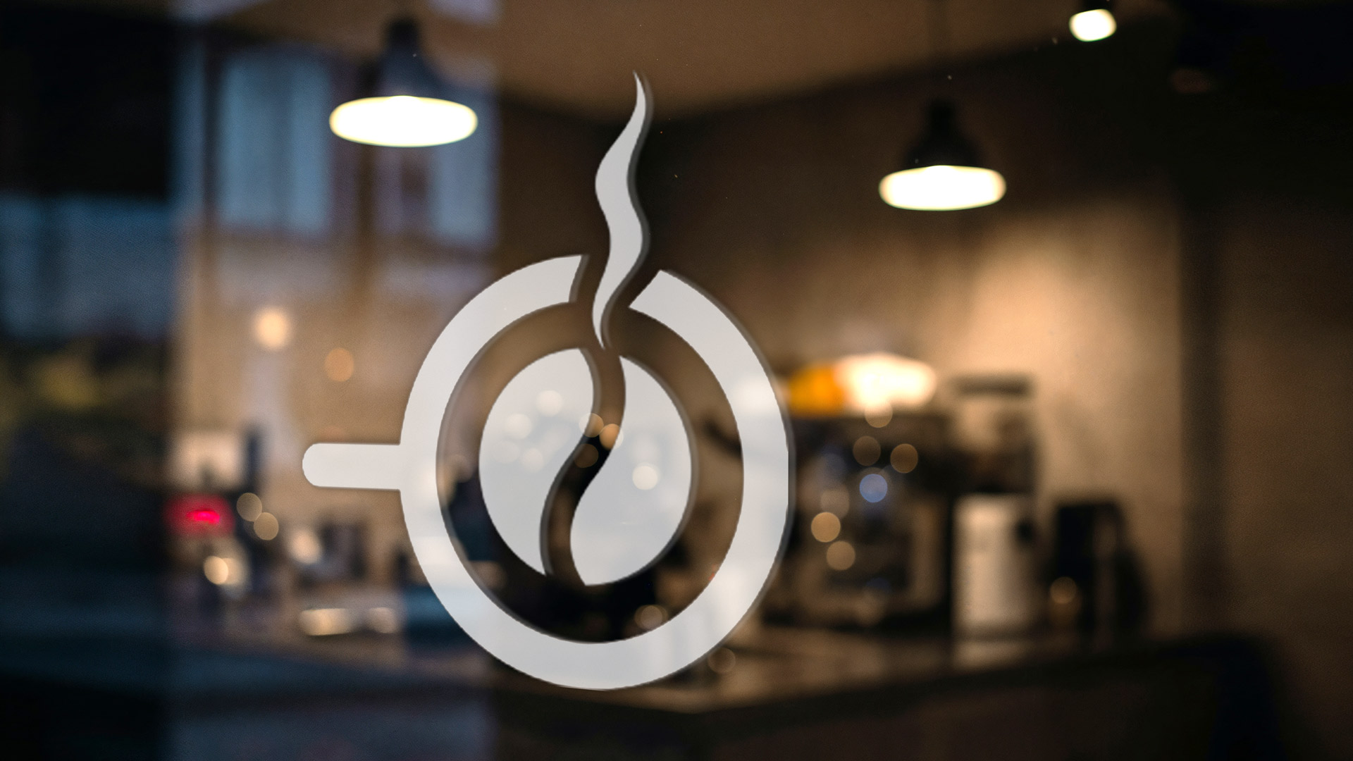
We designed a clean, symbolic logo that unites the essence of coffee (the bean) with the pleasure of drinking it (the cup). Its minimalist approach makes it flexible and instantly recognisable — from a shop window to a barista’s T-shirt.
Deep black was used as the main canvas to signal premium quality. On top of this, bold, vibrant colours (red, blue, orange) not only differentiate the blends but also create a striking visual presence on the shelf. The repetitive circular pattern adds a modern, graphic texture.
We extended the identity beyond packaging, creating a range of applications — from paper cups and T-shirts to delivery bags — that transform Sottos Family from a simple supplier into a complete lifestyle brand, ready to step confidently into the retail arena as well.
With this project, ABC Design Communication redefines the boundaries of B2B branding, proving that even professional-only products can inspire desire and deliver a powerful aesthetic experience.