Sottos Family / Greek Coffee
A Sip of Greece in Every Cup
The Sottos Family, a long-standing family business, wanted to introduce the authentic experience of GRECO Greek coffee to the German market. The challenge was not simply a rebranding exercise to boost sales, but a strategic move to establish the brand with a new, demanding audience. The design had to convey the rich culture of Greek coffee in a way that felt familiar, modern and irresistibly appealing.
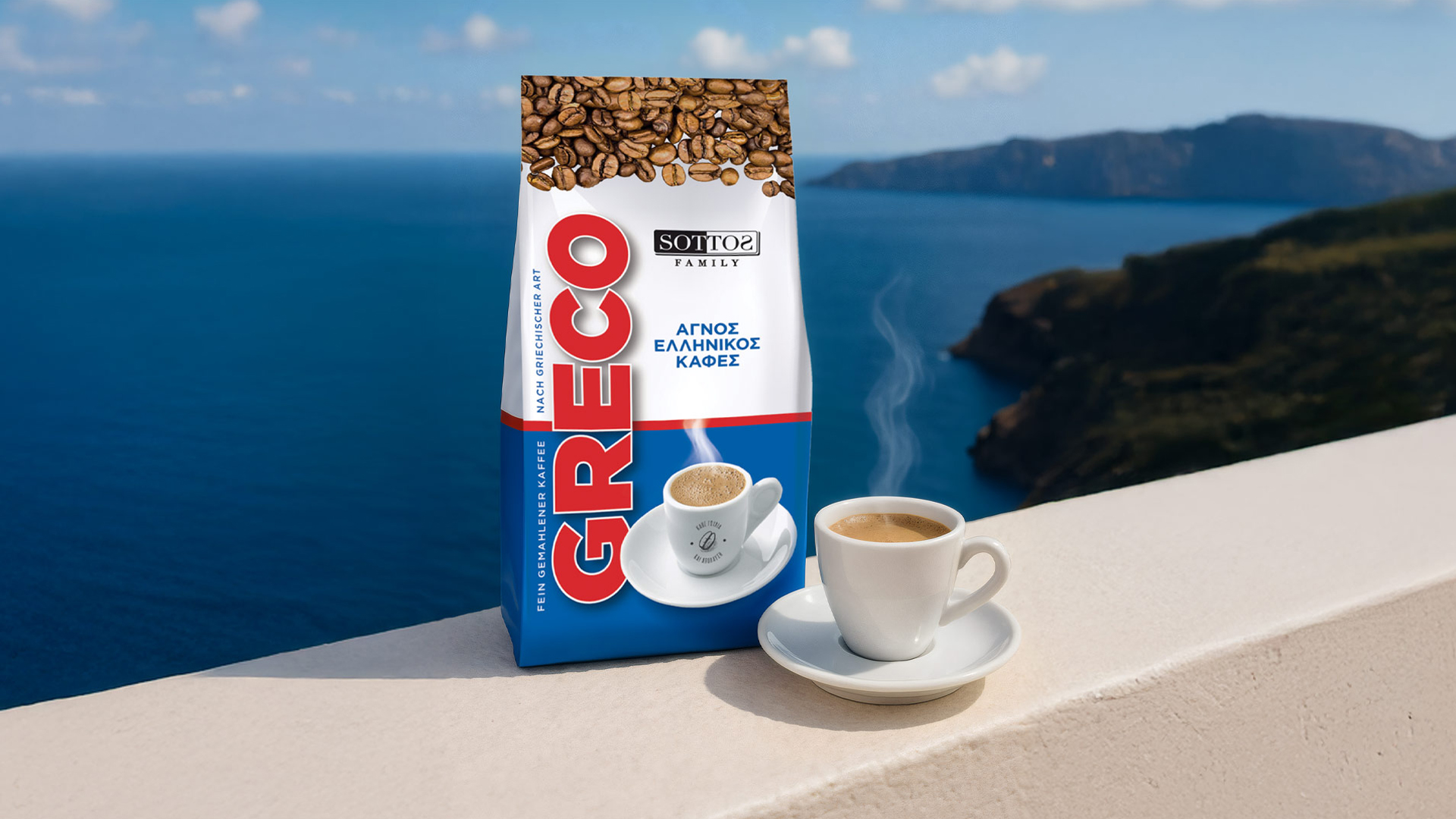
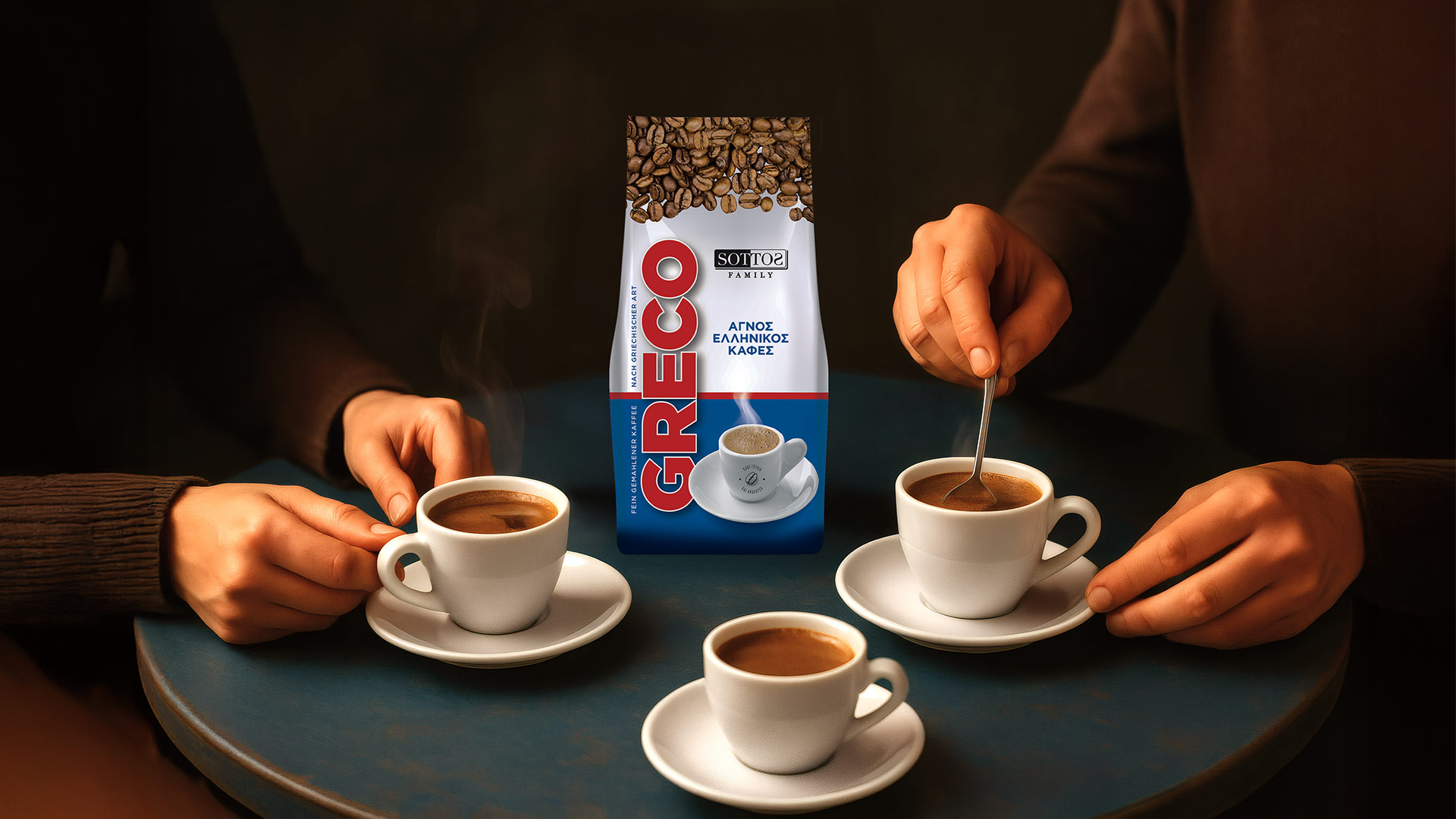
Our central idea was to turn the packaging into a “postcard” from Greece. The strategy was not just to sell coffee, but to offer an imaginary journey. We drew inspiration from the most powerful and recognisable symbols of the Greek summer: the endless blue of the sea, the crisp white of the islands and the passionate red of the Greek heart. The branding needed to be a promise of genuinely memorable moments of enjoyment.
Our solution is an ode to Greek simplicity and vibrancy, captured in a contemporary visual language.
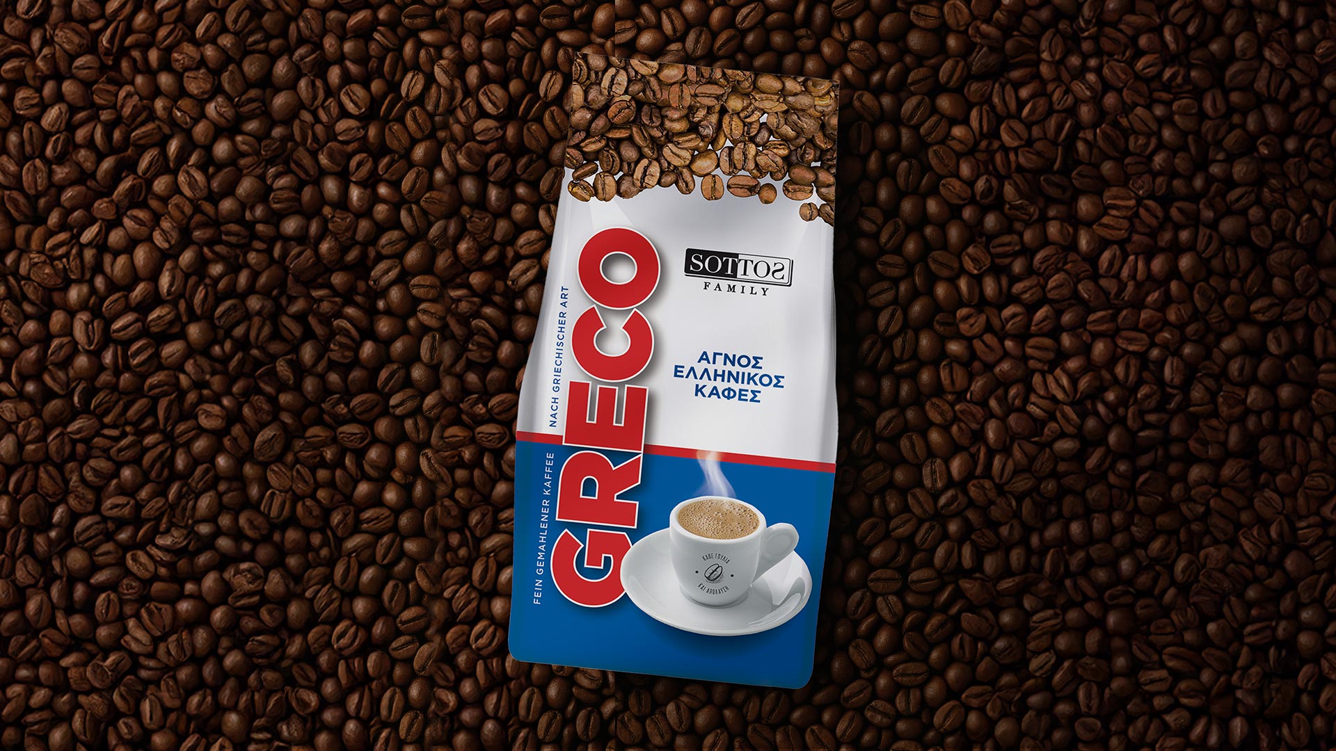
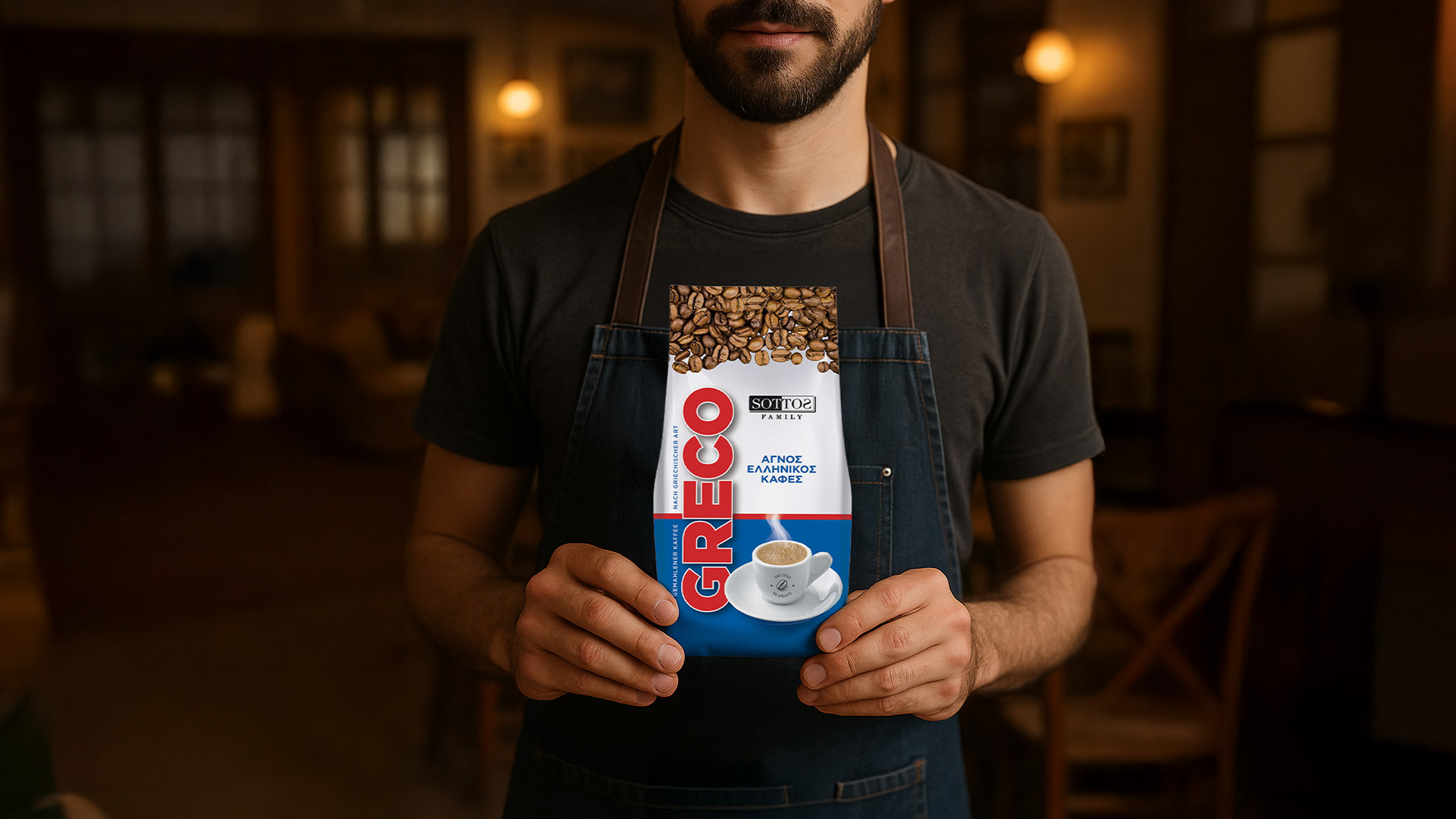
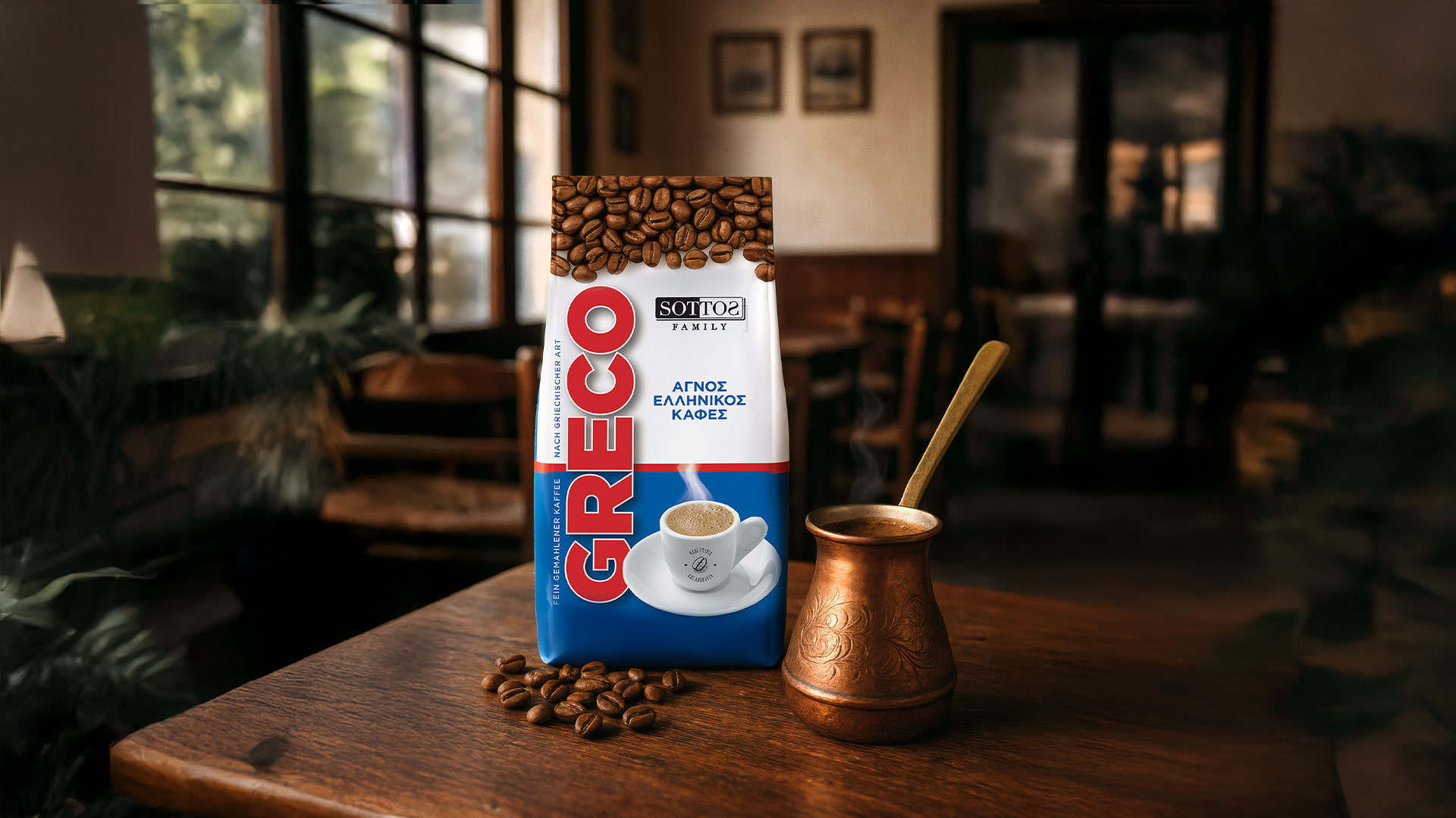
We used blue and white as the main canvas, creating an immediate mental link to Greece. This clean, geometric approach gives the pack a modern aesthetic that stands out on the shelf.
The “GRECO” logotype was designed with a bold vertical orientation and a vivid red colour. It stands tall and confident, symbolising the energy, passion and authentic flavour contained within.
The choice of a metallic bag allows the surface to catch the light, echoing the way the sea reflects the sun. At the top, the image of freshly roasted beans acts as a guarantee of quality, while the perfectly served cup at the bottom invites the consumer into the final moment of indulgence.


