Velvet Eyes Series Packaging Design – Frezyderm Velvet Eye Gel


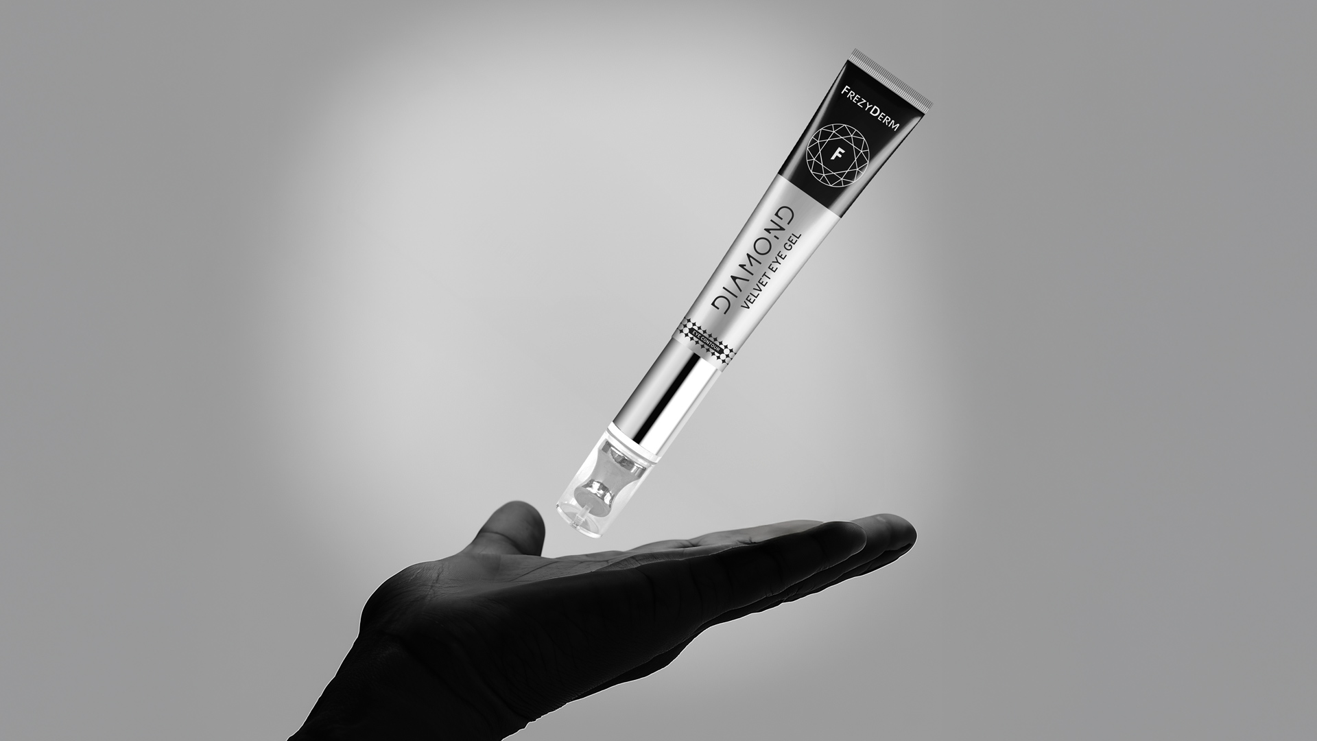
Luxury design for an eye gel series.
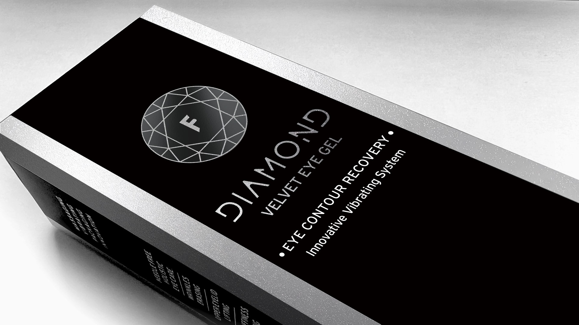
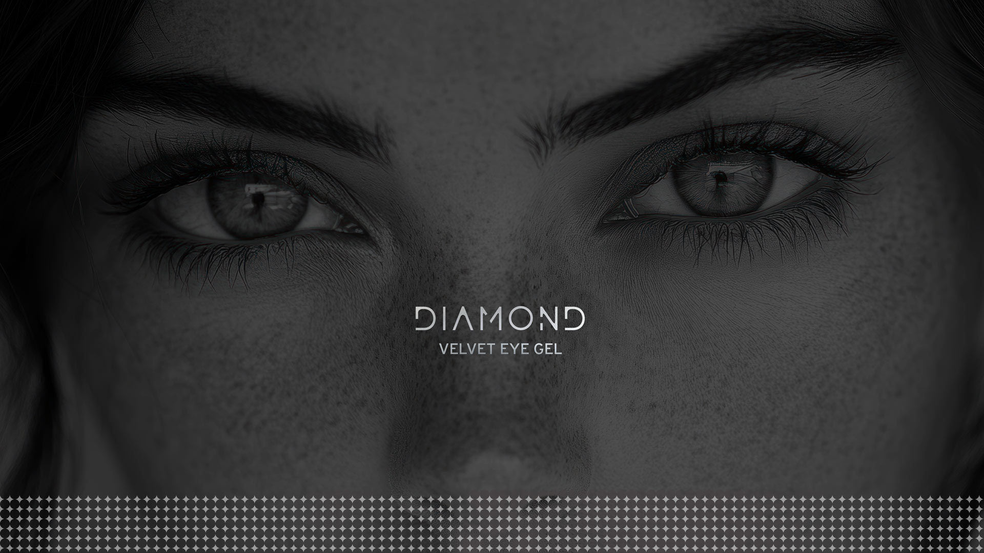
The client’s request was to create a packaging for an innovative eye gel that communicates technological superiority and a sense of absolute luxury. A product based on specialized care, radiance and rejuvenation. The packaging had to be imposing and timeless, highlighting the “diamond” as a symbol of value and durability. To be clearly positioned at the top of the premium cosmetic category.
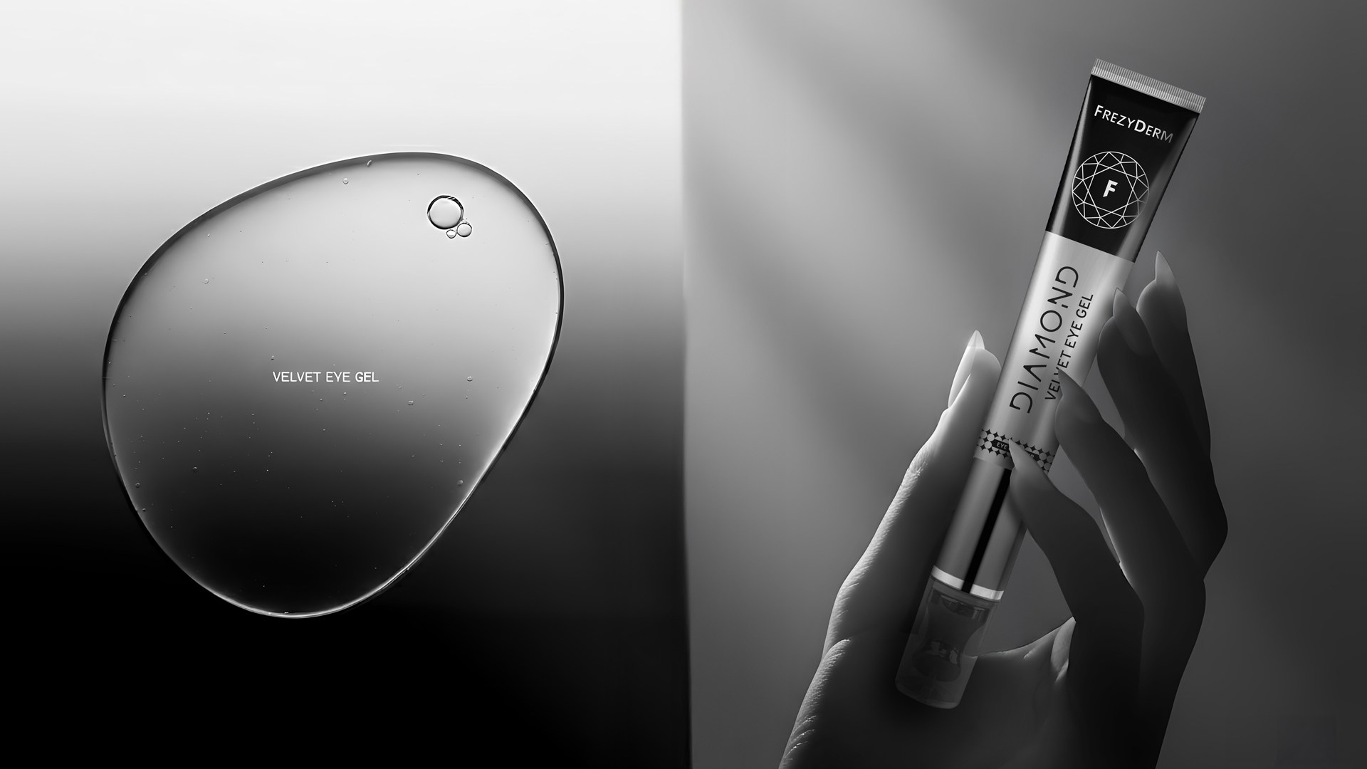
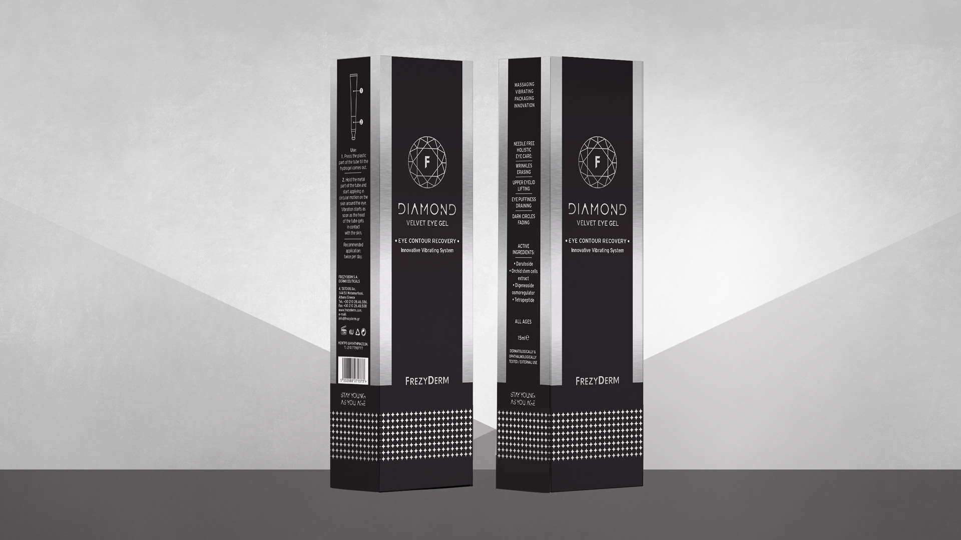
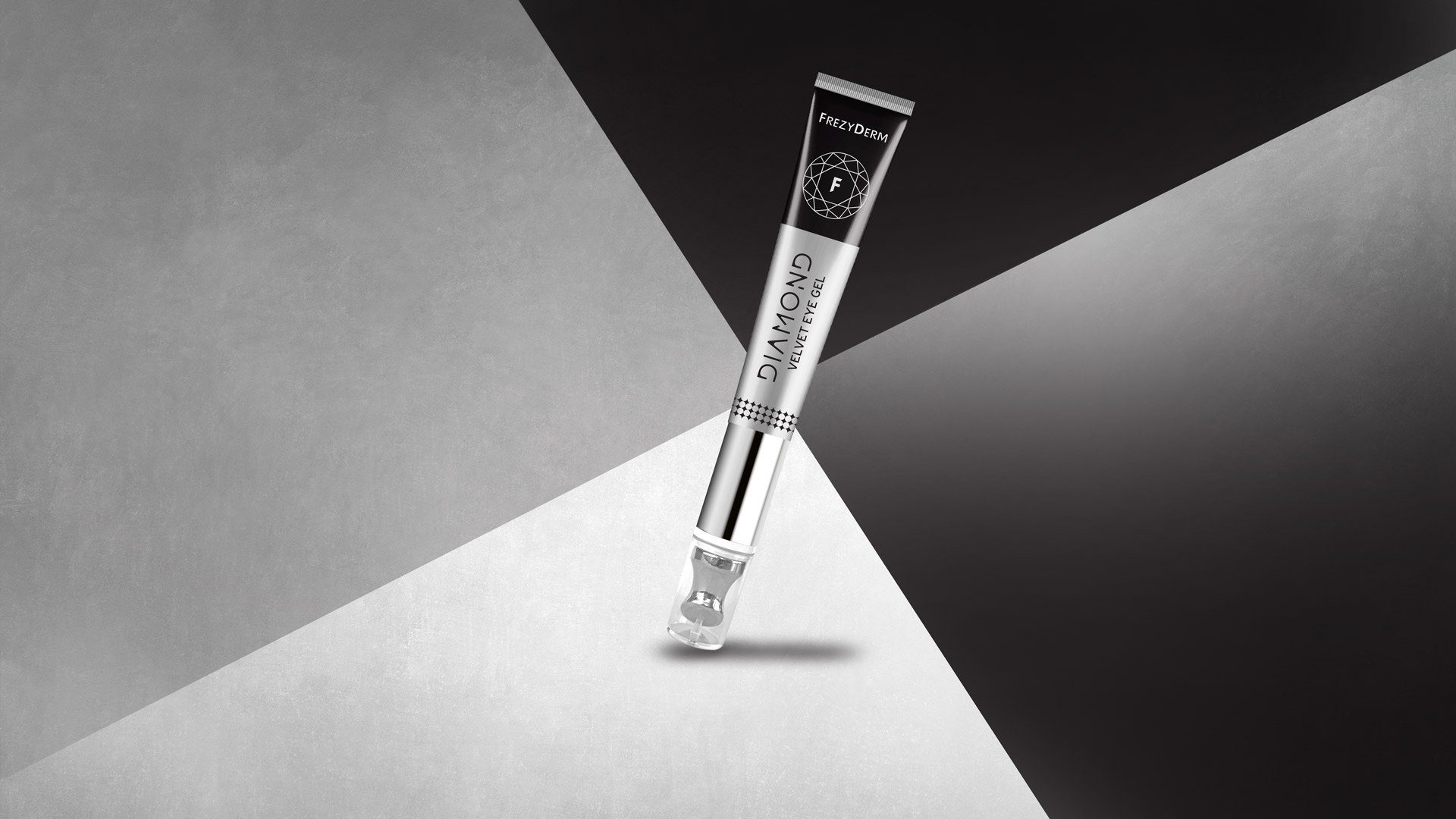
Our strategy was based on the combination of scientific purity and high-end branding. We chose a palette of strong contrasts, with deep black and reflective silver as the dominant colors. We incorporated the geometric symbol of the diamond as the central axis of the visual identity. We emphasized the detail of the pattern and the texture, predisposing to the “velvet” experience of the product. Each element underlines the innovation and precision of the composition.
The result is a packaging that exudes prestige and refined power. It highlights the technological cutting edge and quality of the eye gel. It stands confidently on the shelf, attracting the eye with its crystal clarity. It communicates the ultimate care and natural glow. A packaging design that lets the innovation itself take center stage.
The design approach for the innovative eye gel represents a comprehensive study on modern luxury cosmetic packaging. By blending strategic communication with a clean visual identity, we created an experience that amplifies the brand’s technological superiority on the shelf and offers significant added value to the discerning consumer. ABC Design Communication continues to push the boundaries of packaging design, transforming every project into a powerful marketing tool that combines high aesthetics with innovation.


