
22 Oct WBDS- Sottos Family’s/Espresso Coffee Beans


Discover how strategic color coding and minimalist graphics elevate a premium espresso line's visual identity. Explore the Sottos Family case study, prominently featured by the World Brand Design Society. Creating a strong visual identity for a premium espresso line requires strategic thinking and clean design that stands out instantly on crowded retail shelves. A highly successful coffee packaging design not only protects the product but also makes it incredibly easy for consumers to spot and select their favorite blend in seconds.
How does color coding organize product lines?
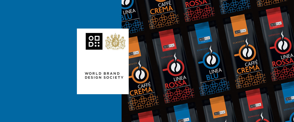
A strict, well-planned color coding system allows for the immediate and clear differentiation of product variants within the same brand family. In the demanding Sottos Family project, the coffee packaging design strategically utilizes bold, vibrant colors (such as striking red, deep blue, and warm orange) against a premium, solid black background to separate the Linea Rossa, Linea Blu, and Caffè Crema ranges. This bold color contrast instantly grabs the consumer's attention and seamlessly guides the buyer toward the right choice.
What is the role of typography and iconography?
Using clean typography combined with a clever, central icon instantly and effectively conveys the product's core message. In this specific case, an abstract yet highly recognizable coffee bean symbol that cleverly transforms into an espresso cup acts as the primary visual anchor of the package. Through this minimalist approach, the coffee packaging design acquires a modern, international, and premium character, communicating the authentic coffee experience while completely avoiding unnecessary visual clutter.
What does recognition from the World Brand Design Society mean?
Official recognition and featuring by leading international design platforms actively certifies the high aesthetic superiority and strategic value of the packaging artwork. This significant accolade for the Sottos Family line clearly confirms ABC Design Communication's ability to build highly competitive brands on a global scale. Fully leveraging our 25+ years of proven industry experience, we consistently deliver brand solutions that perform flawlessly across 19+ countries.
Explore how we have strategically crafted the visual identity for other leading food and beverage brands by browsing our extensive project portfolio. Discover how the award-winning Sottos Family coffee packaging design uses clever color coding and minimalism to build a highly competitive premium brand.
