Organic Cookies – Frezyderm
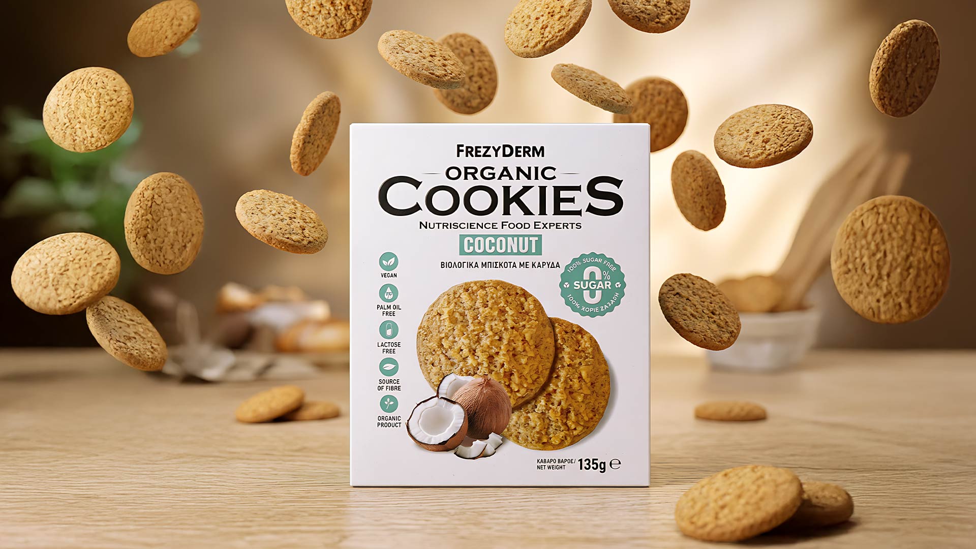
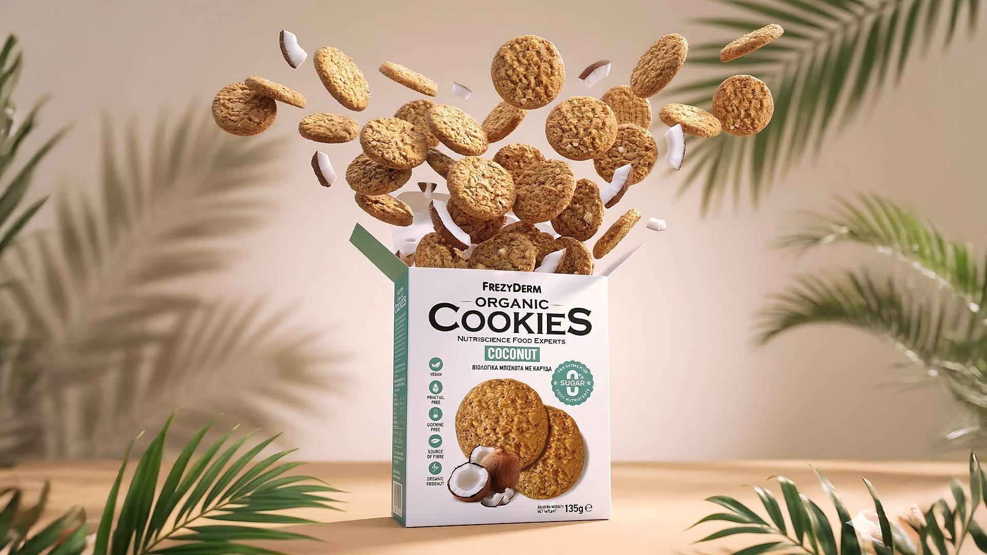
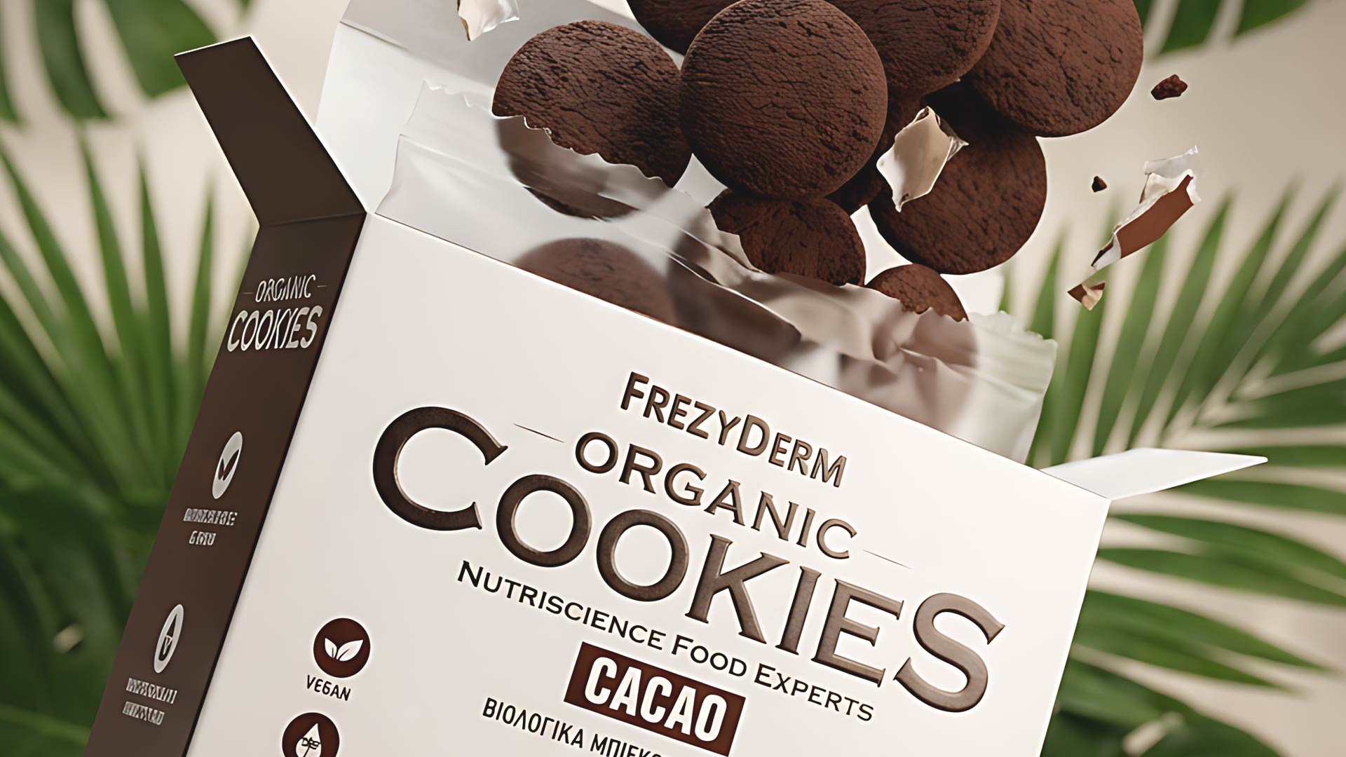
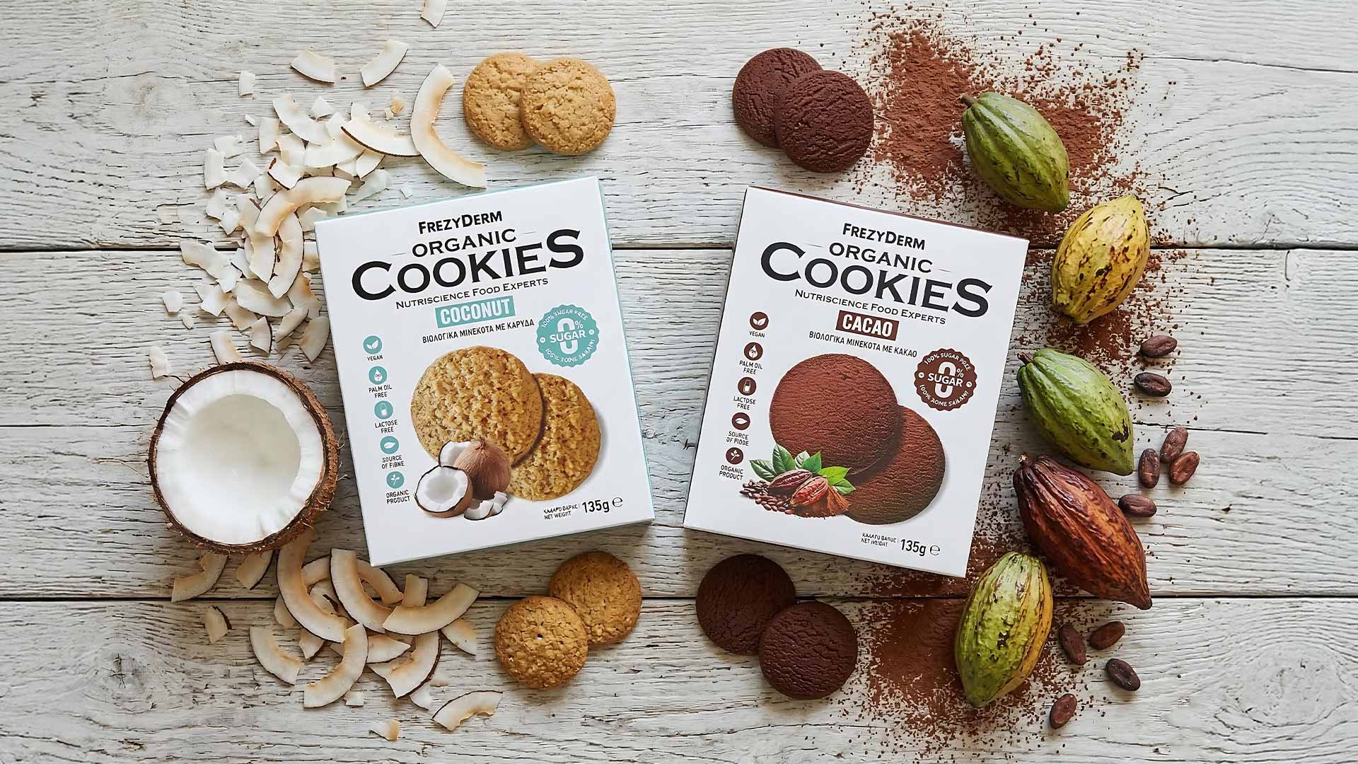

For Frezyderm's Organic Cookies line (Nutriscience Food Experts), our design objective was to combine the credibility of a leading health brand with the mouth-watering appeal of a premium sweet snack. We opted for a clean, white canvas that exudes purity and safety, perfectly maintaining the company's minimalist design DNA.
The dynamic typography creates a strong visual identity, while a subtle color-coding system (cool teal for coconut, warm brown for cacao) instantly differentiates the flavors. To maximize appetite appeal, realistic and tempting depictions of the cookies take center stage, beautifully accompanied by their raw natural ingredients (coconut and cacao pods).
Simultaneously, we developed a system of clean, legible icons on the side, along with a prominent stamp, to clearly communicate the nutritional benefits (vegan, palm oil free, 0% sugar). The result is an elegant and contemporary packaging that confidently stands out on the shelf, offering a visual promise of nutritional superiority and guilt-free enjoyment.
The design approach for Frezyderm’s Organic Cookies represents a comprehensive study on modern health and wellness packaging. By blending strategic communication with a clean visual identity, we created an experience that amplifies brand credibility on the shelf and offers significant added value to the health-conscious consumer. ABC Design Communication continues to push the boundaries of packaging design, transforming every project into a powerful marketing tool that combines nutritional excellence with aesthetic integrity.