
Frezyderm, a leading name in dermocosmetics, needed a new design for its Vitamin D3 food supplement. The challenge was to create a visual identity that would stand out in the strict, clinical environment of the pharmacy, inspire scientific trust, and communicate the core benefit of the product — the “sunshine vitamin” — in a smart and memorable way.
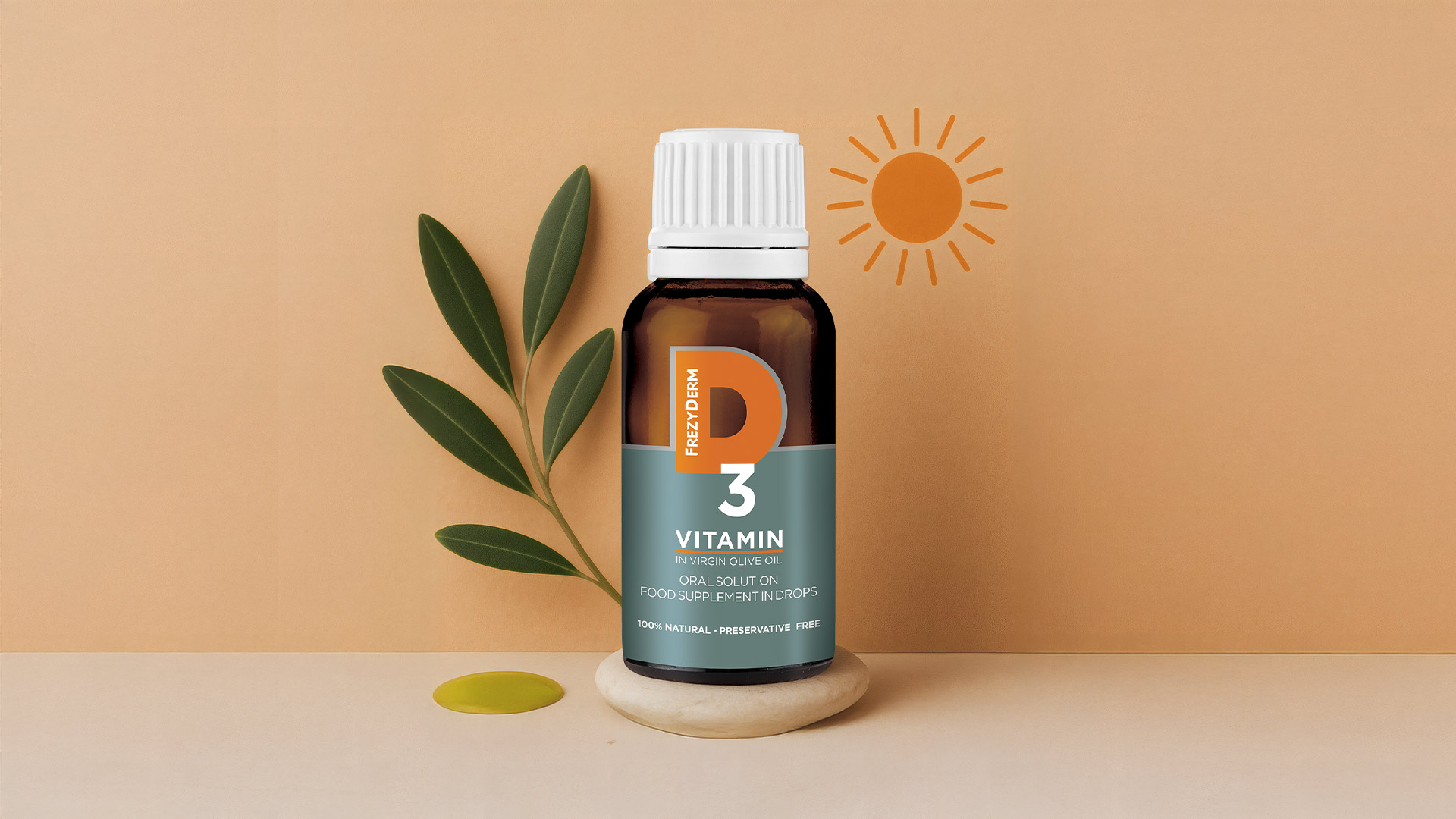
Our central idea was rooted in the power of simplicity. Instead of adding yet another symbol, we turned the product name itself into one. The strategic insight was to redesign the letter “D” in the “D3” logo so that it simultaneously represents a rising sun. This simple yet clever graphic solution instantly links the product to its natural source of power, transforming a scientific denomination into a warm, optimistic image.
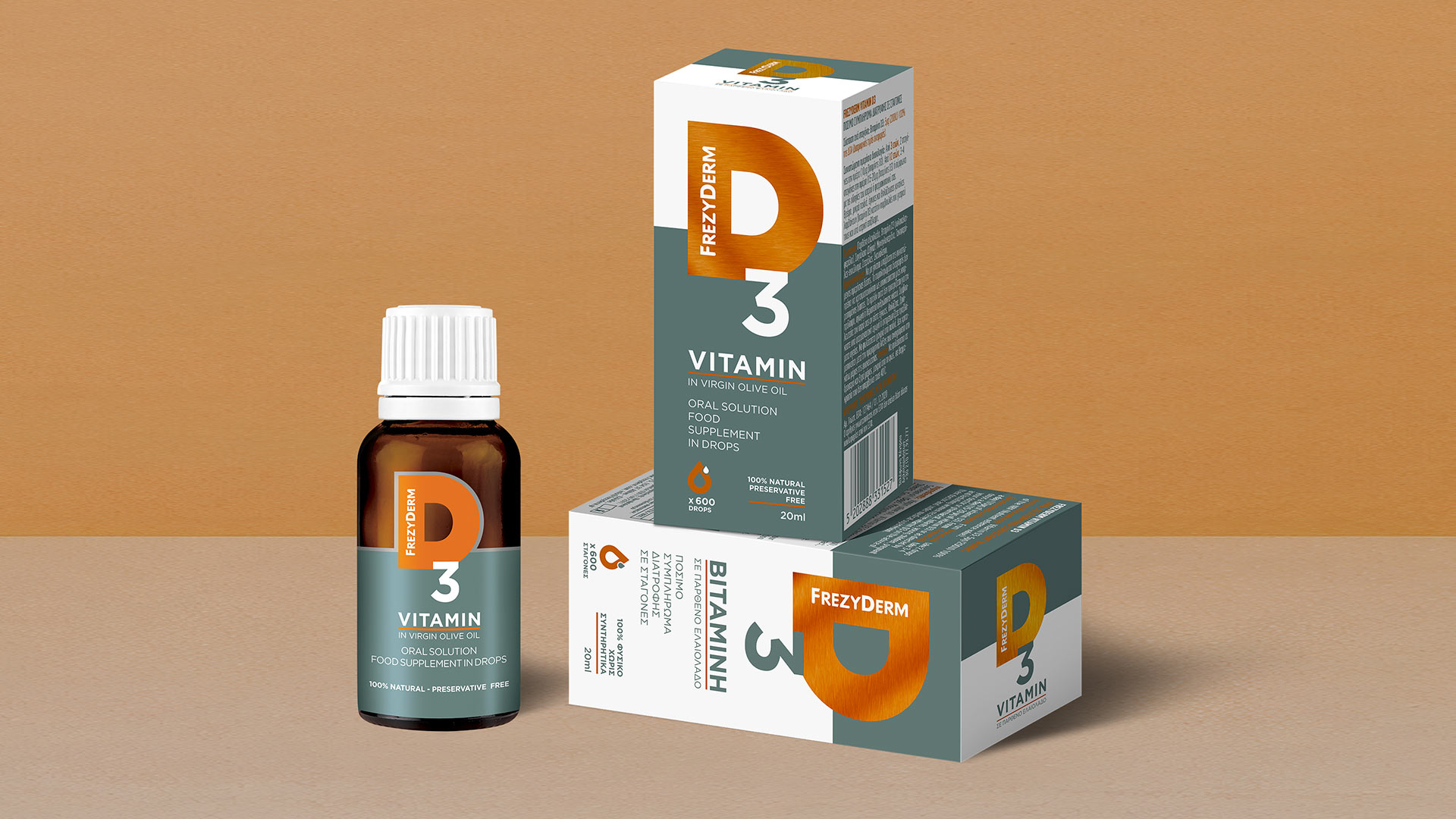
Our solution balances scientific precision with a natural, human aesthetic.
The “D” becomes the focal point of the identity — a direct visual metaphor for the product’s benefit. It is an idea that can be understood in a fraction of a second.
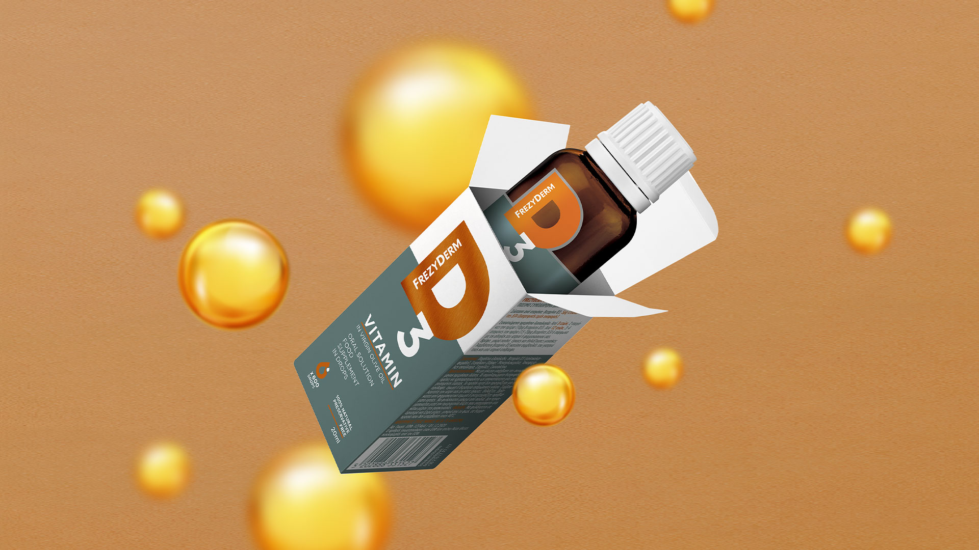
The combination of silver with a warm orange tone creates a well-balanced palette: silver conveys scientific reliability, while orange brings in the warmth and energy of the sun.
A clean sans-serif typeface and the carefully structured layout of information reinforce a sense of trust and efficacy — key qualities for any pharmacy product.
The final packaging is both reliable and approachable, combining Frezyderm’s scientific authority with the positive energy of nature.


