Frezyderm introduced IMMUNO, an advanced dietary supplement designed to deliver comprehensive immune support. The challenge was to create packaging that visually communicates the idea of “shielding” and high technology. The design needed to break away from the traditional aesthetic of supplements and express innovation and scientific superiority in a dynamic, futuristic way.
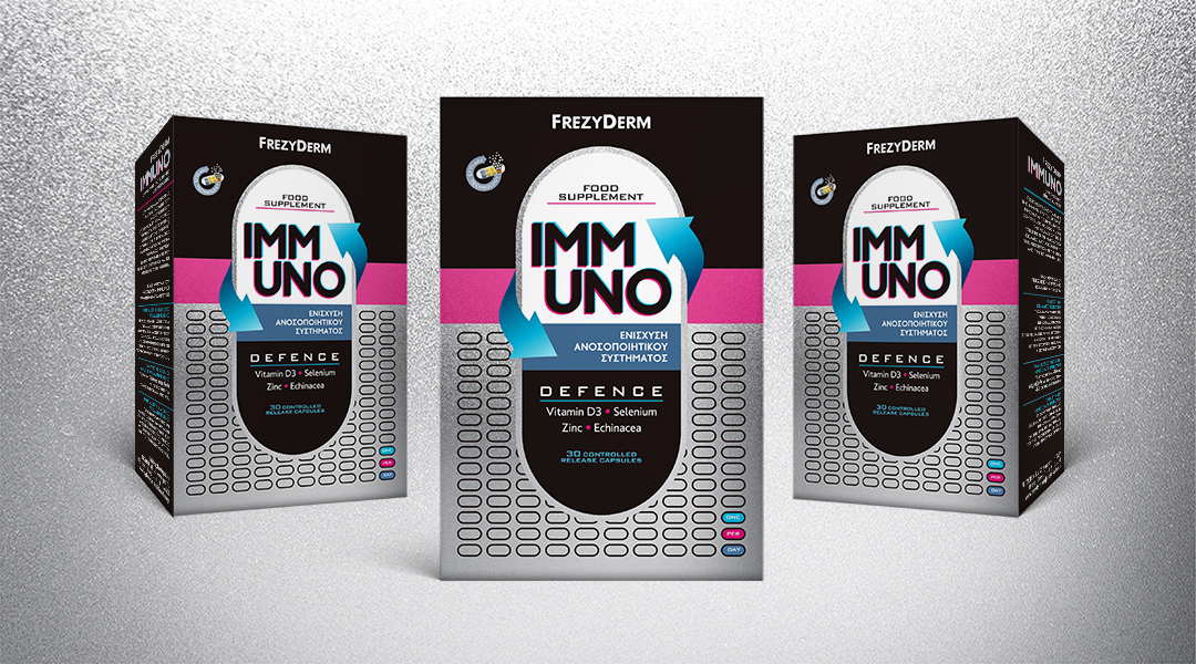
Our central concept was to visualise the idea of active defence. The strategic insight was to turn the packaging into a dynamic diagram of the product’s action. We placed the capsule — the heart of the product — at the centre and surrounded it with circular arrows. This movement isn’t decorative; it’s a visual metaphor for the continuous, all-around reinforcement and protection that IMMUNO provides, like an energetic shield around the body.
The result is a visual identity that radiates technology, energy and scientific precision.
ABC Design Communication developed a design that blends the aesthetics of technology with the clarity of science, creating packaging that stands as a symbol of innovation and trust for a new era of health.
The schematic representation of the capsule becomes the hero of the design, symbolising the concentrated power and targeted action of the product.
The circular arrows create a feeling of perpetual motion and protection, guiding the eye towards the central message of immune enhancement.
The combination of deep black and silver forms a high-tech foundation. Bursts of fuchsia and light blue add energy and vibrancy. Metallic inks and embossed varnish introduce a premium, tactile quality that highlights the product’s innovative nature.