


Frezyderm, a leader in dermocosmetics, introduced the innovative Slimming Line — a range aimed at women seeking targeted body solutions. The challenge was to create a visual identity that communicates “effectiveness” and “scientific action” in a way that feels dynamic and premium. The design needed to form a cohesive series, clearly stand apart from competitors and reinforce Frezyderm’s image as a specialist in skin care.
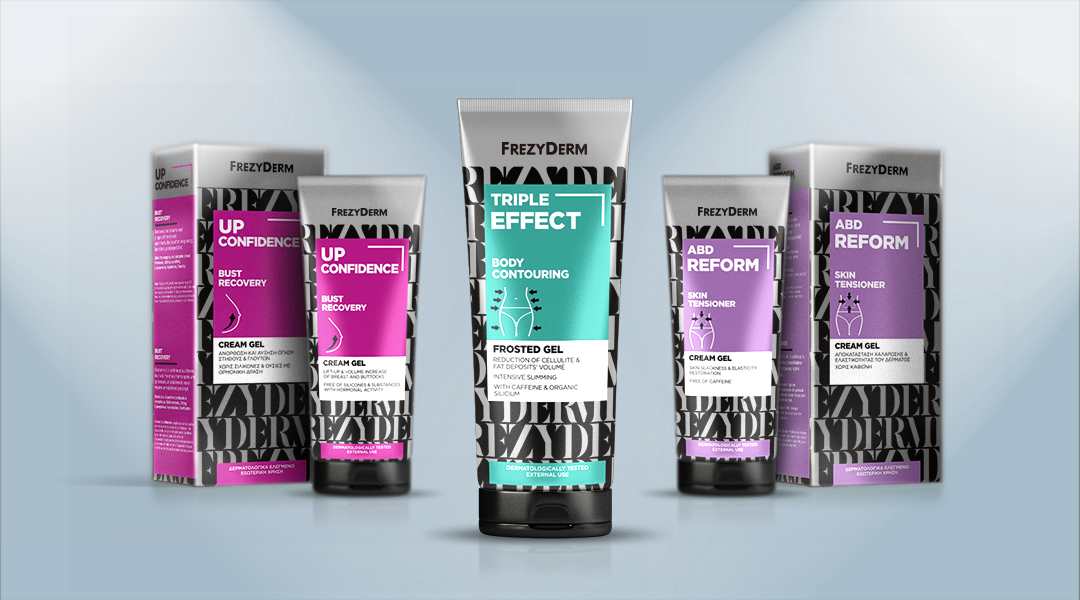
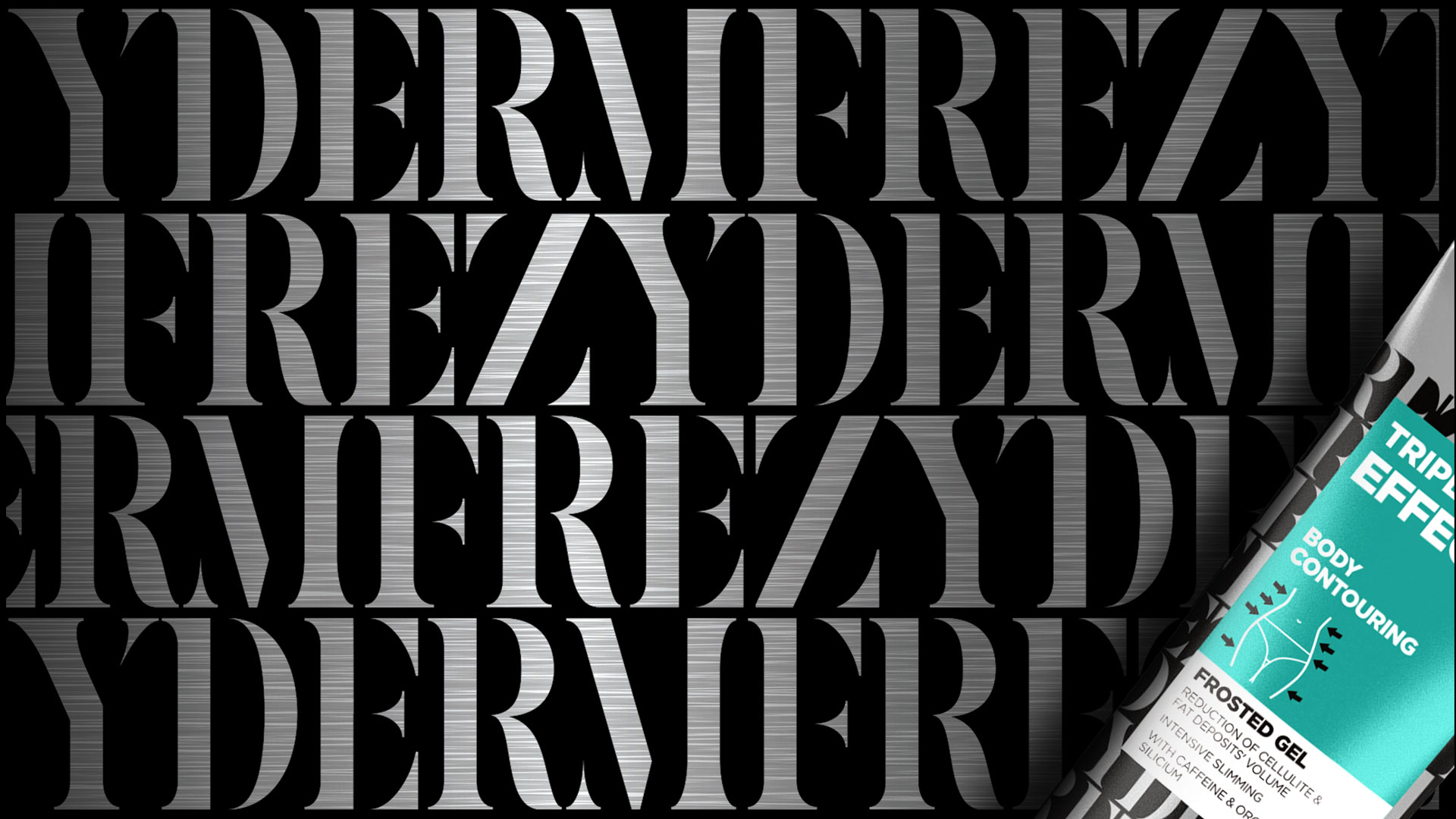
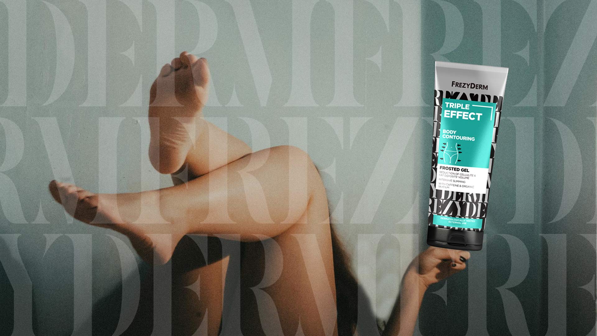
Our central idea was to transform the Frezyderm name itself into a visual symbol of action. The strategic insight was to use typography not as mere information, but as a dynamic, structural pattern. The repeated “FREZYDERM” wordmark creates a woven grid that wraps around the packaging, visually symbolising tightening, support and restructuring of the skin. The branding doesn’t just talk about action — it illustrates it.
Our solution is a bold and elegant visual language that blends the energy of movement with a premium aesthetic.
The repeated Frezyderm name forms a striking black-and-white pattern that becomes the signature of the series. This structural grid symbolises the targeted action and firming effect of the products.
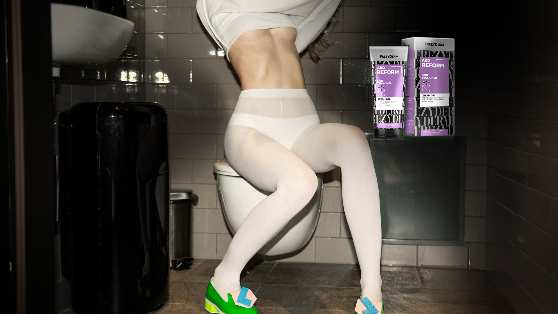
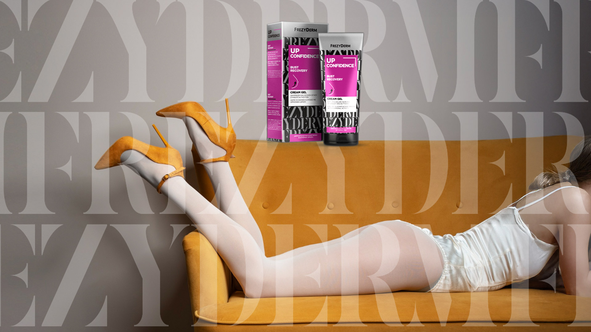
On top of this monochrome canvas, each product gains its own personality through a vivid accent colour (fuchsia, turquoise, purple). This ensures instant differentiation while maintaining a perfectly consistent identity.
Printing on metallic surfaces adds a sense of luxury and scientific purity, strengthening consumer trust in Frezyderm’s quality and effectiveness.