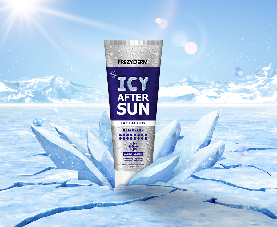


Frezyderm developed Icy After Sun Gel, an innovative product that delivers an immediate cooling effect to sun-exposed skin. The challenge was to design packaging that could convey this unique, intense sensation of “frozen” relief. The design needed to go beyond the classic after-sun aesthetic and visually express the scientific innovation behind the product’s long-lasting cooling action.
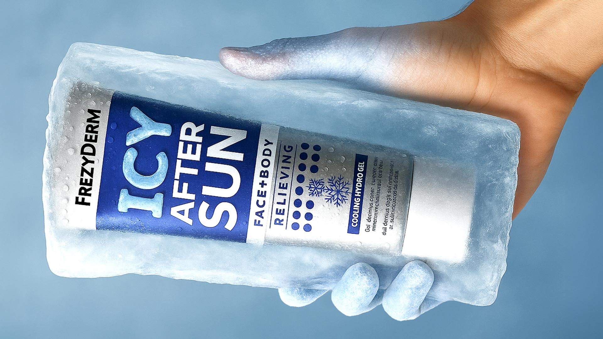
Our central idea was to make the feeling of freshness itself the hero of the design. The strategic insight was to turn the packaging into an object that looks frozen. We chose to use a series of visual cues that the subconscious instantly associates with cold, creating packaging that promises soothing relief before the consumer even touches it.
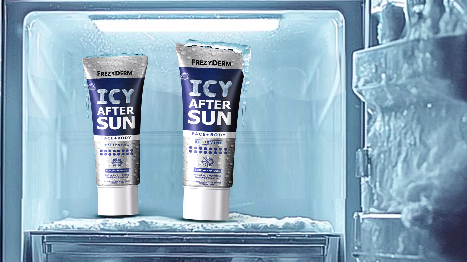
The result is a multi-sensory visual identity that embodies the idea of icy revitalisation.
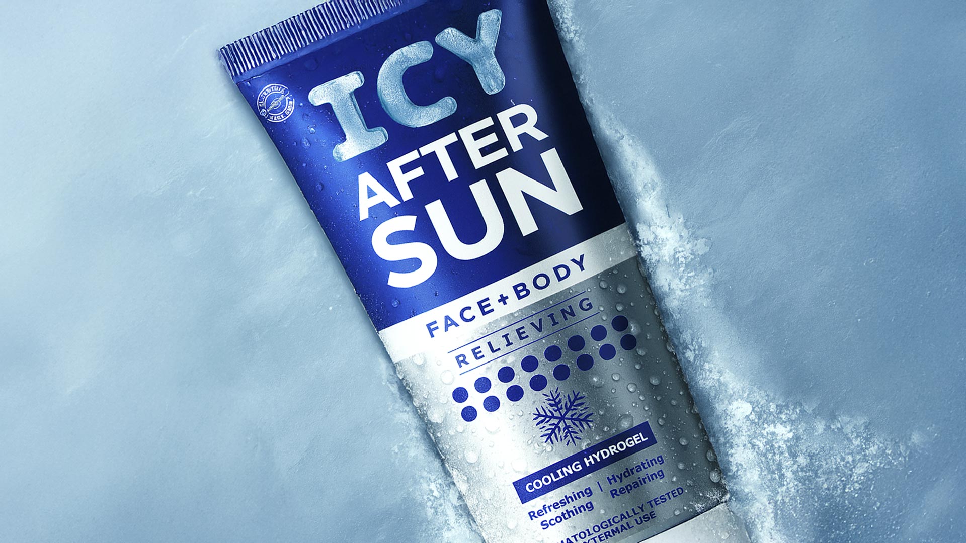
The design incorporates multiple symbols of coolness: a snowflake icon acts as a seal of the product’s cooling power, while the 3D effect of condensation droplets on the metallic surface gives the impression of a chilled tube, freshly taken out of the freezer.
The combination of deep blue with cool metallic silver creates a palette that immediately evokes ice and cold water, reinforcing the product’s promise.
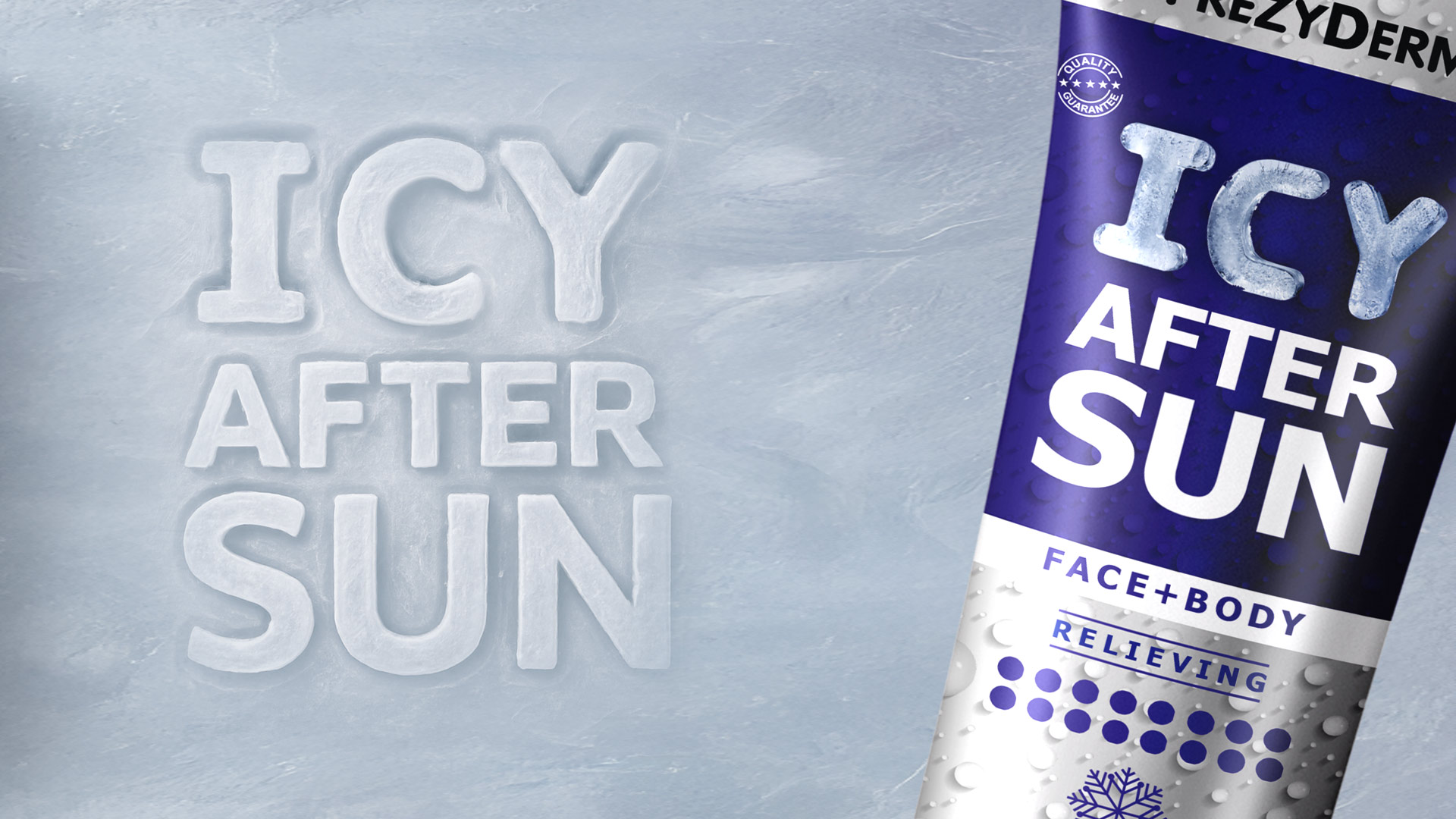
Even the typography of the word “ICY” carries a frosted, ice-like texture, completing the visual narrative and making the product name synonymous with its effect.
With Icy After Sun, ABC Design Communication explored the power of visual illusion and sensory communication, transforming a cosmetic product into a full cooling and refreshing experience.