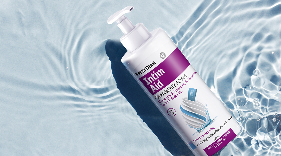
Frezyderm’s Feminine range is designed to offer women absolute safety and care, grounded in the natural purity of its ingredients. The challenge was to redesign the packaging so it would reflect these values in a way that feels contemporary, elegant and discreet. The design needed to convey Frezyderm’s scientific credibility while creating a sense of softness, protection and a deep understanding of the female nature.
Our central idea was to create a strong, abstract symbol that embodies the notion of “protected purity.” The strategic inspiration came from the image of an egg — an ancient symbol of life and protection — embraced by water, the element of cleanliness and hydration. This concept was not illustrated literally, but transformed into a modern, fluid emblem that became the heart of the visual identity.
The result is a visual language that blends purity with elegance, creating a feeling of safety and care.
The key graphic — a contemporary, abstract interpretation of an egg encircled by water — becomes the signature of the range. It communicates protection, hydration and softness in a sophisticated, understated way.
Each product in the series is assigned its own colour code (red, purple), allowing easy recognition while maintaining a cohesive overall aesthetic.
Modern, clean typographic choices reinforce Frezyderm’s scientific aura and improve information hierarchy, building a foundation of trust.
Through the Feminine range, ABC Design Communication captures the delicate balance between science and femininity, creating a design that expresses care, safety and respect.