Organic Olive Oil Award-Winning Packaging Design – Nikolaou Family


The Nikolaou family produces an exceptional, extra virgin, certified organic olive oil — a product born out of deep respect for the land. The challenge was to create packaging that visually communicates this devotion to purity. In a crowded market, the design needed to express the meaning of “organic” with absolute clarity, while highlighting the family’s guarantee of quality and protecting the precious contents.
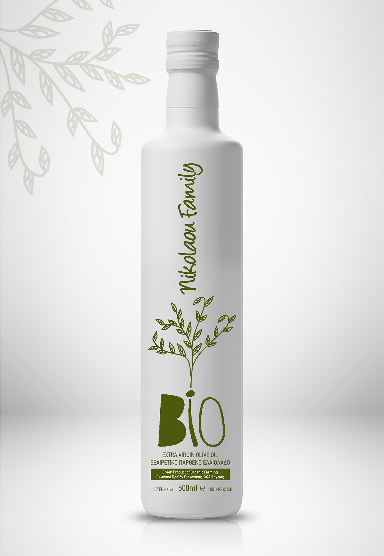
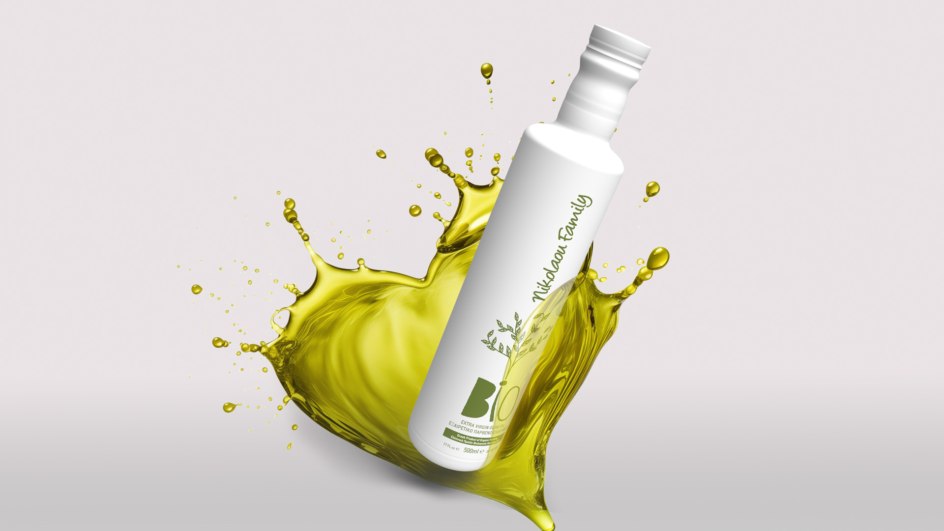
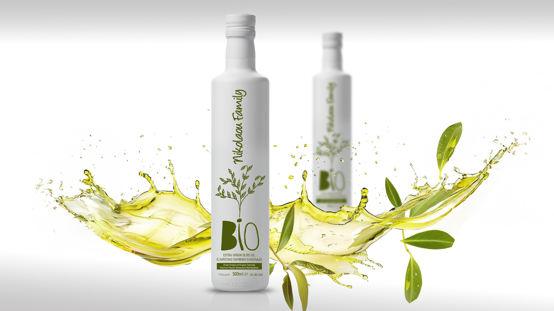
Our central concept was to transform the bottle into a canvas of purity. The strategic insight was to use minimalism not as an aesthetic preference, but as a statement of honesty. The packaging had to reflect the product’s own clarity: no unnecessary elements, no complex graphics — only the essence. White would embody purity; green would represent nature’s signature.
Through branding and packaging design, ABC Design Communication translated the idea of purity into a visual language that conveys trust, transparency and respect for the land.
Our solution is an exercise in balance between simplicity and elegance, where every element serves a clear purpose.
We chose a clean, straight bottle painted in opaque white. This decision plays a dual role: functionally, it completely shields the olive oil from light, preserving its quality; symbolically, the white surface becomes a pure canvas that radiates the integrity of organic cultivation.
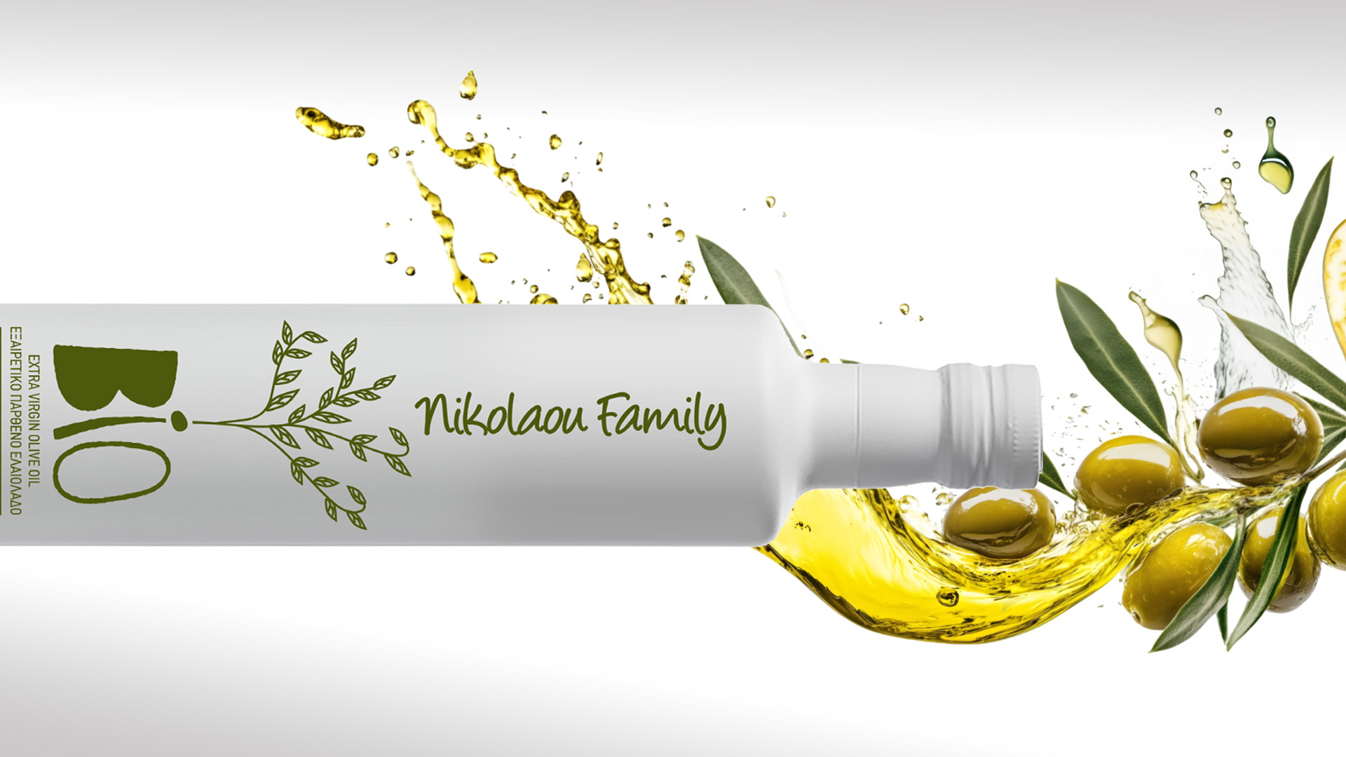
All graphic elements — the “BIO” logotype, the handwritten “Nikolaou Family” signature and the delicate olive-branch illustration — appear in a single colour: the vibrant green of fresh olive oil. This monochromatic approach emphasises honesty and keeps the focus on the essence of the product.
By presenting the “Nikolaou Family” name in a friendly, handwritten style, the product shifts from an anonymous commodity to a personal promise of quality, building a relationship of trust with the consumer.