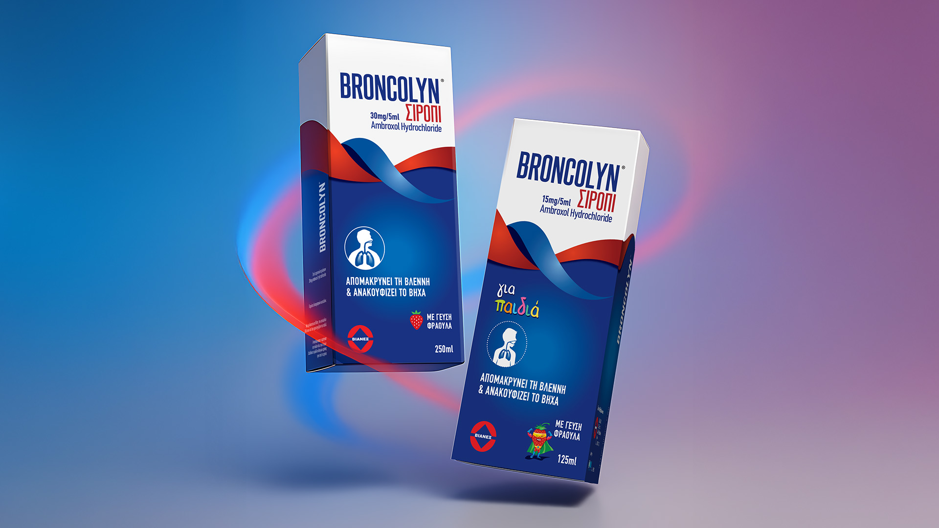
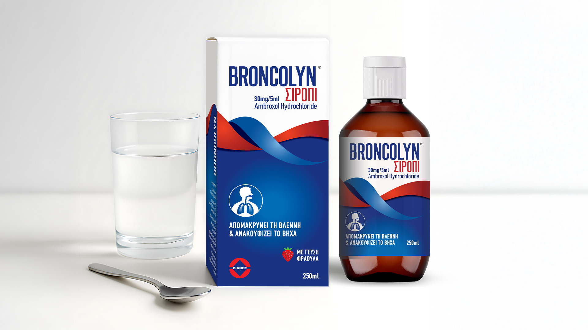
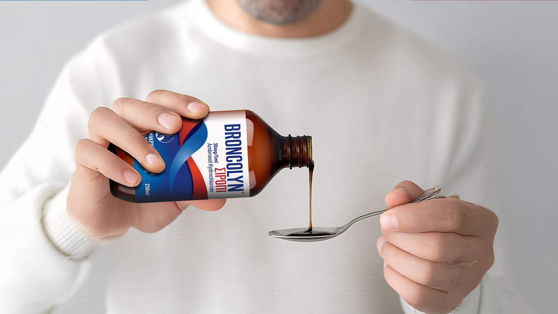
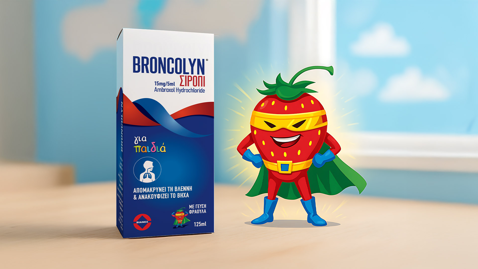
Broncolyn is an antitussive syrup designed for both adults and children. The challenge was to create packaging that visually represents the product’s soothing, healing effect, a sense of calm and wellness spreading through the body.
We approached the concept by visualizing healing through flow and softness. Gentle curves, transparent gradients, and a minimal color palette were used to evoke breath, comfort, and relief. The design needed to not only look trustworthy but to breathe wellness.
The packaging combines simplicity and fluidity, visually expressing the syrup’s action through movement and lightness. The typography remains soft yet confident, reinforcing a sense of safety and care.
The new Broncolyn identity instantly resonated with consumers, communicating the essence of healing in an elegant, emotional way, a design that turns medical functionality into an experience of relief and trust.