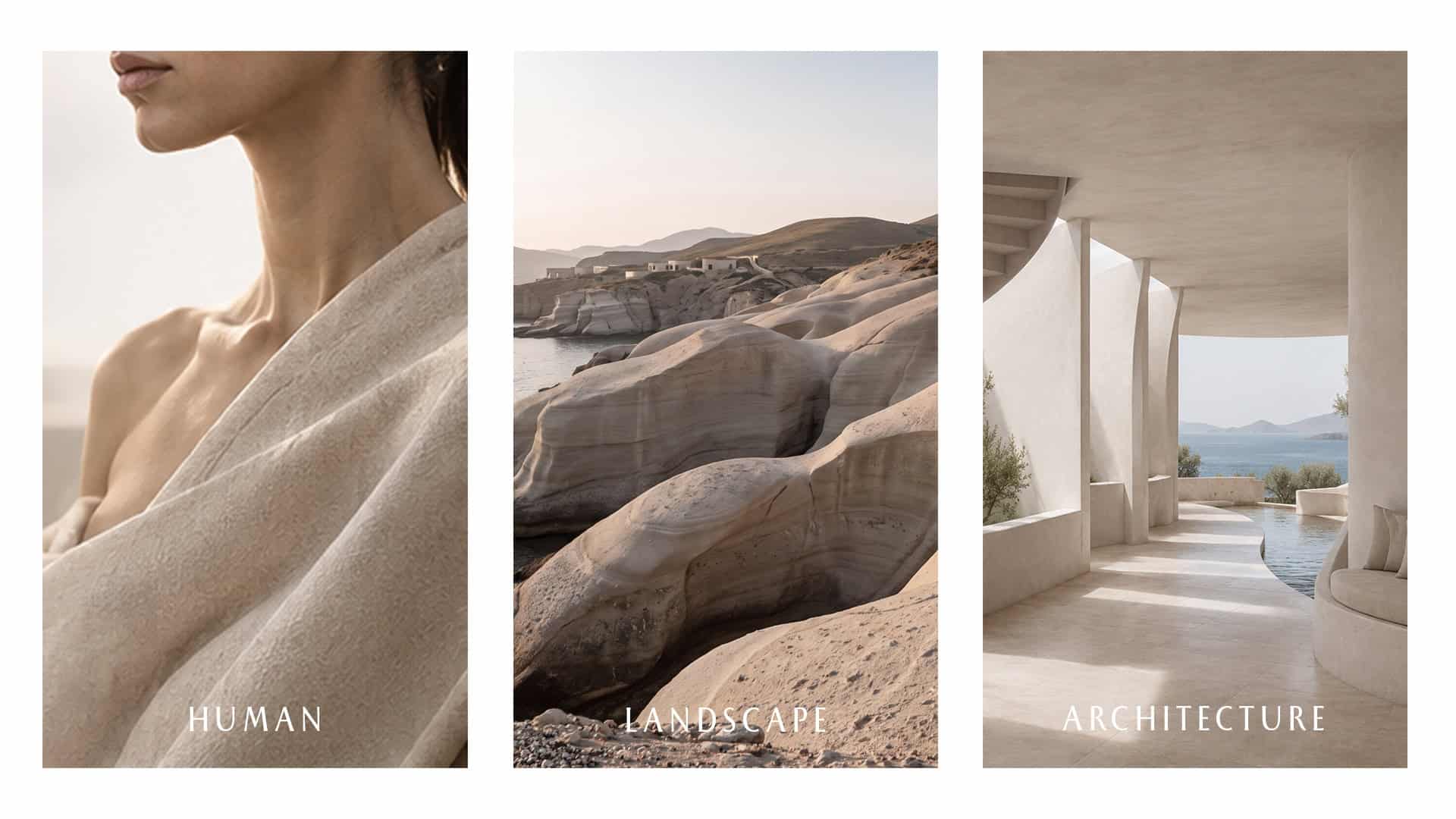


The Human Element. The Natural Landscape. The Built Architecture.
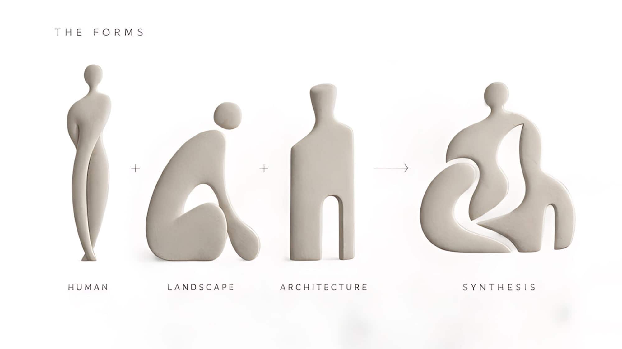
The core brand identity of Synthesis was originally born and carefully developed from the intrinsic relationship and deep connection between three fundamental elements: the human presence, the rugged yet beautiful Cycladic landscape, and the local architecture.
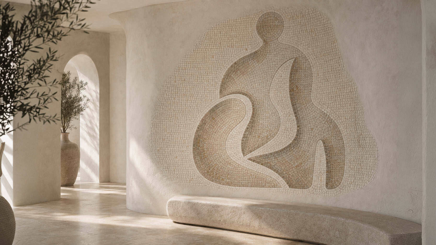
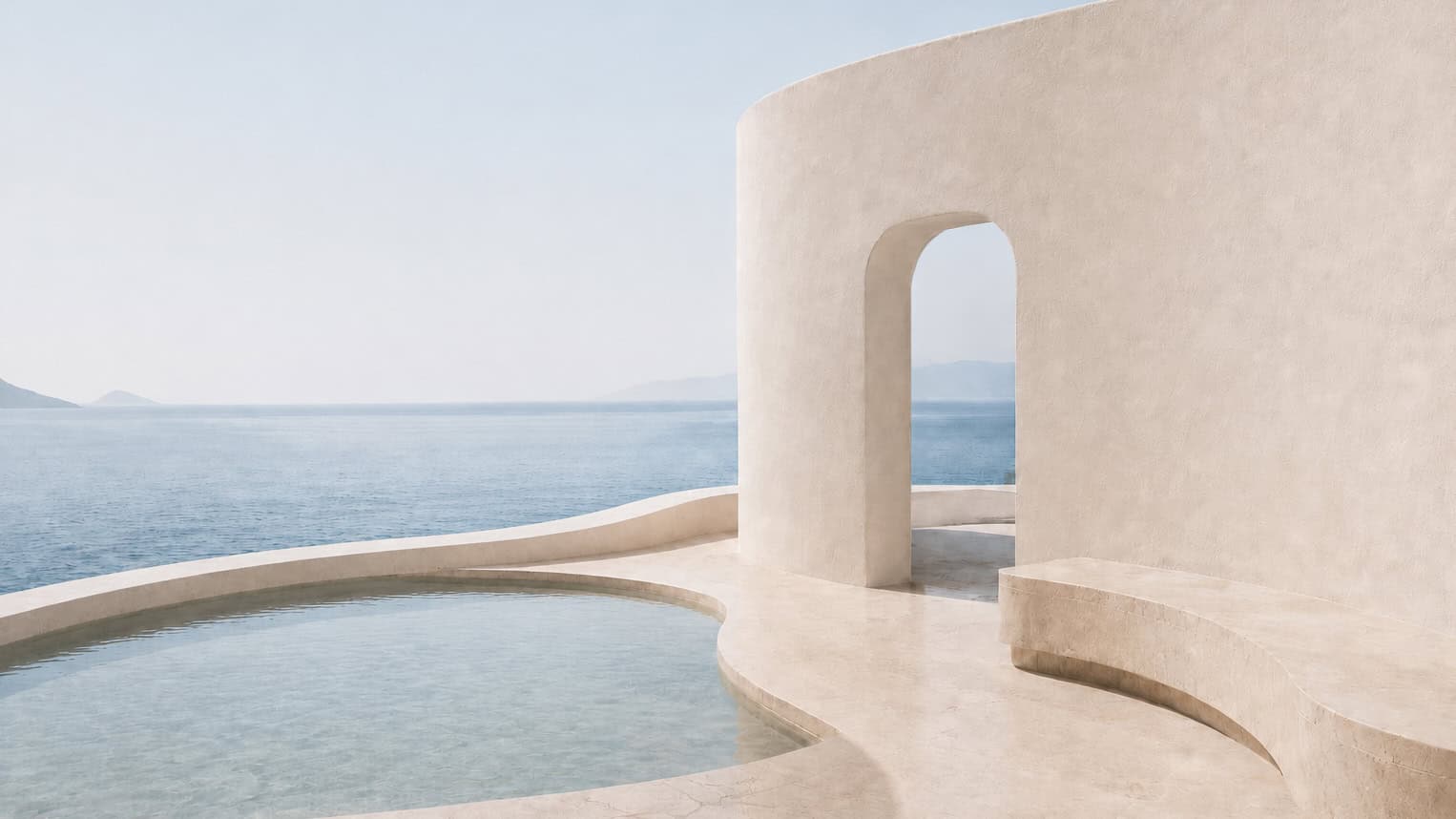
We meticulously studied the fluid contours of human forms, the natural, organic curves of the surrounding island landscape, and the clean, minimalist geometric lines inherent in traditional Cycladic architecture. These three distinct and powerful forms were ultimately synthesized and gracefully blended into a single, cohesive emblem.
This resulting symbol is one that perfectly expresses the central, guiding concept behind Synthesis: the harmonious unification of the human, the physical place, and the architectural space functioning as one seamless entity.
The primary objective of this project was to purposefully create a truly modern and sophisticated visual identity for a premium Cycladic resort a unique destination that seamlessly combines high-end hospitality, rejuvenating spa wellness, and exquisite dining into a single, elevated guest experience. We sought to craft an identity with a clear, undeniable connection to its geographic location, but crucially, without resorting to the cliché or expected traditional symbols so frequently found in standard Greek and Cycladic design aesthetics.
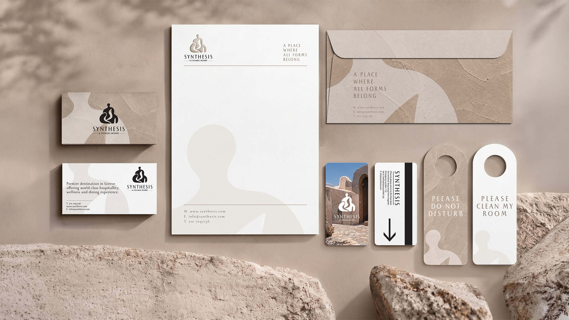
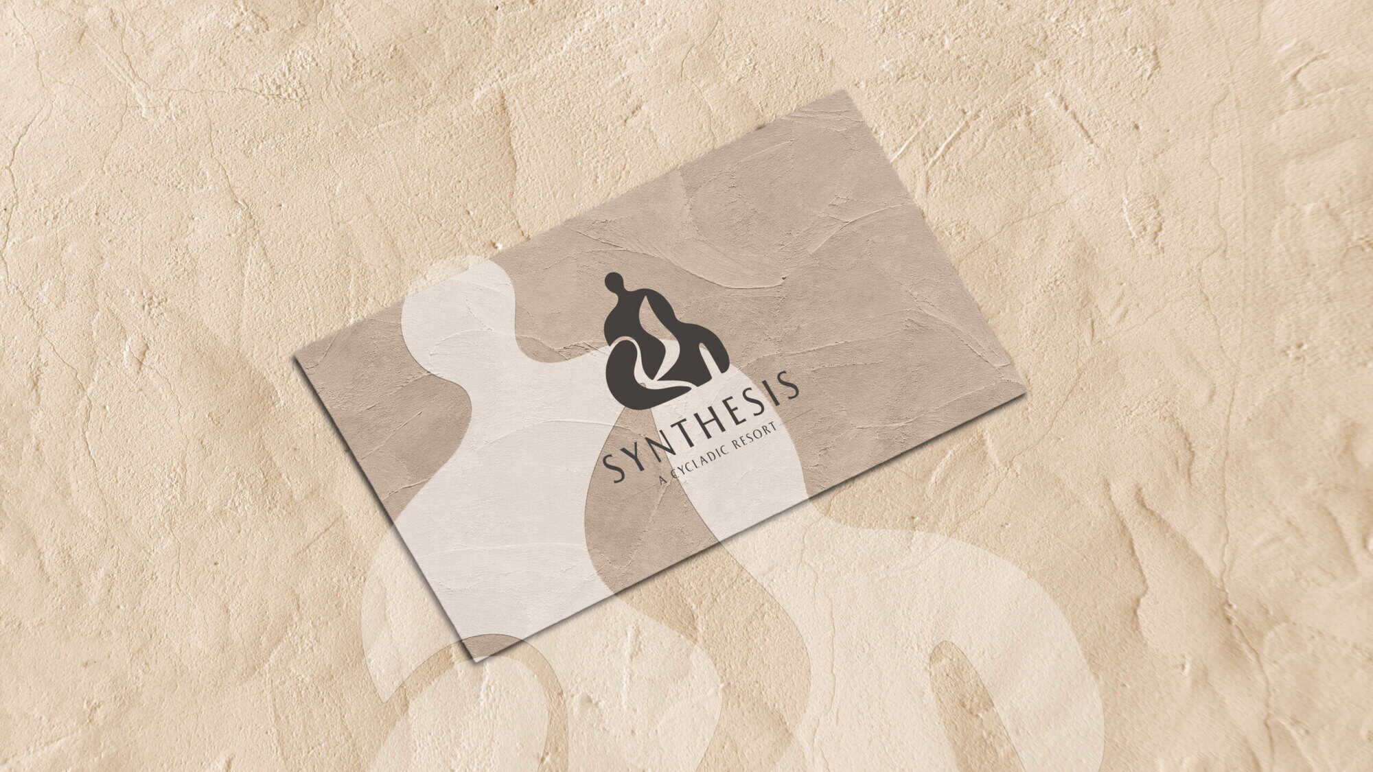
This foundational symbol naturally served as the conceptual starting point for the development of the entire visual and graphic system. Its organic, flowing curves were carefully isolated, thoughtfully enlarged, and creatively transformed into a highly versatile graphic language. This dynamic language possesses the unique ability to effortlessly change its scale and physical application across different mediums, while always securely maintaining its core visual connection to the overarching brand.
The symbol strategically became a complete system.
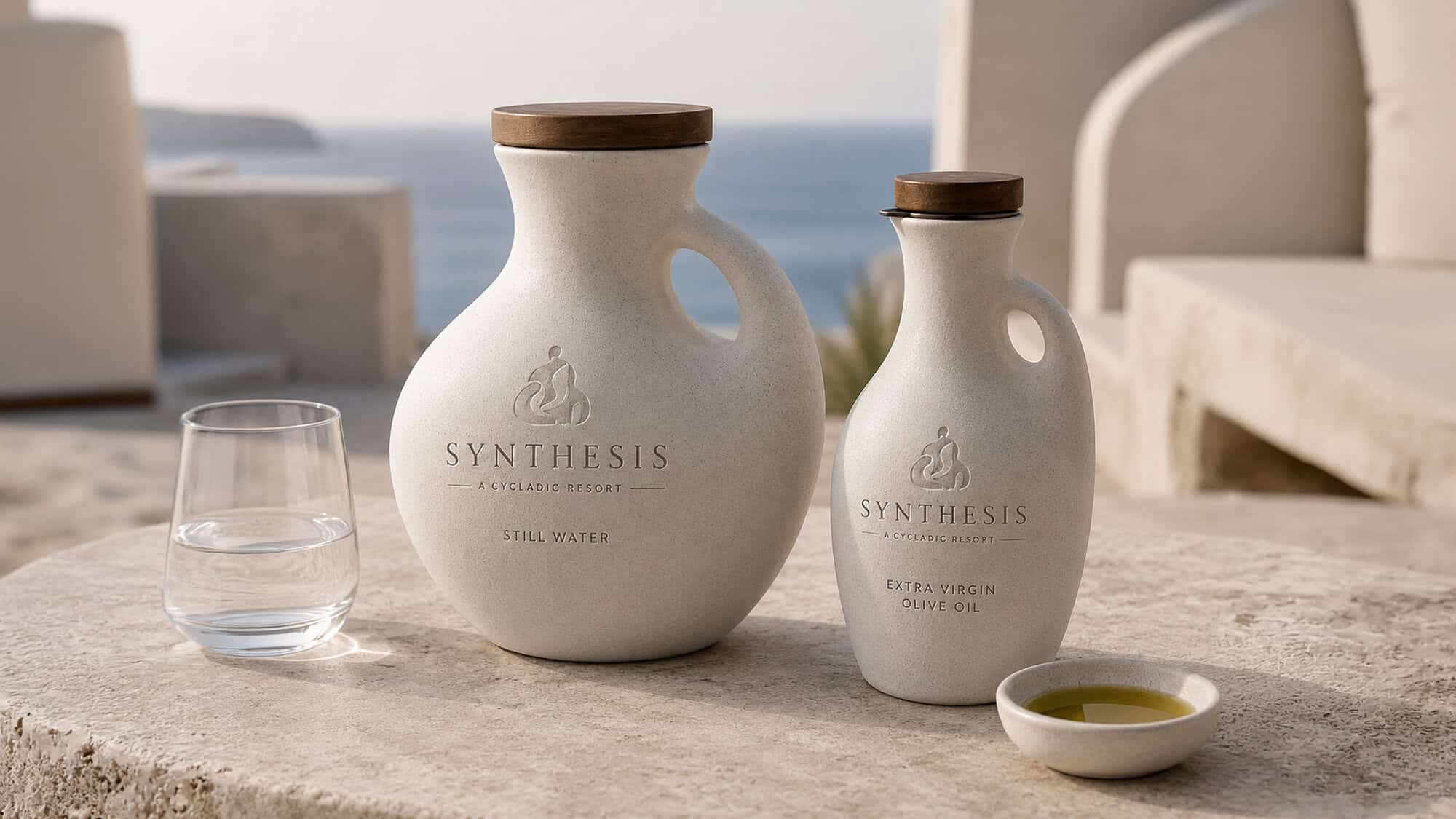
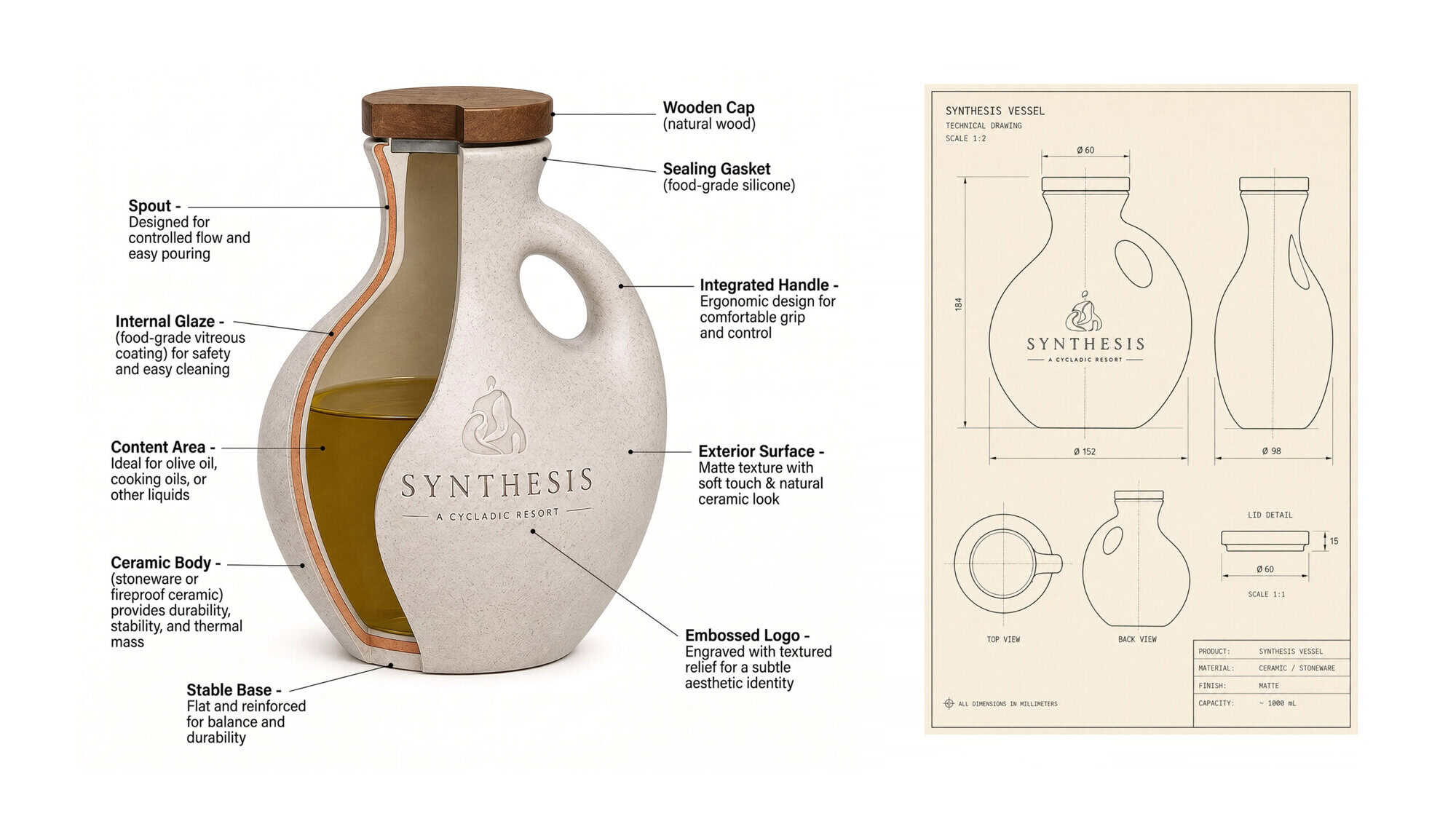
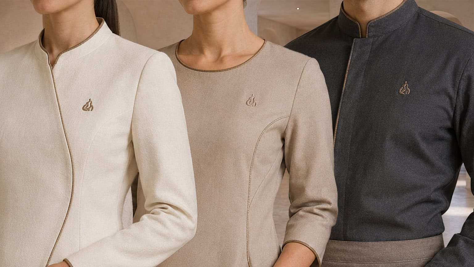
The carefully curated color and material palette is directly drawn and inspired by the surrounding Cycladic environment itself. Delicate off-white and warm sandy shades, beautifully raw natural stone, rich earth tones, authentic wood elements, and highly textured tactile surfaces work together to create an overwhelming sense of grounded naturalness and discreet, understated luxury. In this way, materiality actively becomes an integral part of the brand identity, successfully transferring the design from a purely visual two-dimensional image into the realm of touch, feeling, and ultimately, into the physical architectural space itself.
Furthermore, the bespoke visual language was intentionally designed to live and breathe across absolutely every possible guest touchpoint and interaction with Synthesis: ranging from the environmental signage, elegant printed materials, and custom room key cards, all the way to the serene spa environment, the curated in-room amenities, the restaurant collaterals, and the diverse digital applications.
The final result of this process is a strikingly modern hospitality identity that does not merely use traditional Cycladic aesthetics as a superficial visual reference, but rather masterfully translates its very essence into a deep, comprehensive, and holistic brand system. It is a living system where the human being, the breathtaking natural landscape, and the inspired architecture perfectly coexist and continuously interact with one another.