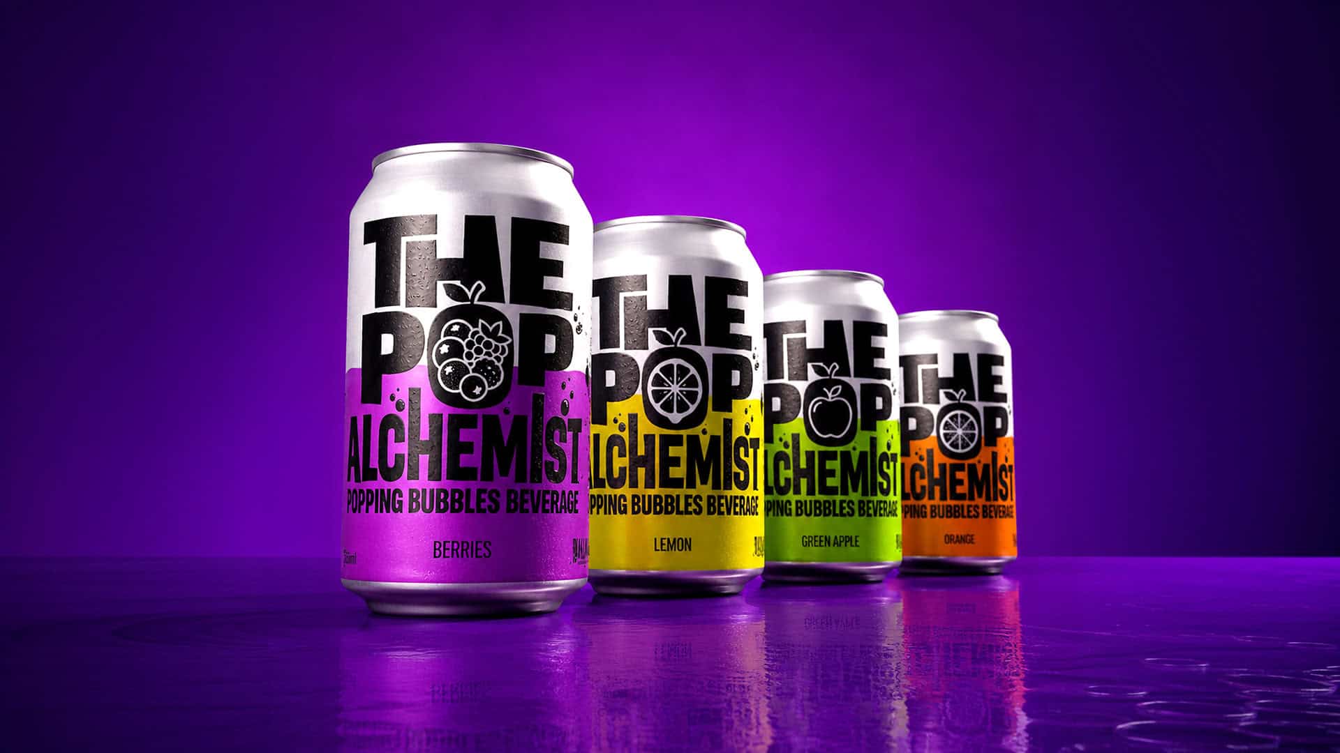

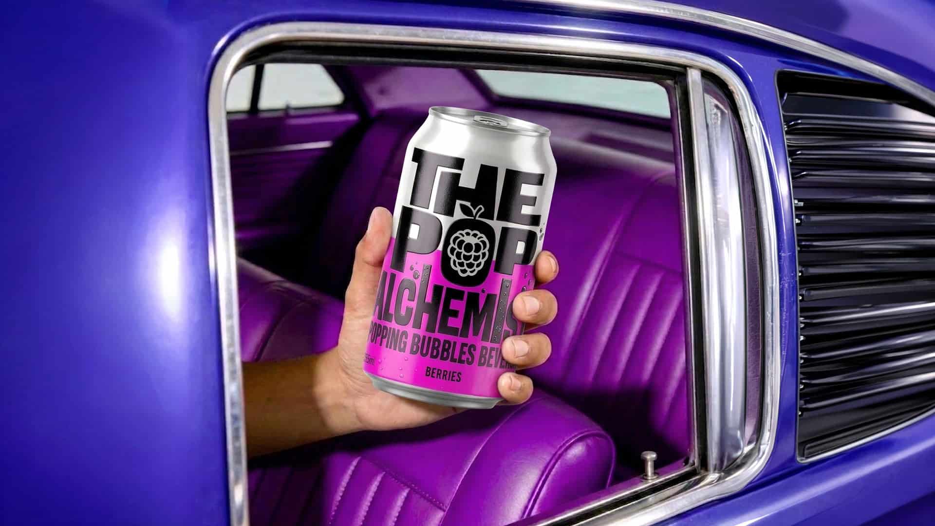
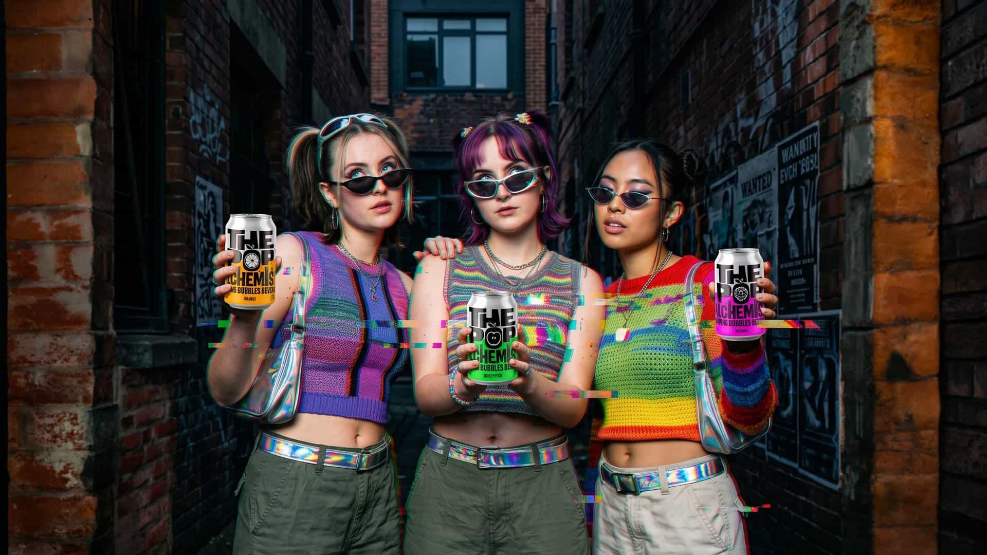
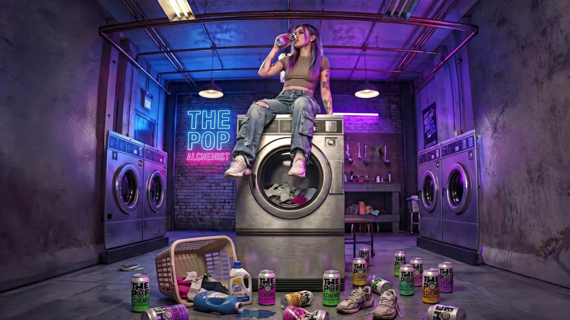
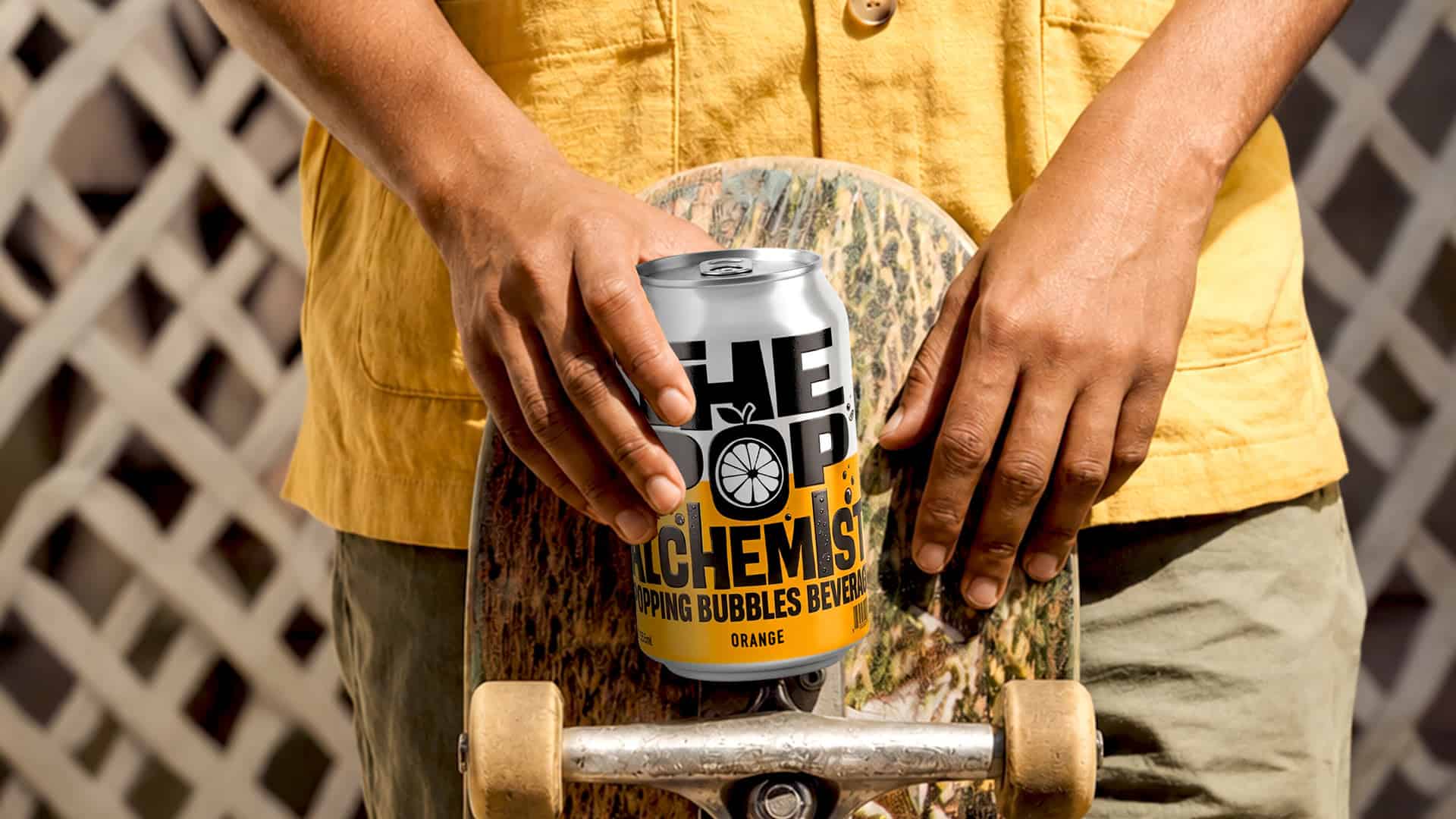
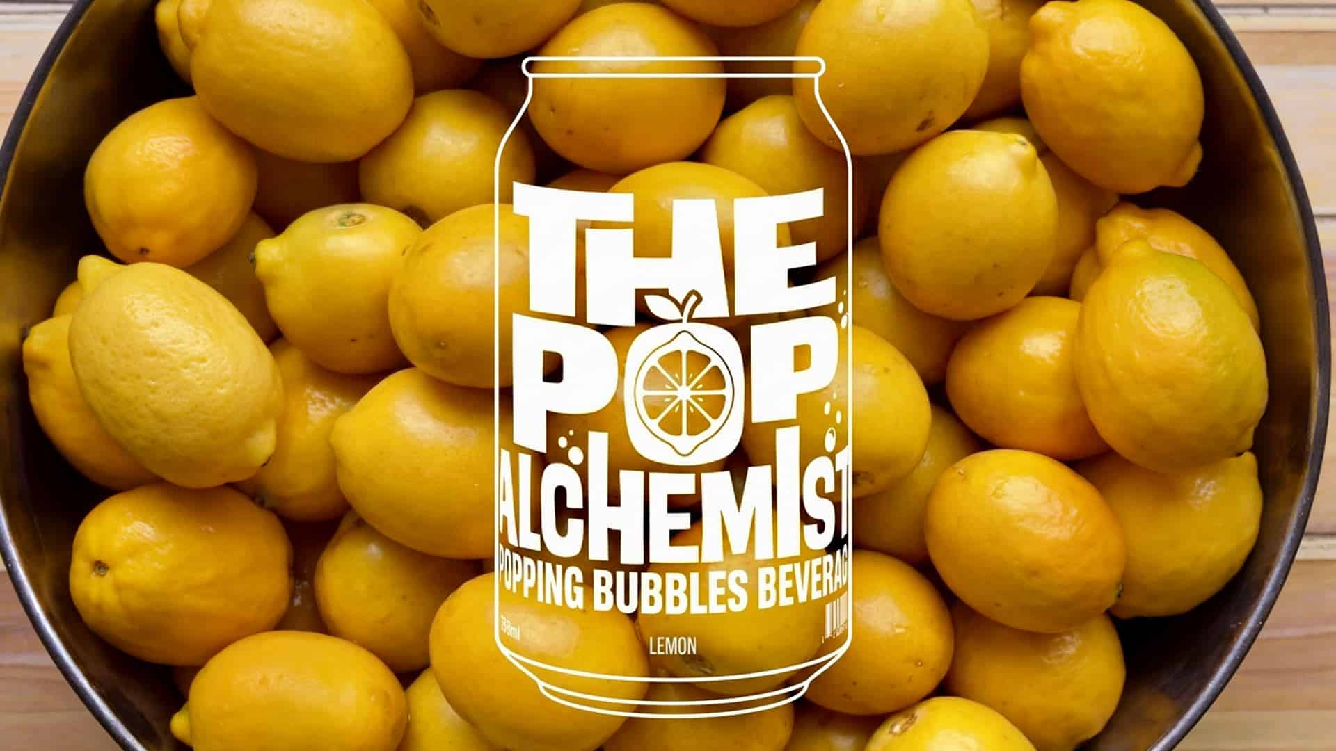

When high aesthetics meet urban street culture, absolute design magic is born. The 'The Pop Alchemist' project is proof of how a meticulous strategy and authentic storytelling can completely redefine the rules of beverage packaging, transforming a soft drink into a statement piece
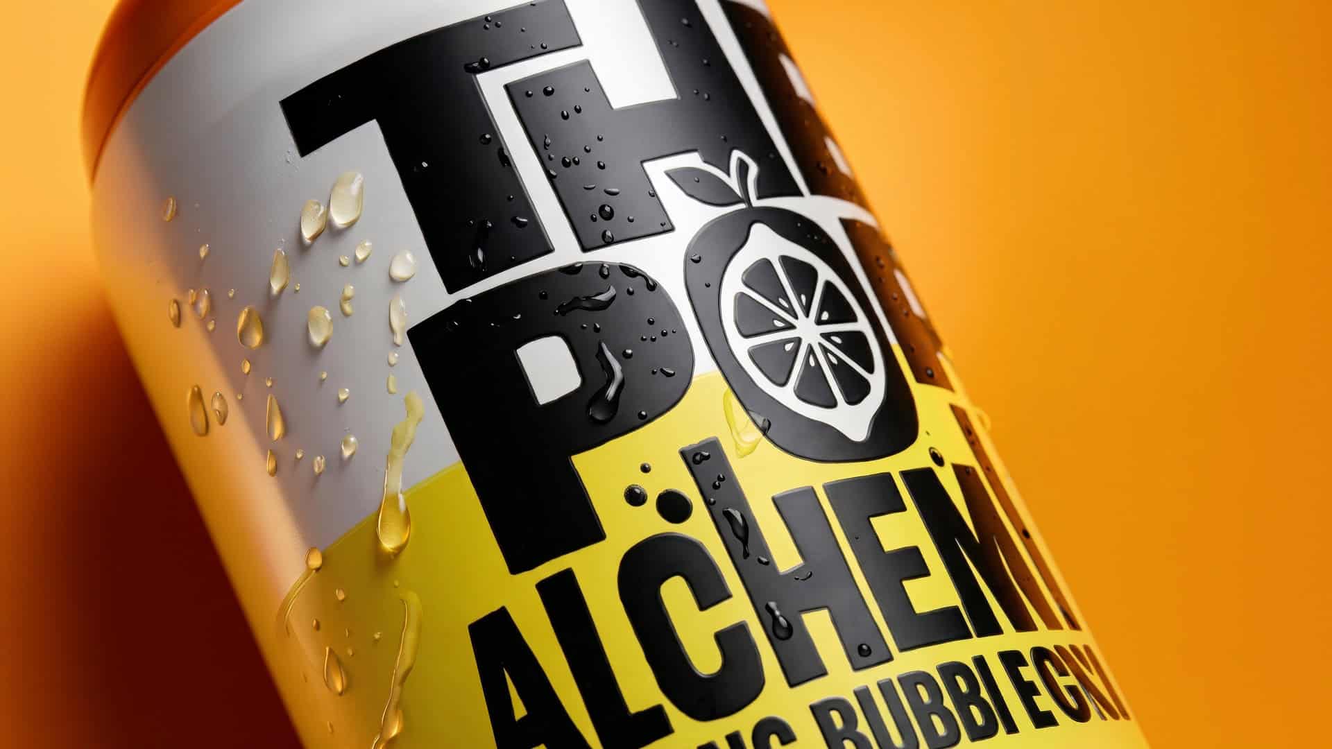
For this innovative beverage featuring popping bubbles, our goal was not merely to create packaging that stands out on the shelf. We wanted to create an object of desire. We developed a visual narrative that radiates energy, summer vibes, and youthfulness, elevating the pop aesthetic to a truly premium level. Our design strategy was rooted in evoking intense emotion: we broke established norms by using imposing, bold typography that dynamically embraces the cylindrical shape.
The absolute contrast between deep black and dazzling neon colors visually translates the explosion of flavors hidden within each package. Simultaneously, we approached every millimeter with a touch of luxury: from the elegant matte textures that elevate the tactile experience, to the flawless finish of the metallic lid.
At ABC Design, we don’t just design cans; we build experiential worlds. By extending our visual storytelling to apparel, glassware, and vehicles, we transformed 'The Pop Alchemist' into a comprehensive, high-end lifestyle brand. The exact point where a raw street vibe is transmuted into a premium strategy.e.