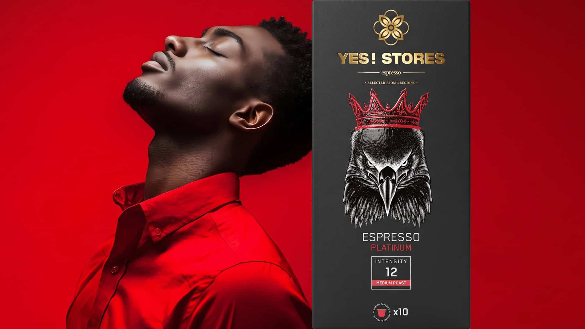
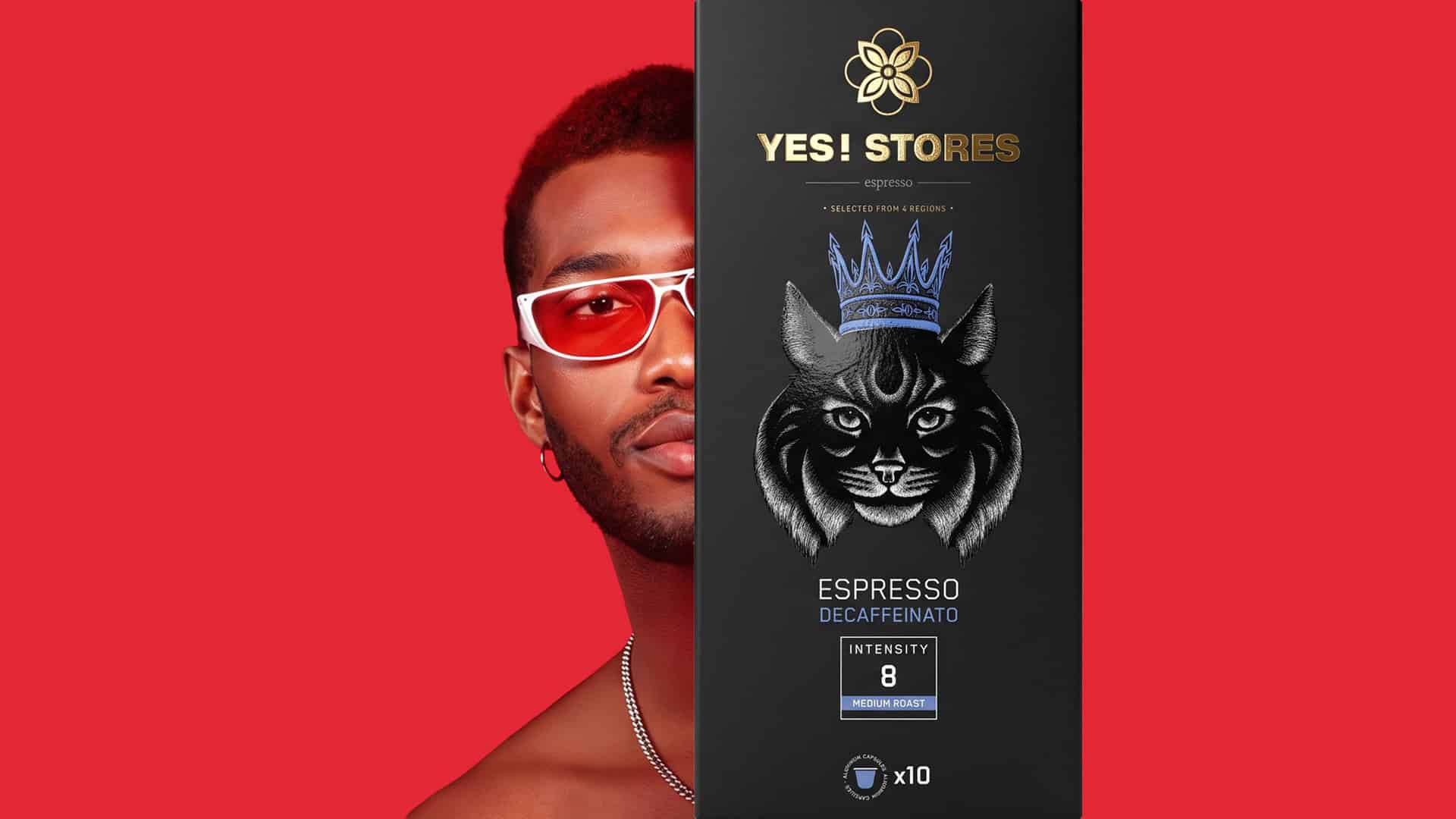
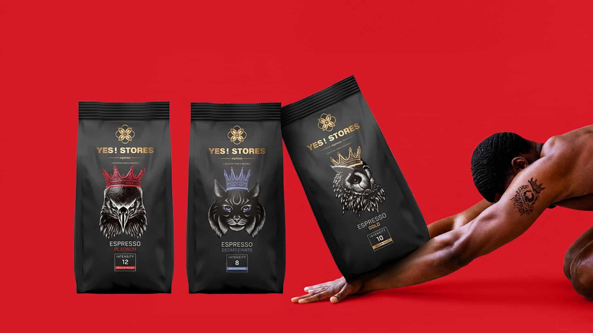
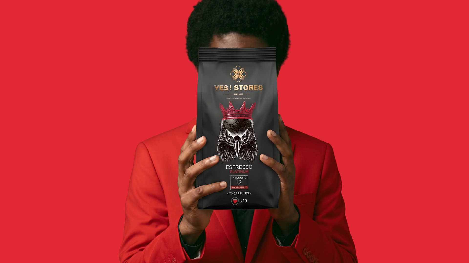
ABC Design Communication designed the premium private-label espresso packaging series for YES! STORES in Greece. The line includes coffee capsules and pouches. Their shared foundation is a recognizable visual identity that gives a distinct character to every option.
The challenge was to combine a strong shelf presence with ease of selection. Coffee is a personal daily habit; every person seeks the flavor and intensity that suits them best. The packaging had to reflect this diversity while maintaining the cohesion of the series.
Our strategy was based on connecting each blend with a unique persona. Illustration, color, and intensity indicators work together. Their goal is to attract interest and help consumers easily identify their choice.
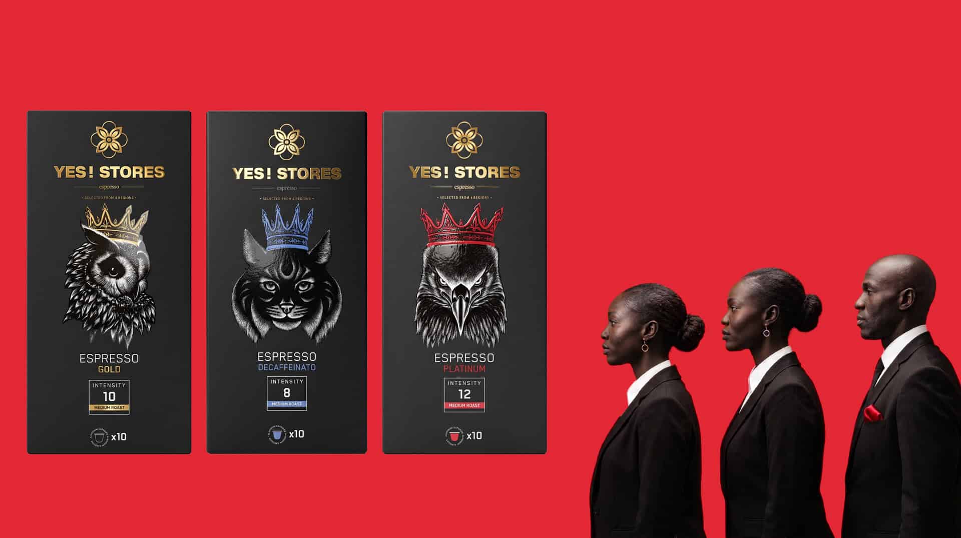
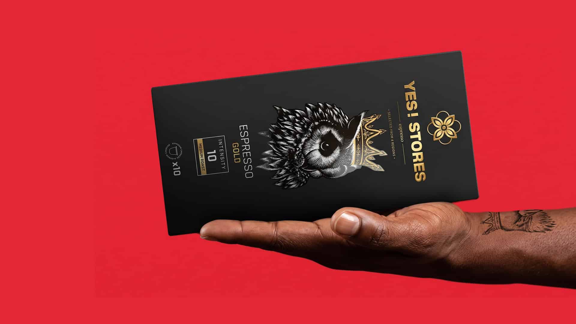
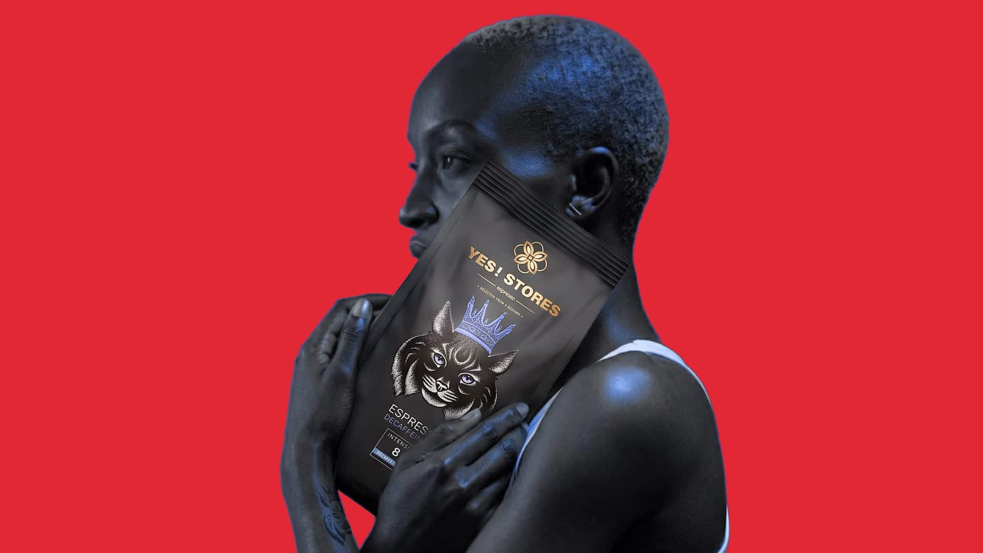
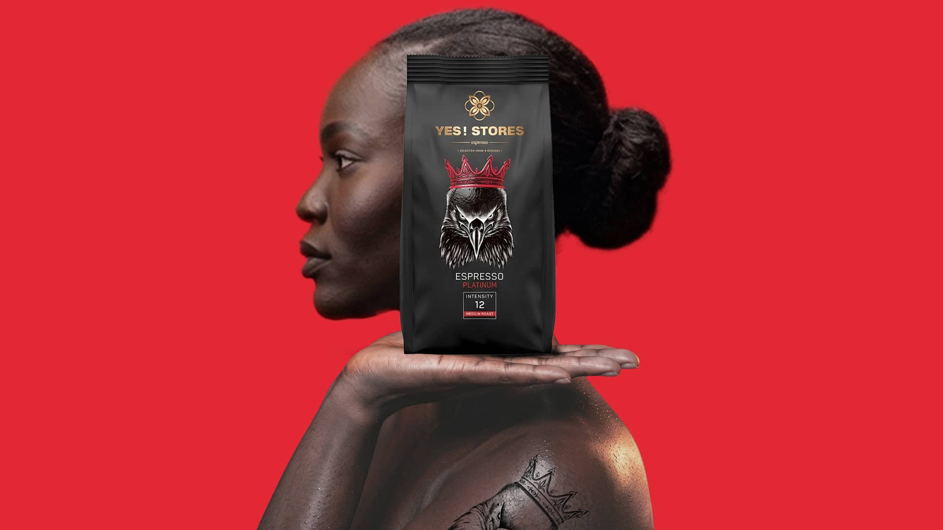
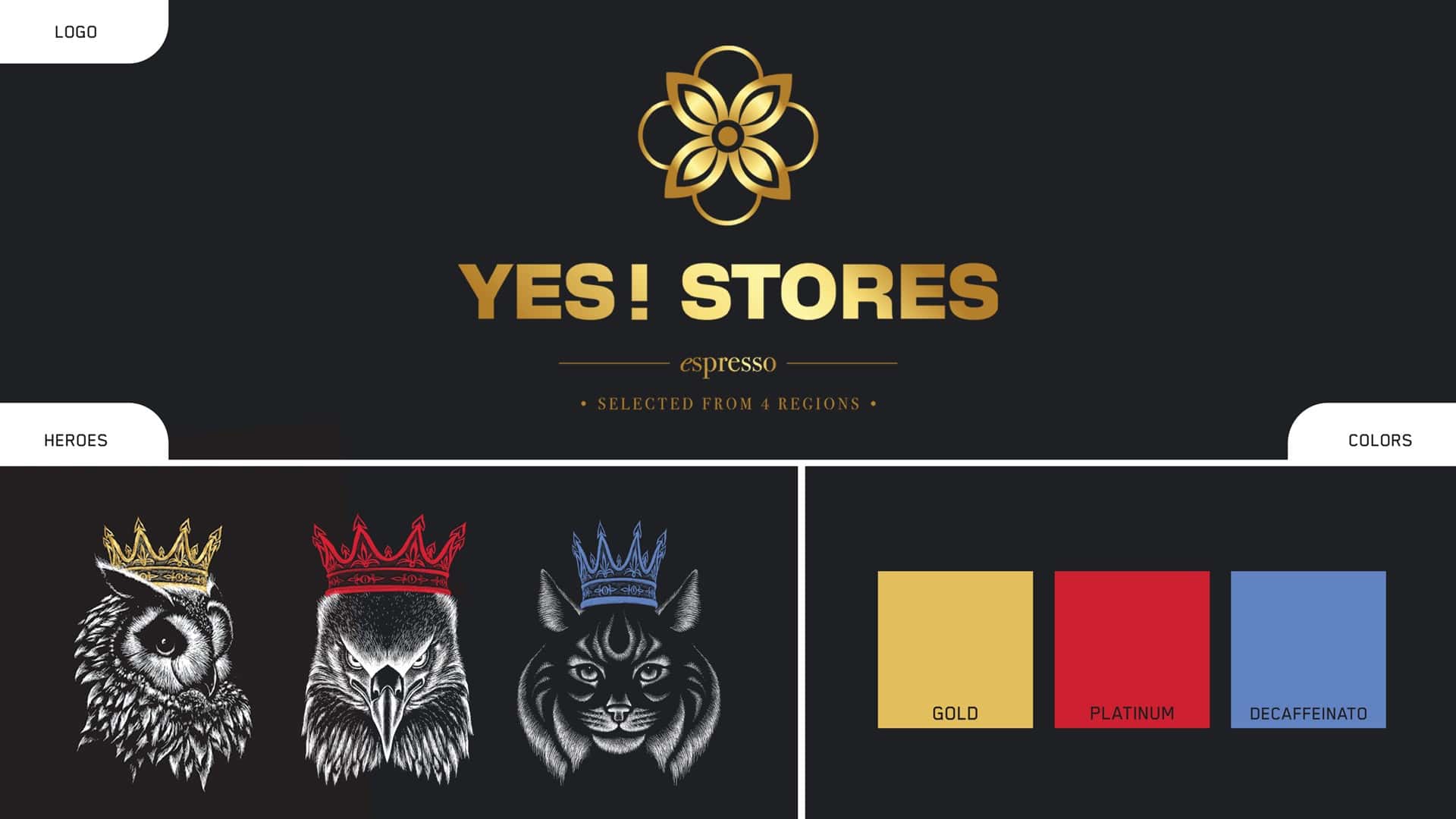
The owl with the gold crown characterizes Gold, with an intensity level of 10. The eagle with the red crown brings dynamism to Platinum, with an intensity of 12. The lynx with the blue crown distinguishes Decaffeinato, with an intensity of 8. The detailed, engraving-style illustrations give the packaging an authentic touch, while the crowns tie the three characters together and express the premium positioning of the line.
The black background highlights the figures and unifies the packaging. Gold, red, and blue details differentiate the products. Clean typography organizes the information, placing emphasis on the blend and its intensity. The same design system seamlessly adapts across both coffee capsules and pouches.
The result is a packaging family driven by cohesion and personality a design that treats coffee as an integral part of people's lives, from the moment of choice on the shelf to that quiet, personal pause in the daily routine.