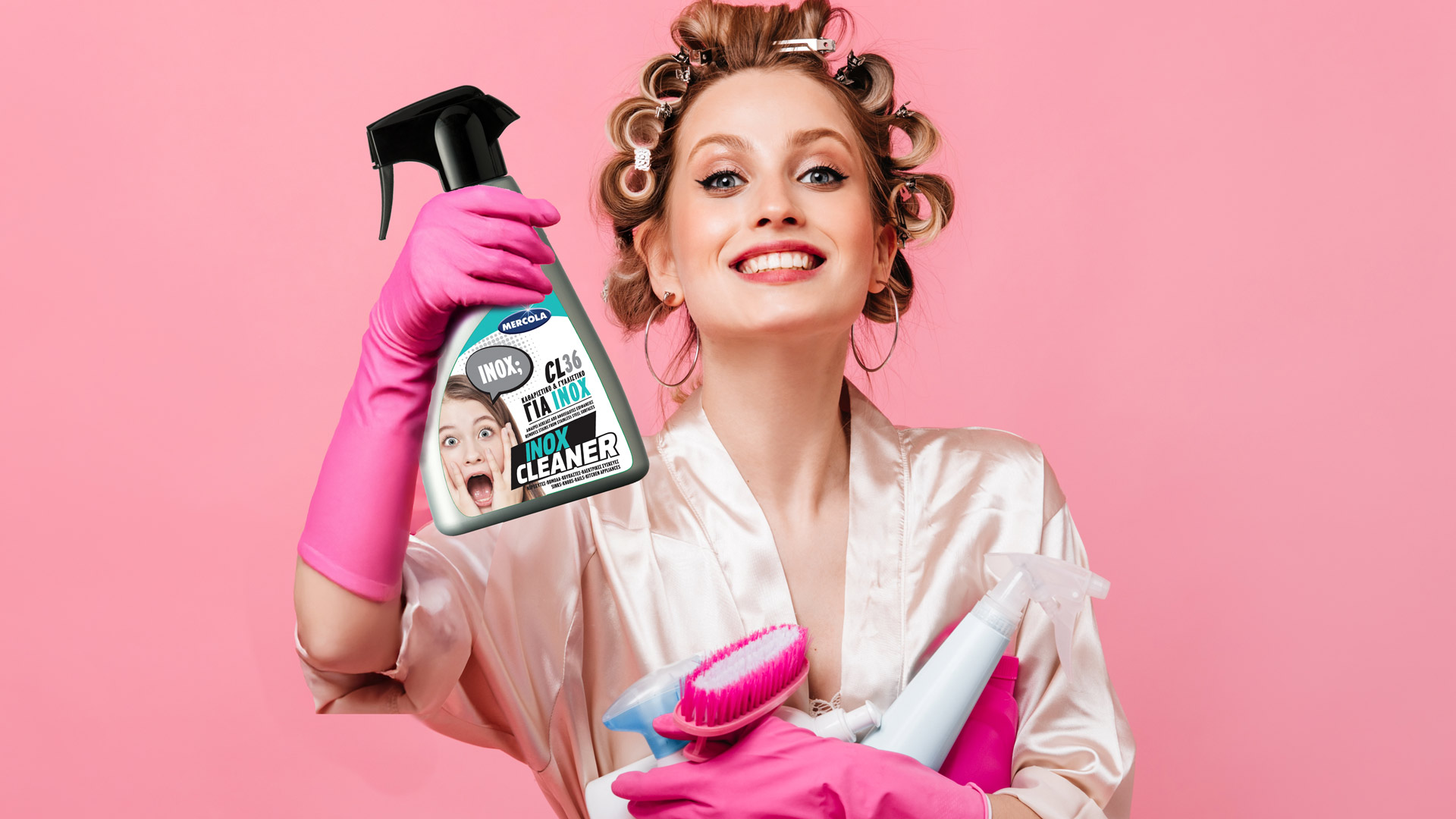
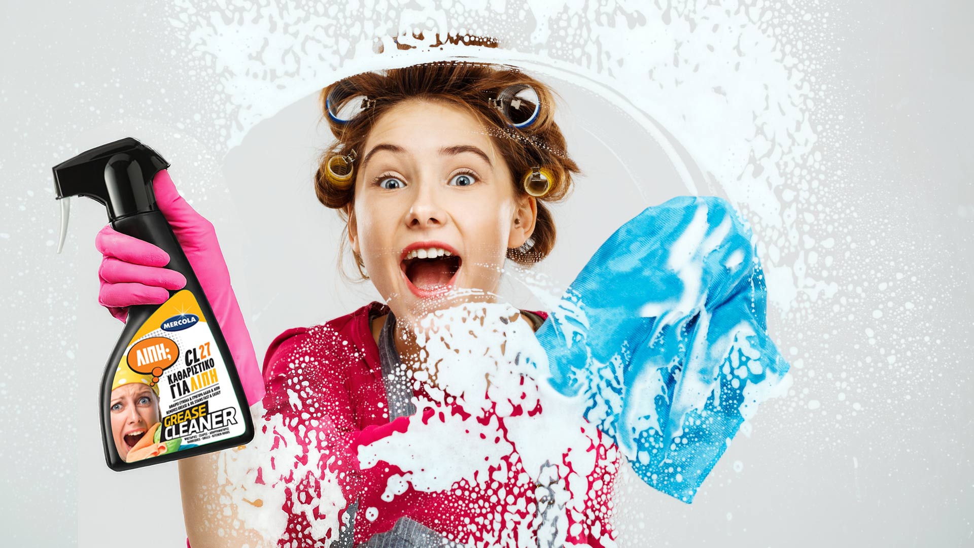
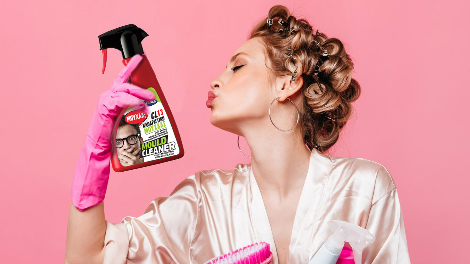


Mercola cleaners are sold in paint shops and hardware stores, not in supermarkets. We needed to design a label that would shout from the shelf, stand out dramatically from the more “industrial” competition, and create an immediate, memorable connection with the customer.
Our strategy was Humorous Shock. The core idea was the “mirror effect”: the label would reflect the consumer’s exaggerated expression at the very moment they spot a tough stain (mould, grease, smoke).
The result is a packaging range that uses humour as its primary sales tool.
Instead of “before & after” photos, we used expressive portraits of people shouting, grimacing or reacting with disgust, creating an instant emotional and humorous identification with the problem.
The product names are not technical, but verbal exclamations (“MOULD?”, “GREASE?”, “SMOKE?”). This simplicity, combined with the strong imagery, delivers a powerful, instantly understandable message.
Each product is assigned its own bold, “industrial” colour (red, orange, grey), making recognition on the hardware-store shelf effortless.